

Warm Minimalism in 2025 blends restrained, durable design with earthy tones like clay, sage, and terracotta to create warm, timeless spaces. You’ll see modular systems, sustainable materials, and precise detailing that ages gracefully. Embrace light-breathing layouts, tactile textures, and low-VOC finishes with subtle contrast and measured color updates. Expect repeatable finish schedules, repairability, and noise-aware surfaces for comfort. If you stay with me, you’ll uncover the practical rules and actionable tactics behind this vibe.
Key Takeaways
- Warm minimalism in 2025 emphasizes intentional simplicity, durable materials, modular systems, and repairability to reduce waste and extend longevity.
- Earthy palettes—clay, sage, terracotta—with warm neutrals and deep olives create cohesive, low-contrast interiors anchored by warm metals and amber lighting.
- Textures and natural fibers (linen, wool, boucle) enhance tactile richness and acoustics, while sustainable finishes and reclaimed materials support responsible sourcing.
- Space is designed with open sightlines, breathable materials, modular storage, and multi-functional furniture to preserve openness and calm.
- Execution focuses on small, strategic updates (lighting, hardware, textiles) backed by standardized finish schedules and repeatable design logic to maintain cohesion.
What Warm Minimalism Means in 2025 (Foundations You Can Apply This Year)

Warm Minimalism in 2025 centers on intentional simplicity that still feels warm and inviting. You apply a framework of restrained ornament, modular systems, and durable materials, ensuring longevity over trendiness. Foundation work centers on Sustainable sourcing, where supply chain transparency and ethical partners safeguard quality and provenance. You align procurement with lifecycle cost analysis, selecting finishes and textiles that age gracefully while minimizing ecological footprint. Cultural influences shape your palette and texture language, translating regional craft into scalable, modern silhouettes without dilution. You implement audits for material footprint, embed warranty-driven design, and prioritize repairability to reduce waste. This approach demands disciplined consistency: standardized specs, clear KPIs, and cross-functional collaboration. In practice, your spaces feel calm, purposeful, and adaptable to evolving urban living.
Choosing Earthy Tenders: Clay, Sage, and Terracotta for Everyday Living
Choosing earthy tones like clay, sage, and terracotta grounds Warm Minimalism in everyday spaces by marrying tactile warmth with durable performance. You’ll deploy these hues across architectural detail, cabinetry, and fixtures to establish a cohesive, low-contrast backbone for evolving palettes. Embrace seasonal color palettes to time finishes with lighting shifts, ensuring your spaces read as calm through year-round cycles. Prioritize materials calibrated for longevity, where porosity, sealants, and matte sheens minimize upkeep while maximizing tactile resonance. Sustainable sourcing matters: select responsibly quarried stone, low-VOC finishes, and reclaimed timber to reduce lifecycle impact without compromising aesthetic integrity. Keep contrast deliberate—pair warm neutrals with deep olives or charcoal accents to sharpen form without shouting. In practice, document color-recipe iterations, confirm colorfastness under ambient light, and verify supplier certifications for certification-enabled workflows.
Texture-Driven Comfort: Fabrics, Surfaces, and Textural Details
Texture-driven comfort starts with tactile honesty: you’re selecting natural fiber textures that read as warmth, like brushed cotton, linen, and wool blends, paired with warm surface finishes that invite touch. You’ll optimize grain, nap, and weave to amplify acoustics, temperature perception, and durability across residential and hospitality contexts. In practice, texture becomes a design instrument—layering fabrics and surface materials to reinforce earthy tones while maintaining restrained minimalism.
Natural Fiber Textures
Natural fiber textures anchor warmth and tactility in a minimal, earthy palette, blending comfort with durability for everyday interiors. You prioritize fiber-driven surfaces that age gracefully, resisting pilling and fading while maintaining structural integrity. Textural contrast becomes a deliberate design lever: boucle weaves, raw linen slubs, and undyed cottons introduce tactile depth without visual noise. You’ll pair breathable fabrics with low-sheen surfaces to preserve legibility of color blocks and patterns. Natural dyeing informs hue behavior, yielding nuanced earth tones that soften sharp edges and deepen over time. Emphasize seam construction, felting, and surface brushing to enhance perception of mass and density. In practice, select fibers with aligned fiber direction and finish, ensuring sustainable sourcing, reduced emissions, and reliable performance in high-traffic zones.
Warm Surface Finishes
Soft surfaces become the backbone of warmth, pairing tactile depth with visual calm to create inviting everyday interiors. You’ll prioritize Warm Surface Finishes that register through tactility, scale, and lightplay. Build layers with performance fabrics in breathable blends, engineered for resilience yet yielding a rich hand. Subtle sheen, matte textures, and brushed edges read as grounded luxury, not distraction. Emphasize surfaces that age gracefully: terrazzo veneers, micaceous plasters, and honed stones roll into the palette with restrained gloss. Introduce vintage accents sparingly to anchor stories without overpowering rhythm. Bold patterns appear as calibrated focal points on upholstery or rugs, anchoring the composition yet preserving calm cadence. Keep color saturation earthy, tonal, and cohesive to maximize warmth, texture, and perceived coziness across high-traffic zones.
Let There Be Light: Designing Open, Grounded Rooms
Let there be light by prioritizing open sightlines and grounded materials that breathe. You design open, grounded rooms by maximizing uninterrupted sightlines from entry to focal points, ensuring ceiling-height glazing reads as daylight rather than glare. Use large-scale MEP planning to minimize bulk, allowing natural light to travel; pair with reflective surfaces and low-contrast palettes to amplify brightness without washing color. Materials should breathe: ventilated timber, limewash plaster, and porous stoneok—avoiding dense, opaque finishes that trap atmosphere. Incorporate indoor plants near light sources to regulate humidity and add vertical contrast. Introduce vintage accents sparingly to anchor warmth without crowding planes. Prioritize furniture with slim profiles, hidden storage, and modular geometry to preserve openness while grounding the space in tactility.
Practical 2025 Rules: Space, Storage, and Simplicity
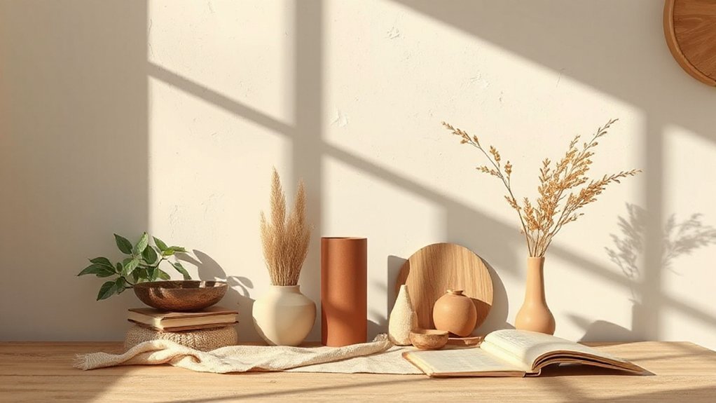
Practical 2025 rules center on space efficiency, streamlined storage, and uncompromising simplicity. You optimize floor plans with modular systems, built-ins, and hidden compartments to maximize every square meter. Prioritize multi-functional furniture, wall-mounted solutions, and floating storage to reduce footprint while preserving access. Sustainable materials guide material selection, favoring low-emission composites and responsibly sourced woods that age gracefully with earthy tones. You implement decluttering protocols and rule-based zoning to maintain calm, focused environments. Cultural influences shape typologies and hardware cues, aligning tactile details with regional craft traditions while maintaining minimalist restraint. Emphasize durability and repairability, standardizing finishings for timeless cohesion. You measure success by reduced maintenance cycles, predictable reuse of spaces, and a cohesive, serene user experience.
Color Play That Supports Calm: Subtle Tones, Not Clutter
Color play should reinforce calm without competing with furniture or textures; subtle hues create depth while keeping surfaces visually quiet. You implement restrained palettes that support a cohesive room flow, avoiding visual noise and cluttered accents. In practice, you leverage color psychology to cue tranquil moods: muted earth tones, desaturated blues, and softened greens heighten perception of space and serenity. You pair cool neutrals with warm undertones to balance contrast, preserving emotional resonance without overstimulation. Surface treatments stay matte or satin to minimize glare, while accent details use small, intentional pops rather than broad swaths. You measure impact by user experience, noting how subtle shifts alter perceived scale, comfort, and focus. The result: a sophisticated, enduring calm that remains functionally adaptable across activities and elevations.
Lighting, Accessories, and Greenery That Elevate Warm Minimalism
Lighting, accessories, and greenery are the levers that elevate warm minimalism from calm interiors to daily livable elegance. You’ll curate with intent: opt for geometry in statement lighting, where sculptural fixtures anchor color-drilled rooms without overpowering the palette. Favor warm-toned metals and diffused amber glow to reinforce earthy tonality while preserving clarity. Accessories should read as calibrated punctuation—minimal, functional, and tactile—preferably in natural textures like raffia, linen, and driftwood. Introduce greenery as a textural element, selecting specimens with architectural silhouettes and low-maintenance care for steady visual rhythm. Vintage patterns appear as restrained accents—think subtle textiles or ceramics that nod to history without competing with modern lines. Execute with restraint; cohesion hinges on repetition, coherence, and purposeful contrast.
Real-Life Makeovers: Before/After and Common Pitfalls

Before/After highlights show how measured updates—like improved layout flow and palette tweaks—transform spaces without overhauling structure. You’ll call out common pitfalls, such as mismatched scale or overcorrecting color saturation, so future projects stay cohesive. Let’s discuss how these real-life results translate into actionable lessons for consistent warmth and earthy depth.
Before/After Highlights
When you compare real-life makeovers, the real value lies in the Before/After contrast and the pitfalls that trip projects up. Your highlights should crystallize how small shifts yield big perceptual gains, not just cosmetic tweaks. Frame outcomes with measurable metrics: space perception, light bounce, and texture fidelity across finishes. In these cases, vintage patterns reemerge as accent signals, balanced by restraint to avoid clutter. Emphasize Monochrome contrast to anchor furniture, textiles, and surfaces into a cohesive narrative—contrast isn’t chaos; it’s a controlled tonal engine. Capture activation moments: lighting tweaks, hardware swaps, and rug placement as proof points. Avoid over-scoring drama; instead, present crisp, actionable substitutions, budget-aware timelines, and supplier-ready checklists that translate design intent into repeatable, scalable results.
Common Pitfall Lessons
Common pitfalls emerge quickly once you start patching a space with minimalism and earthy tones. You’ll learn to micromanage scope creep, resisting the urge to overdecorate with textural accents that compete rather than harmonize. Prioritize Sustainable materials to maintain durability and lifecycle integrity; cheap composites undermine the palette’s integrity and posture. Define a restrained color cadence early, using a core neutral foundation and strategic splashes to avoid chromatic fatigue. You must assess Cultural influences to prevent symbolic mismatches that feel performative or superficial. Measure scale and proportion against lighting curves, not fashion trends, and deploy modular components for future reconfigurations. Finally, document a standardized finish schedule to minimize rework, ensuring a cohesive, timeless outcome that resists quick turnaround remodeling cycles.
Frequently Asked Questions
How Does Warm Minimalism Differ From Traditional Minimalism in 2025?
Warm minimalism blends sustainability with tactile warmth, diverging from traditional minimalism’s austere geometry; you prioritize sustainable design and sensory experiences, integrating natural materials, softer palettes, and products that reveal craftsmanship while maintaining clean, functional silhouettes.
Can Earthy Tones Work in Small, Urban Spaces Effectively?
Yes, earthy tones can work in small urban spaces. Use Urban color palettes to define mood, and choose Small space furniture with clean lines, multifunction. You’ll maximize depth, cohesion, and light reflection, creating perceptual expansion and refined ambience.
What Fabrics Best Balance Warmth and Durability for Daily Living?
Durable blends like recycled-polyester–cotton and engineered viscose deliver warmth, resilience, and daily performance. You’ll want sustainable fabric innovations paired with versatile layering techniques to adapt textures, manage temps, and maintain urban longevity with confidence.
Which Lighting Strategies Create Calm Without Fading Colors?
You should use ambient layering with strategic luminance controls and rely on natural light to create calm, preserving color integrity. Position fixtures to avoid glare, schedule daylight dimming, and balance warm-dim trajectories for enduring atmosphere.
How Can I Avoid Clutter While Keeping Cozy Textures and Accessories?
Sure, you avoid clutter by layering textiles strategically and choosing statement accessories sparingly. You balance space with layered textiles, use statement accessories as focal points, and maintain clean sightlines—achieving cozy texture without visual overload.
Conclusion
In 2025, you embrace warm minimalism as a steady heartbeat—soft clay, sage accents, terracotta whispers grounding every room. You layer texture, light, and greenery to create breathable calm, where open spaces breathe and clutter vanishes like a sunset swallowed by calm dusk. You use practical rules as you would fences around a serene garden: solid, purposeful, scalable. The vibe reads: less noise, more resonance, a home that glows with quiet confidence and enduring warmth.
About the Author



