
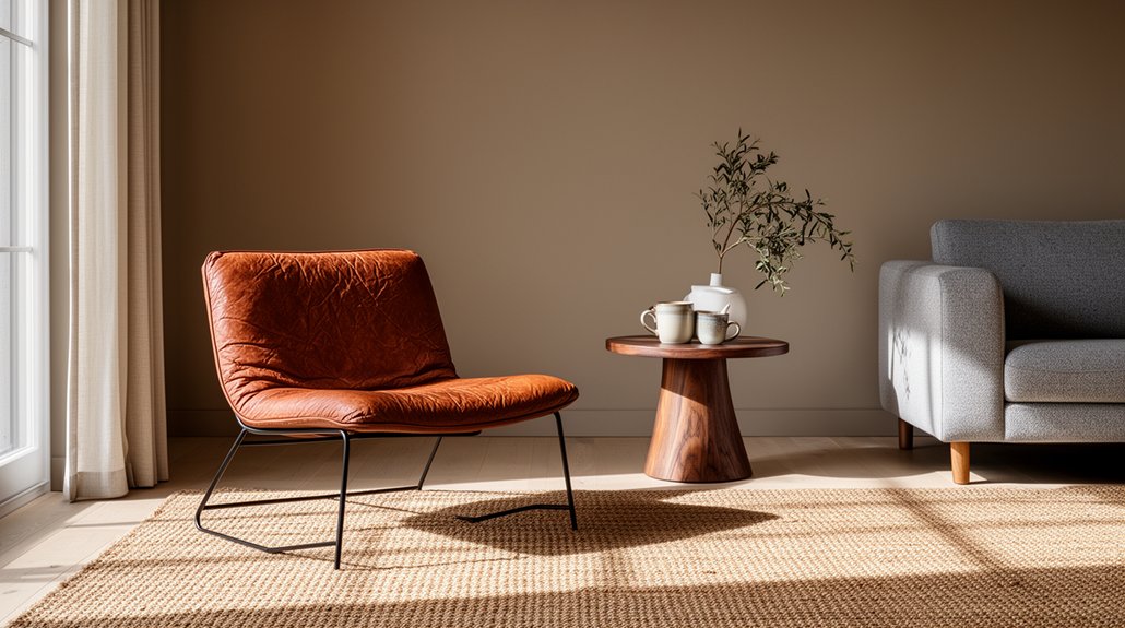
To add character to a neutral interior, layer textures for warmth and depth, and layer lighting for mood and intimacy. Mix fabrics, woods, stone, and tactile finishes, repeating elements across furniture and accessories to create cohesion. Introduce meaningful art and vintage pieces that tell your story, using personal symbols and balanced proportions. Add subtle color and careful focal points to guide the eye without chaos, all while maintaining negative space. If you keep exploring, you’ll uncover more texture-led strategies.
Key Takeaways
- Build identity, mood, and purpose in the space to define its character within a neutral interior.
- Layer textures and cohesive finishes across fabrics, surfaces, and materials to add warmth without overwhelming neutrality.
- Curate meaningful art and vintage pieces that tell personal stories and reinforce the room’s character.
- Use subtle color, layered lighting, and well-placed focal points to create depth and visual interest.
- Design layout and negative space with rhythm and clear sightlines to maintain calm, cohesive character.
Define Your Neutral Space Character (Identity, Mood, and Purpose)

Your neutral space isn’t blank—it’s a canvas that defines how your home feels and functions. To define its character, identify your identity, mood, and purpose. Your identity comes from how you live: the activities you value, the textures you love, and the details you notice daily. Mood defines tone—calm and serene or energetic and bold—shaped by lighting, scale, and color choices. Purpose clarifies what each room should support, from work to rest to socializing. Apply color psychology to guide accents and contrasts, ensuring they reinforce your desired vibe without overwhelming. Consider spatial flow: arrange furniture to honor sightlines and movement, creating intuitive routes that unify rooms. When you align identity, mood, and purpose, your neutral space achieves coherence and function.
Layer Neutral Textures for Warmth and Depth
Layer neutral textures add warmth and depth by combining materials with tactile variety. You’ll layer fabrics, surfaces, and finishes to create subtle warmth, richness, and visual interest. This approach emphasizes how material choices—wood, linen, wool, and stone—work together to elevate a calm, neutral space.
Layered Textures For Warmth
Layered textures add warmth and depth to a neutral interior by combining subtle materials and finishes. You blend Textured wall finishes with soft, tactile elements to avoid flat surfaces. Begin with a muted palette as a base, then introduce contrast through fabric, wood, and stone textures. Layered fabric accents on cushions, throws, and draperies create inviting pockets of comfort without overpowering the room. Choose fabrics with varying weights—velvet, linen, wool—to build depth as light shifts. Incorporate texture in architectural details, such as woven wall panels or plaster with a subtle grain. Keep patterns restrained, letting texture lead. The result: a cohesive, sophisticated space where warmth feels intentional, not decorative. Maintain balance by repeating textures across furniture, textiles, and accents.
Depth Through Materials
Depth through materials starts with a careful mix of neutral textures that read as cohesive, not cluttered. You create depth by balancing tactile finishes—matte and satin, rough and smooth—so each element reads distinctly without shouting. Material contrast matters: pair warm woods with cool stone or ceramic, then anchor with a fabric that echoes those tones. Texture layering builds nuance without visual chaos, so you arrange surfaces in a deliberate hierarchy: primary, secondary, accent. Keep scale varied, but palette restrained, ensuring the neutrals still feel unified. Introduce subtle gloss in small doses to catch light and carve dimension. Avoid overstatement; let tactility do the talking. The result is a quietly rich, human environment that stays calm yet compelling.
Subtle Warmth, Richness Added
Neutral textures aren’t just about sight; they’re about feel. You layer subtle warmth by choosing materials with tactile depth—linen, wool, suede, or brushed woods—that read rich without shouting color. Focus on texture over pattern to preserve serenity while adding character. Muted palettes keep the base calm, while you introduce warmth through a nap, sheen, or grain that catches light differently across hours. Mix matte and subtle gloss to create contrast without glare. Incorporate minimalist accents—simple ceramics, a leather bench, or a woven rug—that anchor the space and amplify depth. Taller pieces in warm tones break vertical monotony; cushions and throws add inviting softness. The result: a composed interior that feels lived-in, refined, and unmistakably warm.
Curate Meaningful Art and Objects That Tell Your Story
Curate pieces that resonate with you—and let their meanings act as a visual narrative for your space. You choose art and objects that speak to your experiences, not trends, so what you display feels earned. Prioritize meaningful storytelling over decoration; each piece should invite a memory, question, or emotion. Balance is essential: mix formats, scales, and textures, but keep your core theme clear. Use personal symbolism—photos, sketches, heirlooms, books—that align with your room’s palette and energy. Display thoughtfully: hang at eye level, group assortments with intention, and give space for each item to breathe. Rotate pieces seasonally or as you evolve, so the collection remains fresh yet cohesive. Your environment becomes a quiet testament, affirmation, or declaration to who you are.
Incorporate Vintage Elements for Timelessness

To timelessness, weave vintage elements into your neutral interior with intention. You’ll choose pieces that echo eras you love, not overwhelm the room. Focus on quality over quantity, favoring a few statement signals—a 1950s lamp, a mid-century chair, or a patinated mirror—that anchor rather than clutter. Mix finishes thoughtfully: brass with aged wood, glass with matte ceramic, keeping a restrained palette to preserve calm. Let vintage charm arrive through textures, such as tufted upholstery, carved wood, or worn leather, that gain character with patina. Confirm proportions stay balanced so these accents support your space instead of stealing the scene. Completed thoughtfully, your setup achieves timeless appeal, inviting linger and showcasing a curated, refined taste.
Introduce Subtle Color Palettes, Not Loud Hues
An understated color story complements a refined, vintage-infused neutral scheme without competing with it. You’ll introduce subtle palettes by selecting muted tones—soft taupes, greens, blues—that deepen a room without shouting. Use variations of the same hue across textiles, rugs, and wall treatments to create cohesion, not contrast. Aim for understated depth: a single, richer shade in a chair or ottoman can anchor the space while remaining quiet. When you add bold accents, do so sparingly and with intention, ensuring they serve as focal points rather than loud interjections. Incorporate statement furniture thoughtfully: a sculptural sofa, a refined credenza, or a vintage armchair can carry personality without overpowering the palette. Balance, restraint, and tasteful repetition define a sophisticated, calm interior.
Use Lighting to Shape Mood and Intimacy
How you light a space shapes its mood and sense of intimacy as surely as color or texture. You control ambience by layering light sources: a dim, warm ceiling lamp for a gentle ambient glow, task lighting where you read, and accents that highlight sculpture or architectural detail. Avoid flat, single-source glare; instead, create depth with shadow play that adds drama without harsh contrast. Use dimmers to modulate intensity, shifting atmosphere from casual to cinematic as the evening unfolds. Placement matters: aim lamps toward walls or ceilings to bounce light softly, and tuck low bulbs behind furniture to sculpt silhouettes. Consistency in color temperature keeps the calm intact, so select warm whites that complement neutral tones and elevate character.
Mix Metals and Materials for Cohesion

Mixing metals and materials adds visual interest and depth without shouting for attention. You pair warm tones with cool ones to create balance, using metal finishes as anchor points across spaces. Aim for a coherent rhythm: repeat a single metal in varied textures, then introduce a contrasting material in a complementary tone. This material contrast should feel intentional, not random, so choose textures that read as cohesive rather than conflicting. In practice, mix a brushed brass with matte black, or a satin chrome with rich wood, ensuring each pairing reinforces your overall palette. Keep scale in check; repeat the same finish in two to three elements, and vary thickness or sheen to prevent monotony. Subtle, deliberate contrast sustains cohesion while adding character.
Create Focal Points Without Visual Chaos
You can create focal points without chaos by using balanced focal anchors that ground the room and guide the eye. Pair these anchors with visual rhythm techniques—repetition, spacing, and a clear hierarchy—to keep the space cohesive. Keep the scale and placement intentional, so every highlight enhances rather than competes.
Balanced Focal Anchors
Balanced focal anchors guide the eye and prevent visual chaos by establishing deliberate points of emphasis. You anchor a room with a single, strong focal element—then support it with measured complements. In neutral color schemes, choose one anchor—like a bold sculpture or statement sofa—to ground the space without shouting. Use minimalist furniture to preserve clarity: clean lines, restrained profiles, and purposeful negative space keep the eye moving, not wandering. Repeat subtle cues—material, texture, or color—across anchored pieces to create cohesion. Balance scale so no element dominates; symmetry can calm, while intentional asymmetry adds interest. Avoid clutter, and let lighting highlight the focal anchor’s form and texture, reinforcing structure. The result is calm, curated, and visually intentional.
Visual Rhythm Techniques
Visual rhythm guides the eye through a neutral room by repeating purposeful elements at varying intervals. You’ll create focal points without visual chaos by balancing color, form, and texture across zones. Use color contrast to highlight features, then ease the eye with pattern repetition that ties disparate pieces together. Maintain deliberate pauses between repeats so each element feels intentional, not cluttered. Vary scale and placement, but keep a cohesive thread running through the space. Avoid overloading walls; instead, anchor with a single statement piece and echo it elsewhere in smaller, quieter forms. Tune lighting to accent contrasts and sharpen edges, ensuring rhythm remains readable. Consistency in execution yields a calm, characterful interior that reads as deliberate rather than fussy.
- Color contrast
- Pattern repetition
- Scale variation
- Quiet echoes
Craft a Cohesive Narrative Through Layout and Rhythm
To craft a cohesive narrative through layout and rhythm, start by mapping the sequence of spaces as you would scenes in a story. You guide movement with purpose, ensuring each zone advances the overall mood. Prioritize clear sightlines, then layer zones with color psychology to influence pace and emotion. Let furniture placement define character: a dominant sofa anchors the living room, while a reading chair invites a moment of quiet. Create rhythm with repeated elements—materials, finishes, or heights—so progressions feel deliberate, not incidental. Align furniture to conversation zones, so gatherings flow naturally and feel intentional. Avoid clutter; let negative space frame moments of emphasis. Finally, plan focal points and traffic paths to keep the eye moving smoothly, reinforcing the narrative you want your space to tell.
Frequently Asked Questions
How Can a Neutral Room Reflect My Daily Routines?
A neutral room reflects your daily routines through practical zones and personal touches. Add color accents for mood shifts, and optimize furniture placement to support flow, work, and relaxation, keeping spaces organized and responsive to your everyday activities.
What Small Textures Most Influence Perceived Warmth?
Texture sweetens rooms; you’ll feel warmer with textured wall treatments and cozy woven textiles. You choose textures, avoiding harsh notes, so you invite softness and depth, subtly signaling warmth through tactile cues you control and enjoy.
Can Personal Mementos Feel Cohesive in a Neutral Scheme?
Yes, personal mementos can feel cohesive in a neutral scheme. You’ll blend them through color coordination, selecting tones that echo your base palette, and place them strategically to create a unified, intentional warmth throughout your space.
How Do You Balance Vintage With Modern Neutrals?
Mix vintage with modern neutrals by layering texture and contrast, you’ll find balance. You shine with intentional lighting, and artificial lighting highlights color accents while you keep a cohesive palette, guiding the room with confidence.
What Lighting Setups Create Intimate, Non-Dominant Mood?
You should use layered lighting to create intimate, non-dominant mood. Aim for soft ambient, task, and accent layers, then adjust with dimmers. Layered lighting supports mood creation while keeping the space calm, cohesive, and unmistakably yours.
Conclusion
You coax character into a neutral interior the way you hum a quiet anthem—bold, yet restrained. You juxtapose clean, calm surfaces with pockets of lived-in warmth, like a whisper beside a shout. You layer texture against simplicity, color against restraint, so personality emerges without shouting. You curate art that knows your name while objects stay purposeful. You let light carve mood, metals harmonize, and layout flow, so your space speaks softly but unmistakably: refined, inviting, unmistakably yours.
About the Author



