

Accent colors anchor rooms and guide mood by highlighting features, defining zones, and creating contrast. Start with a neutral base, then introduce a dominant hue and restrained, repeating accents to reinforce cohesion. Test swatches in natural light, balance warm and cool tones, and guarantee contrast with calm neutrals. Use accessories, textiles, art, and lighting to layer color without clutter. Keep a simple color plan and document results; you’ll master consistency and depth as you move forward. More tips await if you continue.
Key Takeaways
- Establish a dominant hue and use contrasting accents to create focal interest while balancing warm and cool tones.
- Limit bold accents to 10–20% of surfaces to maintain harmony and prevent overwhelm.
- Test swatches in natural light and at eye level to ensure accurate perception across times of day.
- Use accent furniture, textiles, and art to anchor rooms without clutter, repeating a single bold hue for cohesion.
- Protect finishes with UV-aware practices and low-odor sealers, while coordinating textures for depth.
What Accent Colors Do in a Room
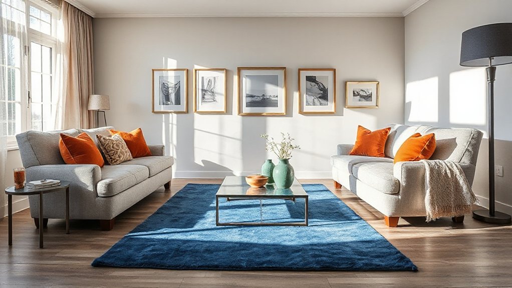
Accent colors guide the eye and set the room’s mood by highlighting architectural features, defining zones, and creating visual contrast against neutrals. You choose accents to steer perception: small swaths draw attention to alcoves, trim, or furniture silhouettes, while larger taps anchor seating areas. Accent psychology informs how color sparks emotion; you’ll pair energetic hues with calming neutrals to balance activity and restfulness. Color symbolism guides intent—reds provoke warmth and urgency, blues convey calm, greens suggest growth, and yellows brighten corners. You don’t rely on novelty alone; you align hues with the room’s function and the light it receives. Use saturation strategically: a restrained palette prevents fatigue, while a single bold note creates focal emphasis. Test contrasts at eye level, then refine until the accent reinforces purpose and harmony.
Build a Neutral Base for Your Color Story
A neutral base sets the stage with calm, balanced tones that anchor your color story. Start with a calm backdrop palette built on versatile core tones, so accents can shift without clashing. This foundation supports flexible layering of neutrals and allows you to tune mood and contrast with precision.
Neutral Base Foundations
How do you set a neutral base that supports a versatile color story? You choose a disciplined palette and crisp finishes, then align texture and light to maximize color flexibility. Your base should read as calm, not clinical, with predictable undertones that support vivid accents. Focus on durable, evenly applied surfaces to reduce visual noise and simplify maintenance.
- Select a light, warm or cool midtone as your core, guiding color psychology and ensuring cohesion across rooms.
- Opt for a single paint finish type for walls (eg, matte or egg-shell) to minimize glare and unify the backdrop.
- Introduce subtle variation through textiles and woods, preserving neutrality while adding depth and interest.
Calm Backdrop Palette
A calm backdrop starts with a single, balanced neutral base that underpins your color story. Begin with a restrained palette—soft whites, warm beiges, or cool grays—that creates steadiness without competing with accent tones. This foundation supports Serene color palettes by providing predictable light reflectance and consistent undertones across rooms. Choose matte or low-sheen finishes to minimize glare and maintain visual harmony as you layer texture. For durability and ease, apply the base in broad, uniform areas—major walls, ceilings, and built-ins—then reserve contrast for deliberate focal points. Incorporate Tranquil hues sparingly in textiles, artwork, or cabinetry accents to preserve balance while guiding mood. Periodically reassess lighting; true neutrality reveals color shifts and prevents unintended shifts in the overall palette.
Versatile Core Tones
Effortlessly establish a neutral backbone with Versatile Core Tones by choosing adaptable neutrals that pair across schemes and lighting conditions. You’ll build a reliable base that supports bold accents without competing with them, ensuring lasting harmony.
- Select neutrals that read as true in daylight and artificial light, minimizing shift between spaces.
- Favor balanced undertones (warm, cool, or neutral) to align with Complementary palettes and Monochrome schemes.
- Use consistent saturation across major surfaces to maintain cohesion while allowing accent colours to pop.
This approach yields flexible cohesion, reduces repaint risk, and enables rapid palette swaps. By anchoring with versatile tones, you preserve room integrity while exploring seasonal or trend-led accents. The result is a timeless, scalable foundation for evolving colour stories.
How to Pick Bold Accents That Fit Your Space
Bold accents should enhance your space without overpowering it. Start with proportion: limit bold hues to 10–20% of wall-to-wall surfaces to maintain balance. Identify your base palette and select a single bold color as the anchor; repeat it in small doses for cohesion. Consider lighting: natural light shifts color perception; test swatches at different times of day. Use color psychology to guide choices—cool tones calm, warm tones energize—align with the room’s function. In high-traffic areas, opt for durable finishes and easy-to-clean textiles to sustain impact. Contrast matters: pair bold accents with neutral backdrops to avoid fatigue. Mood enhancement should be deliberate, not decorative; every accent reinforces the desired atmosphere. Finally, document your selections to ensure consistency across future updates.
Bring in Accent Furniture for Instant Impact

Accent furniture acts as a quick-impact anchor that reinforces your chosen bold accent without overhauling major surfaces. You expose the room to texture, form, and color in a single piece, guiding sightlines and balance. Choose pieces with clean lines and a finish that complements your dominant hue for instant impact.
- Select a statement chair or bench in a contrasting tone to anchor seating areas.
- Introduce a bold-contrast coffee table or side table to frame focal walls.
- Add an accent cabinet or console that echoes your color palette while providing storage.
This approach keeps your layout uncluttered while delivering precise emphasis. Accent furniture delivers instant impact without extensive renovation.
Textiles That Add Color Without Overwhelm
Textiles can inject color without overwhelming a room when you choose patterns and fabrics with restraint. You’ll build visual interest through textile layering, not loud single pieces. Start with a neutral base: muted sofa, plain curtains, and a solid rug. Introduce color with one dominant accent textile, then add two supplementary pieces that echo that hue. Prioritize color coordination by sticking to a cohesive palette—three to five hues across textiles keeps harmony. Opt for low-contrast patterns (tone-on-tone, subtle geometrics) rather than high-contrast prints. Mix textures (linen, wool, velvet) to create depth without bulk. Scale matters: large motifs in small doses prevent crowding. Finish with purposeful placement, so cushions, throws, and coverings cue the eye without competing with furniture. }
Art and Wall Displays as Color Anchors
Art and wall displays act as color anchors by introducing focal points that guide the room’s palette. You’ll use art displays to establish and reinforce the dominant hue family, then pull secondary tones from surrounding pieces. Treat each piece as a deliberate data point in the color matrix, ensuring balance, contrast, and rhythm.
- Curate a cohesive trio: choose one large, one medium, and one contrasting accent to anchor the space.
- Align frames and matting with your core hue for a unified look while letting color anchors pop against neutral walls.
- Vary textures within art and wall displays to add depth without clutter, keeping attention on the palette rather than objects.
Art displays reinforce color anchors, shaping perception and harmony across the room.
Lighting to Elevate Your Accent Hues

Lighting can make your accent hues feel intentional and cohesive. To elevate them, plan accent lighting that complements your palette without washing out the color. Use directional fixtures to highlight focal elements, like a bold throw or artwork, ensuring the light angle enhances saturation rather than flattening it. Combine warm and neutral white temperatures to sustain depth; cooler tones can accentuate drama, while warmer tones soften contrast. Consider dimmable LEDs to modulate intensity across tasks and ambience, preserving color accuracy at various levels. Integrate accent lighting with ambient sources for balanced illumination, avoiding hotspots. Remember color psychology: lighting influences perceived mood, so align temperature and brightness with the desired effect of each hue. Opt for consistent color rendering index (CRI) to maintain true pigment appearance.
Color Theory Essentials for Decorating
Color theory is the foundation of decorating, guiding how you combine hues to achieve harmony, contrast, and mood. You’ll apply core concepts to select accents that reinforce design intent, not just color combos. Understand color psychology and hue psychology to predict how a hue affects perception, energy, and space feel. Use these principles to inform lighting, texture, and furniture choices, ensuring cohesion across room zones.
- Establish a dominant hue that aligns with desired mood.
- Use contrasting or complementary accents to create focal interest.
- Balance warm and cool tones to manage depth and flow.
Applied precision matters: test palettes in context, account for light exposure, and document fixed references. This method keeps your decorating intentional, scalable, and visually stable.
Balancing Warm and Cool Tones in Accents
Balancing warm and cool tones in accents requires purposeful pairing to maintain depth and cohesion across a space. You should think in terms of a baseline neutral and then layer accents to control temperature shifts. Choose complementary palettes that anchor the scheme: warm and cool hues meet at a deliberate midpoint, preventing clash. Use mood enhancing hues sparingly to avoid chromatic fatigue; reserve them for focal points or small upholstery swatches. Balance is achieved by distributing weight: heavier warm tones in larger elements (sofas, rugs) and cooler accents in lighting and accessories. Tie-ins across adjacent rooms reinforce continuity, so maintain consistent undertones. Test pairings under neutral daylight and artificial lighting to verify perceived temperature. Document swaps and monitor for drift as textiles age.
Pattern Play: Mixing Textures and Motifs

Pattern play hinges on deliberate texture and motif pairing to create depth without visual clutter. You’ll optimize spaces by balancing Textural contrast with cohesive Motif blending, ensuring accents read as intentional rather than chaotic. Approach centers on proportion, scale, and repetition to reinforce rhythm across surfaces.
- Select two contrasting textures (velvet, linen) and one repeating motif (geometric, organic) to establish a unified thread.
- Pair bold textures with subdued motifs, so contrast remains directional rather than disruptive.
- Use consistent color accents to tie disparate elements, avoiding pattern overload.
Execution tips: limit patterns to three focal areas, maintain a unifying line or edge, and test lighting to preserve legibility. This method delivers depth, clarity, and polished visual flow.
Color Stories by Room Type: Living Room, Kitchen, Bedroom
Explore how color stories differ by space: optimize Living Room Hues, tailor Kitchen Accent Pairings, and set Bedroom Mood Palettes to align with function and lighting. You’ll compare tonal ranges, material finishes, and accent thresholds to maintain cohesion without sacrificing room-specific impact. This framework guides precise Palette decisions for each area, balancing harmony with purposeful contrast.
Living Room Hues Guide
A well-chosen living room hue sets the tone for daily living, from relaxing evenings to lively gatherings. In this guide, you’ll learn practical color storytelling that supports function and flow, not guesswork. Choose palettes that balance contrast, depth, and light to optimize comfort and perception.
- Use vintage textiles as a texture anchor; let their patterns cue accent placements and tonal shifts.
- Pair floral arrangements with complementary hues to reinforce focal points without overpowering furniture.
- Apply color zoning in seating zones, ensuring rug and upholstery tones align with wall and accessory hues for cohesion.
Maintain clarity by testing swatches in natural and artificial light, then adjust saturation for long-term harmony.
Kitchen Accent Pairings
When choosing kitchen accent pairings, start with a dominant cabinet color and build around it with complementary accents drawn from countertop materials, hardware, and textiles. You’ll use color psychology to guide contrasts that energize workflows—cool neutrals for focus, warm accents to invite interaction. Choose hardware finishes that reinforce the cabinet tone, then inject textiles and backsplashes to echo or offset it. Balance is essential: high-contrast pairings feel dynamic, while tonal schemes read as cohesive and calm. Consider cultural symbolism when selecting reds for appetite or greens for freshness, ensuring intent aligns with how occupants experience the space. Limit metallics to one or two finishes to avoid visual clutter and support a clean, purposeful aesthetic. Document choices to sustain consistency across surfaces and accessories.
Bedroom Mood Palettes
Bedroom Mood Palettes: choose a dominant wall or headboard tone and build a cohesive color story around it, using accents from textiles, furniture, and lighting to guide mood, energy, and restfulness. In practice, you’ll pair a calm base with purposeful pops to optimize color psychology and mood enhancement.
- Select a dominant hue for walls or headboard that supports tranquility, then layer with complementary textiles to reinforce depth.
- Introduce accent colors via throws, pillows, and artwork to cue energy when needed, while maintaining balance.
- Code lighting and furniture finishes to reinforce the desired atmosphere, ensuring brightness and contrast support restorative sleep.
This approach yields precise, evidence-based room dynamics, prioritizing clarity and measurable mood outcomes.
Accent Color Dos and Don’Ts From Pros
Accent color decisions hinge on contrast, balance, and context; pros insist you plan first for function, then for pop. You should anchor hues to room purpose and lighting, not just trend. Dos: test color psychology in real spaces, observe how tones morph with time and activities; choose durable paint finishes for walls and trim, and apply color in architectural features to reduce fatigue. Don’ts: over-saturate large surfaces, chase every trend, or mix incompatible undertones. Maintain harmony by selecting a neutral base and using accent shades for focal points. Consider finish contrast—matte walls with satin trim, or eggshell surfaces for durability without glare. Document your palette, and validate it under varied daylight. Revisit color decisions when furniture or lighting shifts, ensuring lasting cohesion.
Seasonal Swaps: Refresh With Minimal Changes

Swap small accessories and layer textiles subtly to refresh your space with minimal disruption. You’ll create a seasonal shift by swapping in like-for-like items and varying textures, rather than overhauling key pieces. This approach keeps the palette cohesive while delivering a fresh, purposeful look.
Swap Small Accessories
Seasonal swaps are a targeted, low-effort way to refresh a room without a full remodel; by swapping small accessories, you can change the mood, color accents, and focal points with minimal cost and disruption.
- Accessory layering delivers depth by pairing a bold foreground piece with quieter background items.
- Color coordination ensures your new accents harmonize with existing tones rather than clash.
- Strategic placement guides attention to key architectural features or art without major changes.
Choose a few pieces to switch seasonally, then rotate them to test impact. Keep a baseline palette and repeat motifs (shapes, finishes, metals) for cohesion. Avoid overcrowding; allow negative space to highlight updates. This approach preserves structure while enabling clear, data-driven updates to mood and emphasis.
Layer Textiles Subtly
Layer textiles subtly by layering fabrics and finishes to gently shift a room’s mood without wholesale changes. In this approach, you swap seasonal textiles rather than entire ensembles, preserving structure while delivering color cues. Begin with a neutral base and introduce textile layering through throws, cushions, and lightweight drapery to create depth. Opt for one cohesive palette and vary textures to avoid visual noise. Focus on subtle fabric accents that complement existing upholstery rather than compete with it. Choose natural fibers for breathability and durability, and align sheen to room lighting to control mood shifts throughout the day. Prioritize scale consistency, ensuring pattern repeats stay proportionate to furniture. This method supports minimal disruption while achieving a refreshed, cohesive feel.
Accessorizing: Layers of Color the Easy Way
Accessorizing is about layering color with intention, not clutter. You deploy accents through a controlled mix of texture, scale, and placement, letting each hue support the room’s purpose. Color psychology informs your choices, guiding how tones affect perception and energy. Mood enhancement comes from deliberate contrast and harmony, not saturation storms.
- Select a dominant accent and repeat it in varied contexts to create cohesion.
- Introduce a secondary color via small objects, ensuring it complements the primary hue.
- Use metallics or neutrals to anchor contrasting shades without visual overload.
Keep patterns simple, edges crisp, and lighting calibrated. You’ll notice how deliberate layering elevates space without overwhelming it, delivering clarity and intention in every focal point.
How to Score Your Color Choices in Real Life
You’ll score color choices by evaluating color swatches, ensuring you capture both contrast and harmony across your palette. Test in real life with controlled lighting, compare combos, and adjust based on how edges and focal points read in situ. Use quick checks for durability of color relationships, then apply proven tips for real-life testing to refine your selections.
Color Swatch Scoring
Color swatch scoring turns subjective color choices into objective decisions. You’ll quantify hues against room variables, light, and intent, ensuring repeatable results rather than whim. Scorecards translate perception into metrics, guiding selection and comparison.
- Establish a baseline: record current lighting, wall color, and furniture undertones to anchor your scores.
- Evaluate contrast and coherence: assign higher marks to swatches that deliver purposeful color contrast and cohesive mood enhancement.
- Validate in context: test samples in real locations, adjust scores for daylight variation, and re-check accuracy.
This method yields consistent outcomes for accent colour palettes, enabling you to forecast mood impact before committing. By prioritising color contrast and mood enhancement, you reduce guesswork and align choices with designed objectives, delivering precise, repeatable results across spaces.
Contrast and Harmony
How you judge contrast and harmony in real life shapes the success of any accent palette. You quantify contrast by relative luminance and saturation, then verify balance through proportion. Aim for a dominant base with a clearly defined accent subset, keeping the ratio near 70/20/10 for large surfaces, midtones, and highlights. Evaluate harmony by alignment with room function and lighting conditions; warm spaces benefit from cooler accents and vice versa. Color psychology informs mood outcomes; leverage it to support intended use, such as calm or energy, without overpowering architectural features. Consider cultural influences in color interpretation, avoiding universal misreads by testing contexts, not assumptions. Finalize choices with neutral calibrations and controlled lighting to ensure consistent perception across times of day.
Real-Life Testing Tips
Real-Life Testing Tips: start with controlled, repeatable checks by placing swatches in the actual space under the room’s lighting at different times of day. This reveals true hue, saturation, and warmth, guiding reliable decisions. You’ll compare how color psychology shifts with ambient effects and how lighting techniques alter perceived depth and mood. Use quick, repeatable steps to minimize bias and guarantee consistency across surfaces.
- Observe swatches at morning, noon, and evening to log tonal changes.
- Note interaction with fixtures, metals, and wall textures, recording subtle shifts.
- Document recommended adjustments and finalize one or two confident options.
This process prioritizes measurable outcomes, enabling precise execution. Apply findings to focal walls, trim, and accents, ensuring your chosen palette remains legible under all conditions.
Quick, Budget-Friendly Accent Updates
When you’re aiming for quick, budget-friendly accent updates, start with a focused plan and a tight palette. You’ll prioritize high-impact, low-cost changes that transform perception without overhauling rooms. Begin with color psychology to select hues that amplify mood and space perception; a cool accent can visually expand, while warm tones invite coziness. Implement inexpensive, scalable upgrades: swap throw pillows, curtains, and wall art before considering furniture. Use paint finish strategically; matte reduces glare and shows subtle texture, while satin adds gentle sheen on accessories or trims for a polished look. Reversible options stay budget-friendly: removable wallpaper, decals, and DIY frames. Measure lighting conditions to avoid oversaturation, and bias toward cohesive contrasts rather than full-room overhauls to maintain harmony. Plan, execute, evaluate, and adjust based on observed impact.
Maintenance Tips to Keep Color Looking Fresh
Establish a regular cleaning schedule to prevent buildup that dulls color and texture, and stick to it across high-traffic areas and finishes. Protect surfaces with appropriate sealants, mats, and gentle cleaners so occasional spills don’t compromise the hue or sheen. This approach keeps accents looking fresh by balancing routine maintenance with surface safeguards.
Regular Cleaning Schedule
A regular cleaning schedule is essential to keep accent colors vibrant and consistent across rooms. You’ll maintain hue integrity by disciplined routines and targeted dust control, preventing dulling from buildup and staining. Implement standardized steps to minimize color fade and surface wear.
- Cleaning routines: Establish daily quick wipe-downs for high-visibility surfaces, then weekly thorough cleaning using mild detergents.
- Dust removal: Use microfiber cloths and a soft brush to lift dust from textiles, trims, and ledges before damp wiping.
- Schedule cadence: Align tasks with room use; intensify frequency during seasonal changes to prevent residue and maintain color saturation.
Document procedures, track completion, and adjust based on wear patterns to sustain consistent accent hues.
Protection For Surfaces
To keep color looking fresh, protect surfaces from damage that dulls or alters hues. Begin with a clear plan: identify high-traffic zones, selective coatings, and durable finishes that resist abrasion and chemical attack. Apply surface protection that suits material type—foil, film, or hardened sealants for furniture; UV-blocking window films for sunlit walls; and low-odor sealers on painted surfaces. Maintain a routine check for scratches, chips, and wear, addressing issues before they worsen. Use approved cleaners that do not degrade finishes; avoid ammonia, bleach, or solvent-heavy products on color-treated surfaces. Enroll in preventive care: mats, spill mats, and gentle, pH-balanced cleansers. This approach supports material preservation by minimizing color fade and staining, keeping accent hues vibrant over time. Surface protection sustains value and aesthetic integrity.
Your Next Step: A Simple Color-Planning Checklist
Develop a simple color-planning checklist now to guide your decisions efficiently. A systematic approach keeps you focused on impact, not guesswork, using color psychology and cultural influences to inform choices. Begin with a baseline palette and test with swatches in natural light to confirm perceived hues.
- Define intent: mood, space function, and focal accents.
- Map color relationships: dominant, secondary, and accent roles across rooms.
- Validate across cultures and lighting: note adjustments for context and time of day.
Execute with a quick audit: record outcomes, note mismatches, and adjust saturation or value accordingly. Maintain documentation for future refreshes. This checklist guarantees consistent results, minimizes rework, and aligns design with psychological triggers and cultural expectations, delivering cohesive, intentional accent integration throughout your home.
Frequently Asked Questions
How to Avoid Color Clashes With Existing Furniture?
To avoid clashes, you align with Complementary color schemes and Color wheel techniques, examining undertones, and balancing neutrals. You test swatches, adjust lighting, and guarantee furniture hues harmonize, using contrast deliberately for cohesion rather than conflict.
What Are Quick, Subtle Ways to Test New Accents?
You test accents quickly by draping fabric swatches and tapping in lighting. Accent wall ideas guide without commitment; use decorative accessories as placeholders. You compare undertones, then select, polish, and document results for precise, repeatable decisions.
Which Accent Colors Suit Small Spaces Best?
Small spaces suit cool neutrals with pops of color; you’ll benefit from color psychology insights and lighting effects to maximize perceived depth. Use soft contrasts, airy whites, and controlled lighting to avoid visual crowding and fatigue.
How to Maintain Color Vibrancy Over Time?
Color fading is preventable with proper maintenance tips; you’ll preserve vibrancy by UV-protective finishes, temperature control, and regular cleaning. You’ll monitor and repair fades promptly, ensuring long-lasting color performance through disciplined, proactive care and testing.
What Inexpensive Tools Measure Color Harmony?
You can use inexpensive tools like a colorimeter or smartphone apps to measure color harmony. They help assess your color palette against color psychology principles, ensuring balanced saturation and contrast for consistent, data-driven design decisions.
Conclusion
Accent colors anchor your space, so plan deliberately and act boldly. Start with a neutral base, then layer bolds through textiles, furniture, and decor. Test swatches, measure lighting, and keep balance—don’t overwhelm. Use one recurring accent to tie rooms together, and vary saturation for depth. Think of color like a compass: it guides mood, not traffic. With a clear plan, you’ll craft cohesive rooms that feel polished, timeless, and uniquely yours. Ready to color your next update?
About the Author



