
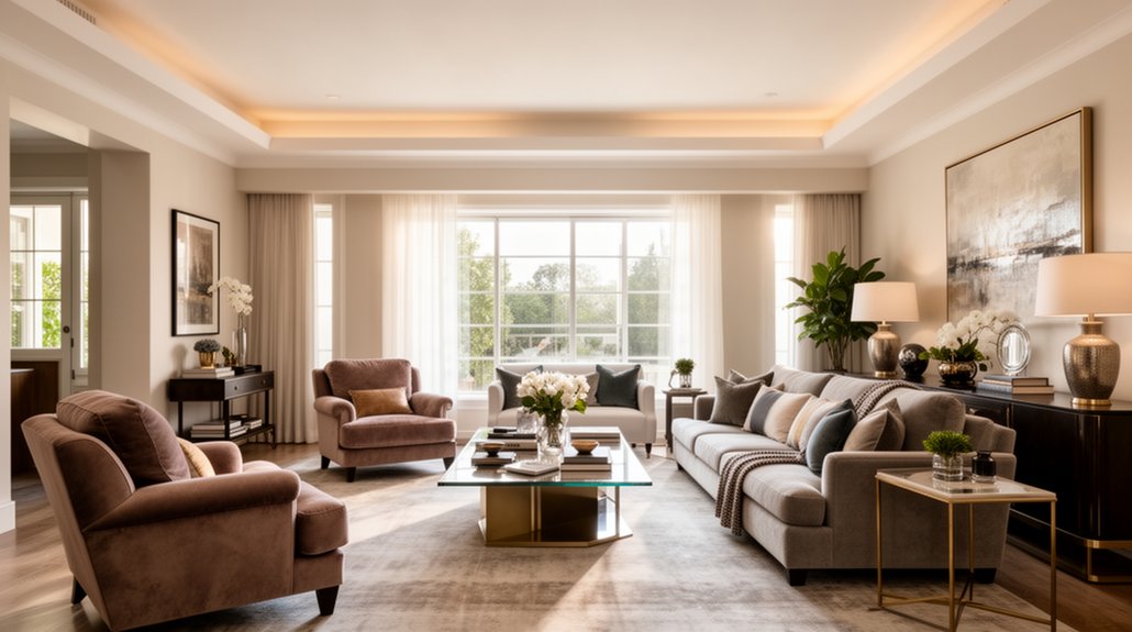
Avoid common decorating missteps that break cohesion. Start by planning the right scale for furniture and rugs, ensuring doors, windows, and seating fit comfortably. Create a functional layout with clear traffic flow, then layer lighting—ambient, task, and accent—for adaptability. Establish a room-to-room color strategy and use purposeful negative space to avoid clutter. Test ideas with quick tweaks, and choose durable, budget-friendly finishes. Continue exploring practical steps to refine mood, function, and style as you go.
Key Takeaways
- Avoid mismatched styles and conflicting scales that disrupt room cohesion and flow.
- Limit patterns to three and ground bold prints with solid neutrals to maintain balance.
- Plan scale carefully for furniture and rugs to ensure proper fit and comfortable proportion.
- Create clear traffic paths and functional zones to prevent clutter and obstruction.
- Balance lighting with ambient, task, and accent layers, and use adaptable controls for mood and practicality.
Identify Common Decorating Mistakes That Derail Cohesion

Cohesion in a room hinges on a clear throughline: mismatched styles, conflicting scales, or too many competing colors can derail it fast. You’ll derail cohesion if you chase trends without a unifying idea, ignore proportion, or mix wildly divergent textures. Common mistakes include overloading surfaces with decor, neglecting flow between spaces, and treating color as decoration rather than mood and meaning. You’ll also undermine balance by skimping on storage solutions, letting clutter steal focus. Leverage color psychology to guide accents and backgrounds so luminance, tone, and saturation support function, not just flair. Pair this with intentional storage solutions to maintain order, preserving a calm backdrop for your chosen style. By prioritizing a consistent palette, scale, and purposeful storage, you reinforce a cohesive, comfortable environment.
Plan for the Right Scale: Furniture and Rug Sizing
Size matters in shaping a room’s feel, and after you’ve aligned color and style, the next step is to get furniture and rugs that fit the space and function. Plan for the right scale by measuring doorways, windows, and seating zones, then compare actual sizes to your layout. Focus on scale harmony: make certain every piece relates to the room’s overall dimensions, not just the largest object. Use furniture proportion to balance open floor space with usable surfaces—consider leg height, chair depth, and sofa length relative to the rug. Choose a rug that anchors seating and allows at least one front leg of each piece to rest on it. Avoid oversized or undersized choices; precision in scale yields comfort, flow, and a cohesive, polished look.
Build a Functional Layout With Clear Traffic Flow
To build a functional layout with clear traffic flow, start by mapping how people move through the space and around furniture. You’ll prioritize unobstructed routes, seating alignment, and easy access to key zones, so energy stays efficient and conversations feel natural. Practice space optimization by reserving primary pathways and minimizing clutter, which reduces friction and delays. Apply traffic management concepts to kitchen, living, and entry zones, ensuring doors, stairs, and thresholds don’t collide with furniture.
- Define primary circulation paths and keep them open
- Zone furniture for conversation, work, and relaxation
- Place seating to face focal points without blocking flow
- Use scale, symmetry, and negative space to guide movement
Layer Lighting: Ambient, Task, and Accent

To layer lighting successfully, you balance ambient, task, and accent sources so the room feels cohesive rather than chaotic. Start by ensuring each type serves a distinct purpose—overall illumination, specific activities, and focal highlights—without overpowering the others. When you mix in layers thoughtfully, you create harmony, clarity, and practical flexibility for daily use.
Layering For Harmony
Layering lighting creates a balanced, functional atmosphere by combining ambient, task, and accent layers. You’ll achieve harmony by aligning light quality with purpose, not just decoration. Focus on textural contrast and color harmony to deepen depth and mood. Use warm ambient light to soften edges, brighter task light for reading or prep, and subtle accents to highlight architectural features. Vary fixtures and heights to create visual rhythm without clutter. Keep controls intuitive so you can tweak scenes quickly. Maintain contrast between shadows and highlights to avoid flatness. When layering, guarantee each layer supports the next, rather than competing. This disciplined approach prevents visual confusion and reinforces a cohesive design narrative.
- Prioritize warm ambient in living areas
- Add task lighting at work zones
- Place accent lighting to emphasize texture
- Use dimmers for flexible moods
Balance Of Lighting Types
Balancing ambient, task, and accent lighting isn’t about filling every inch of space with light; it’s about how each layer serves a purpose and supports the room’s activities. You create a coherent glow by combining soft general light, focused task illumination, and selective highlights. Start with ambient lighting that evenly fills the room, then add task lights where you read, cook, or work. Use accent lighting to emphasize art, texture, or architectural features. Consider natural light during daytime and adjust with window treatments to control glare. Choose lighting fixtures with compatible color temperatures for a unified feel, typically warm to neutral tones. Aim for a flexible setup: dimmers, multiple sources, and scalable fixtures to adapt to occasions without sacrificing efficiency or comfort.
Establish a Room-to-Room Color Strategy

Wondering how to keep color from clashing as you move from room to room? You’ll establish a room-to-room color strategy that reinforces unity without stifling personality. Start with a core palette for shared areas, then adapt accents in private spaces to suit function while preserving color coordination and palette consistency. Plan gradual shifts with subtle shifts in value and undertones so rooms breathe like one story.
- Define a primary neutral base across spaces
- Choose 1–2 accent colors and reuse them thoughtfully
- Use variations in shade, not new hues, at thresholds
- Align textiles, artwork, and finishes to the palette
This approach keeps the eye calm, supports flow, and prevents visual jarring as you move through the home.
Blend Styles Without Clashing: A Practical Method
You’ll blend styles without clash by harmonizing textures, using accent anchors, and balancing patterns mindfully. Start by pairing complementary materials and tucking a few standout anchors to guide the eye. Keep the rhythm steady with repeatable motifs and restrained contrasts to maintain cohesion.
Harmonize Textures Strategically
To harmonize textures without clashing, start by identifying the dominant material in the room and then layer complementary textures around it. You’ll achieve cohesion through deliberate textural contrast and purposeful surface layering that supports the overall palette.
- Balance glossy, matte, and tactile finishes for depth
- Pair natural fibers with controlled sheen to avoid glare
- Use subtle pattern repeats to unify disparate materials
- Introduce a single unifying textile as an anchor
Keep proportion in mind: a dominant texture, supporting textures, and a few accents. Avoid competing surfaces; let one bold texture lead while others recede. This method preserves visual calm while adding intrigue through tactility. Stay precise: match warm and cool undertones, respect scale, and test lighting effects. Mastery comes from restrained contrast, deliberate layering, and intentional restraint. Textural contrast and surface layering become your design vocabulary.
Use Accent Anchors
Accent anchors are the practical method for blending styles without visual chaos. You establish a unifying element—a single anchor—that ties disparate aesthetics into a cohesive scene. Choose a focal point that represents the room’s core vibe, such as a statement sofa, an art piece, or a textured rug, and let it guide all accessory choices. Build around this focal point with complementary materials, colors, and silhouettes that echo its tone without duplicating it. Use understated hardware, consistent metal finishes, and a controlled palette to prevent clashes. Accent anchors aren’t about matching everything; they’re about intentional contrast that reads as deliberate design. When you create a clear hierarchy, you’ll enjoy harmonious rooms where focal points anchor diverse styles rather than collide.
Balance Patterns Mindfully
When mixing multiple patterns, aim for a deliberate rhythm rather than random pairing. You balance patterns by defining a unifying thread—color, scale, or motif—and repeat it across elements. Prioritize contrast in texture and tone to keep your rooms lively without visual chaos. Maintain visual rhythm by varying the scale between large, medium, and small patterns, so eye moves smoothly through each zone. Limit the number of patterns to three to avoid distraction, and rely on solid neutrals to ground bolder prints. Use pattern contrast strategically to highlight focal areas, like a feature wall or textiles. Mindful layering prevents clash and creates cohesion.
- Establish a unifying thread across patterns
- Vary scale to guide visual rhythm
- Limit patterns to three
- Ground with neutrals for balance
Prioritize Investments: What to Budget for First
Prioritizing investments sets the foundation for a stylish, functional space, so start with the essentials that will impact daily living. You’ll benefit most from allocating funds toward durable, high-use items before decorative pieces. Focus on core systems and furniture that support daily routines: a reliable sofa, a comfortable bed, quality seating for dining, and proper lighting for tasks and ambiance. For the budget prioritization, identify which rooms demand immediate upgrades and which investments yield lasting value, then map costs against how often you’ll use them. Apply steady investment planning by avoiding trendy, low-cost swaps that wear out quickly. Reserve flexibility for upcoming needs, like new countertops or storage solutions, while ensuring the layout remains practical. Your aim: cohesive aesthetics paired with enduring comfort.
Curate Art, Textiles, and Accessories With Restraint

Curating art, textiles, and accessories with restraint keeps your rooms polished and livable. You’ll guide the eye with purposeful choices, prioritizing quality over quantity. Focus on cohesive color, scale, and context to support the space, not dominate it. Art curation and textile selection should amplify architecture, lighting, and focal points rather than compete with them. Choose a limited palette, repeat motifs thoughtfully, and rotate pieces seasonally to maintain freshness. When you pause before each addition, you preserve balance and ease of living.
- Curate with a single, unifying theme
- Favor a few standout pieces over many
- Align textiles with the room’s light and purpose
- Edit regularly to maintain intentionality
Avoid Overcrowding: Embrace Purposeful Negative Space
Overcrowding a room defeats its purpose by making every element compete for attention. You’ll regain focus by embracing purposeful negative space that guides the eye and clarifies function. Start with a clear rule: every piece should earn its place. Remove clutter first, then evaluate remaining items for scale, proportion, and rhythm. Negative space isn’t empty waste; it’s intentional breathing room that prevents visual fatigue and strengthens focal points. Aim for visual balance by aligning furniture to sightlines and grouping accessories in cohesive triplets or pairs. Leave gaps around seating to enhance comfort and flow, and choose larger, well-placed art or a bold statement piece to anchor a zone. Practically, test layouts from multiple angles and adjust before committing to moves or finishes.
Test, Tweak, Repeat: Mini-Redos That Move the Needle
Try quick room dials and tiny changes to see what shifts the vibe without overhauling the whole space. Track results, tweak what you adjust, and celebrate the triumphs that follow. Small moves compound into big impact if you keep the process deliberate and repeatable.
Quick Room Dials
Here’s how Quick Room Dials work: you test a small change, observe the impact, and tweak it until you hit the result you want. You approach each space like a micro-experiment, using rapid cycles to refine mood, function, and flow. Think color psychology to guide a tweak, then pair it with practical outcomes. You’ll keep iterations tight, measuring how a lamp, rug, or arrangement alters perceived scale and rhythm. When you hit a satisfying balance, lock in the change and move to the next dial. Expect clearer decisions, faster results, and less regret.
- Color psychology-informed tweaks that shift mood without heavy revamps
- Subtle vintage accents to mingle with modern setups
- Lighting and placement adjustments for perceived space
- Quick swaps that preserve budget and effort
Tiny Changes, Big Impact
Tiny changes can move the needle without overhauling a space. When you test small tweaks, you stay nimble and learn faster than grand overhauls allow. Start with color contrast: swap a light pillow against a dark sofa, or emphasize a wall with a bold artwork frame to sharpen depth. You’ll discover values that feel intentional without changing major furniture. Next, examine furniture placement. Shift a chair to create a conversational flow, or relocate a lamp to balance lighting and focus. These micro-adjustments reveal how sightlines and access shape comfort. Track results quickly, then refine. The goal isn’t perfection but momentum: reliable clues, repeatable tweaks, and a cleaner, more purposeful room.
Track, Tweak, Triumph
Track, tweak, triumph means you test ideas, measure results, and repeat until you converge on what works. You’ll run small redos that reveal preference, not perfection, so you stay efficient and focused. Track outcomes visually and emotionally, then adjust elements like scale, color, and texture to boost coherence. The goal is creative collaboration and personal expression, not monotony. Use rapid iterations to compare options, then lock in a confident path that resonates with you and occupants.
- Establish a baseline vignette to guide future changes
- Swap one element at a time to isolate impact
- Record responses and preferences from collaborators
- Audit for balance between function and flair
Source Durable, Budget-Friendly Finishes and Pieces

When you source durable, budget-friendly finishes and pieces, you’ll get long-lasting value without sacrificing style. Start with sustainable materials that perform well in daily life—think solid wood, metal, ceramic, and tightly woven textiles. Prioritize pieces with simple silhouettes and enduring finishes rather than on-trend gimmicks. Look for affordable alternatives that don’t feel cheap: properly sealed laminates, powder-coated metals, and faux leather that ages well. Compare warranties, care requirements, and repair options to extend life. Favor classics in neutral tones, then layer color with accessories you can swap seasonally. Shop during sales, consider outlet or second-hand sources, and determine total cost of ownership, not just sticker price. By choosing pragmatic, resilient options, you’ll build spaces that endure.
Align Design Dreams With Real-Life Routines and Maintenance
You’ve chosen durable, budget-friendly finishes as a foundation; now it’s time to align those choices with real-life routines and maintenance needs. When you pursue design consistency, you’ll save time and reduce friction. Plan for routine adaptation by selecting materials that adapt to daily cycles and cleaning habits. Build a simple maintenance calendar and pair finishes with corresponding care steps to prevent wear and surprise costs.
- Choose finishes that tolerate frequent wiping and light scrubbing while keeping color and texture cohesive
- Schedule seasonal checks to reseal, tighten fittings, and refresh protected surfaces
- Group high-traffic zones and storage around practical cleaning access
- Match textiles to maintenance tasks, favoring washable, stain-resistant options
This approach sustains clarity, practicality, and a resilient, unified aesthetic.
Frequently Asked Questions
How Do I Measure Room Traffic Effectively?
You measure room traffic by observing flow patterns, noting entryway layout and pinch points, and timing movements. Use a simple walkthrough, track peak hours, and map clear paths to optimize traffic flow and improve entryway layout for practicality.
What Are Signs My Color Palette Feels Flat?
Your color palette feels flat when color harmony lacks depth and shade contrast is absent; you’ll notice dull rooms. Add deliberate contrasts, deepen hues, and vary tones to create dynamic, cohesive, and eye-catching spaces you confidently curate.
Can I Mix Too Many Patterns Without Chaos?
Yes, you can mix patterns, but aim for pattern harmony and visual balance. Limit to three prints, vary scale, and repeat a unifying color. Use solids to ground, and stagger placements to keep the room cohesive and intentional.
Which Pieces Are Worth Upgrading First?
Prioritize Furniture upgrades first, then Artwork enhancements to elevate your space efficiently. You’ll notice immediate impact from solid seating and durable tables, while refined art anchors color and mood. Invest thoughtfully, focusing on scale, construction, and personal resonance with your rooms.
How Often Should I Refresh Accessor Accents?
Refresh accessor accents every 3–6 months for freshness, balancing practicality with style. You’ll keep spaces cohesive by integrating seasonal updates and trend integration, ensuring updates feel intentional rather than random. Stay mindful of scale, color, and texture shifts.
Conclusion
To wrap it up, avoid common missteps, and you’ll design with ease and intent. Start with a cohesive plan, scale your furniture and rugs thoughtfully, and map a clear traffic pattern. Layer lighting, craft a room-to-room color story, and invite purposeful negative space. Test ideas, tweak as needed, and pick durable, budget-friendly finishes. Fun fact: homes with a defined color palette across rooms report 40% faster sense of harmony, making daily living feel instantly more deliberate and polished.
About the Author



