
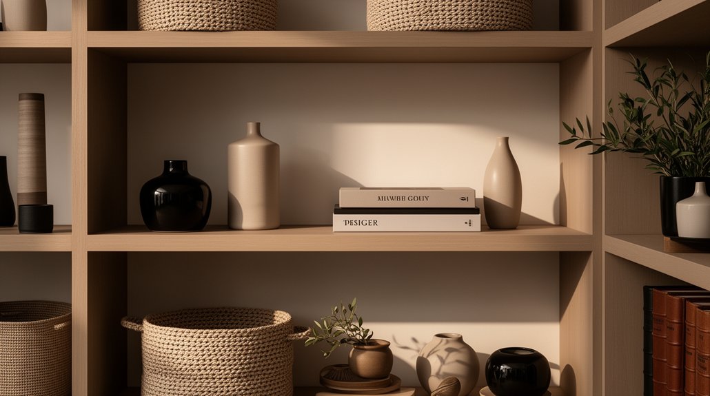
A well-styled shelf transforms a room by organizing space, guiding the eye, and balancing color, texture, and form. Start with function: keep items you truly use or love within easy reach, grouping similar functions to streamline workflow. Choose a unifying color palette, layer textures, and mix open with closed storage to reduce clutter. Use height and scale strategically, maintain negative space, and keep routines for maintenance. Want more tips to refine your shelves? You’ll get practical steps ahead.
Key Takeaways
- Start with function: gather items you regularly use or love, then arrange by access and workflow.
- Pick a unifying palette (2–3 tones) and repeat accents to create visual cohesion.
- Vary scale, height, and textures to add depth while balancing open and closed storage.
- Layer objects with taller items at the back and shorter in front to maintain sightlines.
- Use lighting and negative space: ambient light, task lighting, and breathing room keep shelves polished.
Why a Well-Styled Shelf Transforms a Space
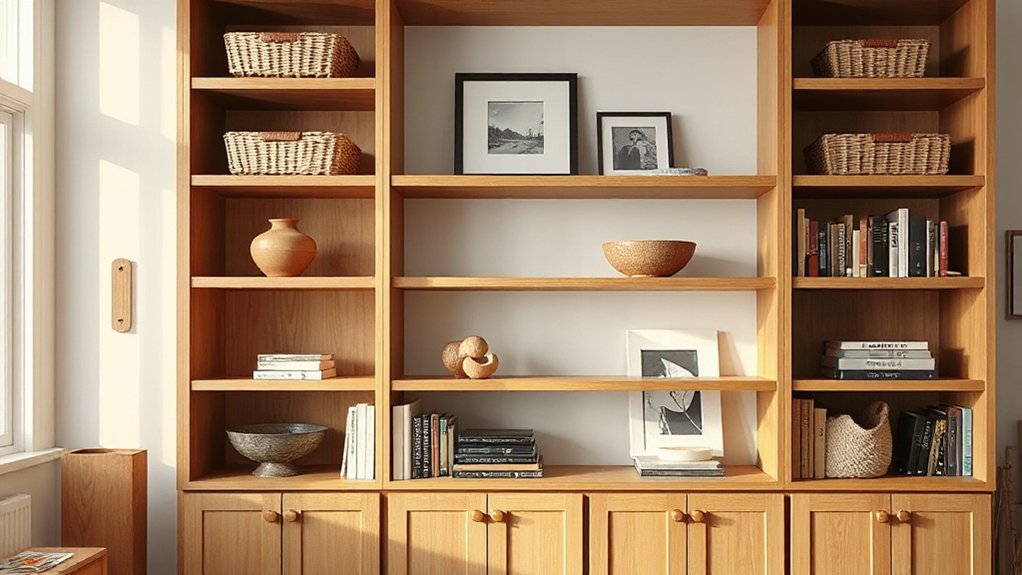
A well-styled shelf instantly elevates a room by organizing space and guiding the eye. When you design with intention, you create balance, rhythm, and focus that feels purposeful. You’ll notice how color contrast makes objects pop against the backdrop, drawing attention to key pieces while receding others into a supportive veil. Think in layers: taller items at the rear or sides, shorter accents in the front to maintain sightlines and avoid clutter. Shelf height matters: vary verticals to create visual interest without breaking harmony. Use a restrained color palette with occasional bold notes to anchor zones and guide movement through the room. Purposefully placed textures, finishes, and negative space keep the display refined, functional, and easy to update as seasons change.
Start With Function: Decide What You Truly Use or Love
Start by identifying what you actually use or love on your shelves, then let that list guide the arrangement. You’ll prioritize items that prove functional daily, like frequently referenced cookbooks, essential tools, or cherished keepsakes, over purely decorative pieces. Group similar functions together to reduce searching time and to reinforce a clear workflow, whether you’re styling a pantry, home office, or living room. Once you’ve mapped usage, plan access: place daily items within easy reach and reserve secondary displays for seasonal swaps. Use color coordination selectively to support function—align similar tones for quick recognition without overpowering the shelf. Keep shelves breathable by balancing bulk with negative space, and label where helpful to sustain order. This approach blends practicality with intentional care for your space.
Pick a Unifying Color Palette to Set the Mood
Choose a unifying color palette to set the mood across your shelves, then balance warm and cool tones to keep everything cohesive. Use a dominant scheme—think neutrals with a few accents—and let textiles like throws and pillows reinforce the look. This approach keeps the space calm, polished, and visually linked from shelf to storage.
Unified Color Schemes
Unified color schemes anchor the scene by choosing a single palette that guides every shelf, crate, and accent. You simplify decisions by aligning book spines, storage bins, and decor items to a cohesive range, then you repeat that range across textures and finishes for consistent tone. Choose a dominant color and two supporting hues that complement it, preventing visual noise. Color coordination becomes a deliberate act: you test contrast for readability, then adjust until elements feel cohesive rather than competing. Practical tweaks matter: vary saturation to maintain interest, distance color blocks to balance mass, and use neutral anchors to ground the composition. The result is visual harmony, a calm backdrop that elevates organization and purpose.
Balance Warm And Cool
Balancing warm and cool tones begins with selecting a unifying color palette that sets the mood across shelves, crates, and decor. You choose a base and then weave in accents that reinforce contrast without shouting. Pair warm neutrals with cooler accents to create depth, ensuring color contrast guides the eye through the display. Use consistent lighting effects to harmonize tones: soft, ambient lighting for warmth, cooler task lighting to sharpen highlights where you want focus. Keep finishes cohesive—matte woods with satin metals or glass—to avoid visual jank. Balance layout: group items by temperature, then intersperse small cool notes among larger warm blocks. Verify readability by testing scale and spacing, so accessories read clearly against backgrounds. This approach yields a polished, functional display.
Accent With Textiles
Textiles are the easiest way to unify a palette and set the mood across shelves and storage displays. To begin, choose a unifying color palette—two to three hues with a neutral anchor—and apply it consistently. Use Textile layering to build depth: fold, drape, and stack fabrics in varying weights and textures to create visual interest without clutter. Swap bold pieces for calmer equivalents if you want a quieter look, or introduce a pop color sparingly to energize the display. When selecting Fabric accents, mix patterns with solids at different scales to avoid competing motifs. Keep hems neat, seams aligned, and edges trimmed for polish. Finally, rotate textiles seasonally to refresh the space without costly changes.
Layer Texture and Material for Depth on Shelves

Layer texture adds instant depth, so mix a variety of finishes—matte, satin, and tactile weaves—to catch the eye from different angles. Pair contrasting materials, like wood, metal, and ceramic, to create visual interest without clutter. Use layering strategically—stack or stagger objects to build dimension while keeping the shelves cohesive.
Layer Texture for Depth
To add depth on your shelves, mix textures and materials so each layer reads distinctly. Layer texture becomes your depth amplifier: pair smooth surfaces with rough finishes, and insert tactile accents like woven baskets or ribbed ceramics to catch light and shadow. Keep sizes varied so you read vertical and horizontal movement without crowding. Textural contrast guides the eye, while subtle repeats—a glaze, a weave, a matte timber—link disparate objects into a cohesive narrative. Practice deliberate material layering: a metal frame against a wood backdrop, a soft linen throw over a hard shelf edge, a glossy vase next to a matte book cover. Avoid overpowering, and let negative space balance the composition for a polished, resonant display.
Material Mix on Shelves
As you move from layering textures to mixing materials, focus on how different materials interact in the same shelf plane. A deliberate Material mix creates visual interest without shouting. Pair hard surfaces, like metal or glass, with warm woods or ceramic, balancing reflections and warmth. Keep scale and finish consistent to prevent chaos: matte with matte, gloss with gloss, or a soft contrast if you introduce sheen. Position durable, easy-care pieces toward the front for Shelf organization and practical use, reserving delicate or sentimental items for higher, lower, or protected zones. Use three material categories per shelf to maintain cohesion: primary, secondary, and accent. Avoid clutter by restricting accents to two or three small objects, and maintain breathing room between items for clarity.
Depth Through Layering Elements
Depth on shelves comes from layering elements to create visual interest and dimensionality without clutter. To build Layered depth, mix textures and materials at varying scales so each piece reads distinctly. Use visual layering by overlapping small objects with taller, structured pieces, letting negative space define balance. Keep color restrained to emphasize texture, not compete for attention.
- Choose a matte wood, a glossy accent, and a soft fabric texture to add tactile contrast
- Place a tall element behind shorter items to create depth cues
- Layer books, baskets, and plant pots with staggered heights for rhythm and order
This approach stays practical and polished, guiding you to intentional, clutter-free shelves that feel richer and more cohesive through layered depth and visual layering.
Mix Open and Closed Storage Without Visual Clutter
Mix open and closed storage wisely to reduce visual clutter while keeping your space functional. You balance shelves by grouping similar items and tucking away the rest in cabinets or boxes, so the eye travels smoothly. Use open sections for a curated display of decorative accessories, ensuring each piece has a clear role and contributes to your room’s vibe. Keep color coordination in mind; limit palettes to two or three tones and repeat accents for cohesion. Vary storage sizes to create rhythm, but avoid crowding; leave negative space to breathe. Label or containerize items you repeatedly use, so daily routines stay efficient. Choose doors with matte finishes to minimize reflection, and align hardware for a polished, unified look.
Use Scale and Height to Create Visual Interest
Vary scale and height intentionally to keep shelves visually engaging without overwhelming the room. You’ll create focal points with a deliberate mix of tall, short, and mid-sized pieces, guiding the eye across the display. Emphasize scale contrast to prevent flat shelving and to add depth. Use height variation to balance open spaces with grouped items, avoiding crowding. Place a tall object opposite a low, broad one to create a dynamic rhythm that reads as cohesive, not cluttered. Keep finishes and textures complementary for a polished look.
- Pair a vertical sculpture with a low, wide tray for contrast
- Layer books by height to form stepping stones across shelves
- Position framed art between taller pieces to anchor the arrangement
Style With Everyday Objects You Already Own

You can elevate shelves using everyday objects you already own, turning familiar items into intentional design accents. Begin by sorting items into two groups: display-worthy and casual clutter. Choose a few vintage finds to anchor shelves, pairing them with clean, modern pieces to avoid visual chaos. Layer heights thoughtfully: place taller objects at the back or sides and shorter ones in front to create depth. Embrace artistic displays by grouping objects in odd numbers and varying textures—ceramics, glass, textiles, and metal. Rotate pieces seasonally to maintain freshness without buying more. Keep surfaces clean and items well spaced; negative space matters. Let personal history inform choices, but prioritize composition over sentiment. This approach results in cohesive, polished shelves that feel curated, not crowded.
Add Decorative Accents That Reflect Your Personality
You can start by personalizing your shelves with objects that tell your story. Choose bold color accents and varied textures to create visual interest without clutter, and pick materials that feel authentic to you. Let these choices reflect who you are while keeping the display cohesive and practical.
Personalize With Objects
Personalizing your shelves starts with objects that reflect who you are, not what trends dictate. You’ll choose personalized objects and decorative accents that tell your story, then place them where they’re easy to see and reach. Seek balance between meaningful pieces and practical display, so your shelves stay orderly while feeling personal. Focus on scale, color harmony, and spacing to avoid visual clutter.
- Curate a few specialty items that celebrate your interests
- Mix textures and shapes for depth without crowding
- Group complementary objects to create intentional focal points
Colorful Accent Choices
Colorful accents are a quick win for personality, adding mood and energy without overpowering the shelf. You choose pieces that echo your taste while remaining cohesive with nearby items. Prioritize a deliberate mix of colors that delivers color contrast without clashing; pair bold hues with neutrals to keep balance intact. Start with a focal accessory in a saturated shade, then repeat a hue or two across smaller objects to create color harmony. Limit patterns to one or two items to avoid visual noise, and assure finishes vary enough to feel intentional rather than random. Consider the shelf’s overall palette—if the background is light, lean into richer accents; if it’s dark, lighter pops feel grounded. Finish with thoughtful placement: group, stagger, and leave breathing room for visual clarity.
Textures And Materials
Textures and materials are the fast track to a shelf that feels tactile and intentional; mix glossy, matte, and natural surfaces to add depth without crowding the space. You’ll create visual interest by pairing, not overwhelming, contrasts. Focus on material contrast to highlight curated pieces and textures, guiding the eye through the display. Use texture layering to build dimension: combine woven baskets with smooth ceramic, rough stone, and sleek metal accents. Keep scale and repetition in mind so the arrangement reads cohesive, not chaotic. Remember purpose over trend—choose pieces that reflect your personality, then let their textures speak.
- Stimulating contrasts with curated items
- Layered textures for depth and balance
- Coherent material palette that echoes your style
Bring in Greenery for Freshness and Calm
Bringing in greenery instantly refreshes a space, delivering calm and a natural focal point without fuss. You’ll keep shelves feeling breathable by choosing compact indoor plants that thrive in low-light corners and modest water routines. Start with a practical mix: a few small pots, a trailing plant, and one statement piece for texture. Place vertical greens where eye level sits, so they’re noticed but not crowded. For ease, opt for low-maintenance options like pothos, zz plants, or snake plants, which support air quality and calm vibes. Use hanging greenery to free surface space, drafting a tidy, layered look. Rotate plants by season to maintain importance, and group in threes for visual harmony. Regularly wipe leaves to preserve color and minimize dust. Indoor plants, hanging greenery.
Create Focal Points With Statement Pieces
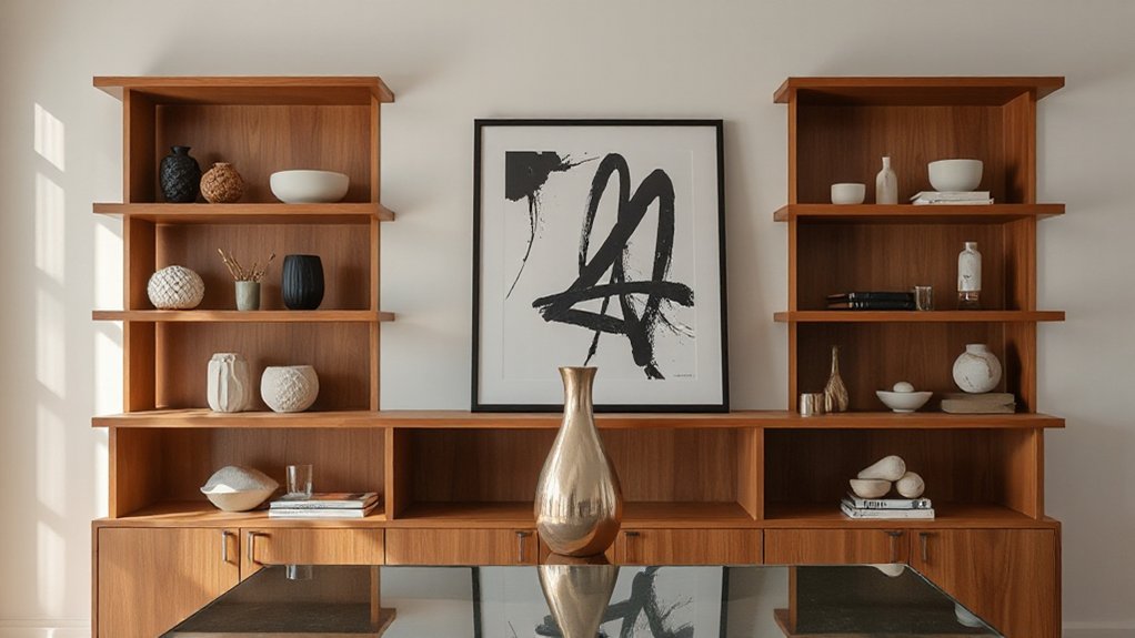
Statement pieces instantly set the mood, so pick one standout item that anchors the display. Use it to create an eye-catching shelf focal that guides the eye and unifies surrounding decor. Keep supporting pieces quiet and cohesive to let that focal piece do the talking.
Statement Piece Impact
A well-chosen statement piece instantly creates a focal point in any room, drawing the eye and anchoring the entire shelving or storage display. You guarantee visual impact by selecting items that contrast or harmonize with surrounding shelves, then place them thoughtfully for balance and purpose. Keep scale in mind so one piece dominates without overcrowding.
- Choose a standout element with a finish echoed elsewhere for cohesion
- Position at eye level to maximize visibility and impact
- Pair with restrained surrounding accents to avoid competing textures
A deliberate contrast in color, texture, or form amplifies the statement piece’s authority, guiding the viewer through the display. Lean on practical rules, like spacing and alignment, to ensure a polished, high-impact result that feels intentional rather than accidental.
Eye-Catching Shelf Focal
Eye-catching shelf focal starts with a single, intentional piece that immediately draws the eye and sets the tone for the display. You choose one standout item and position it at eye level for maximum impact. Then build around it with complementary, not competing, decorative accessories. Aim for a clean silhouette and deliberate negative space to avoid clutter in your shelf arrangements. Use a consistent color or material palette to unify disparate objects while preserving personality. Rotate pieces seasonally so the focal point remains fresh without major overhauls. Keep scale in mind; oversized items can overwhelm smaller shelves, while undersized pieces read weak. Remember balance: anchor the arrangement, then layer textures, finishes, and subtle accents to sustain interest. Your goal is a cohesive, striking focal that enhances the entire display.
Organize by Category: Books, Decor, and Storage Boxes
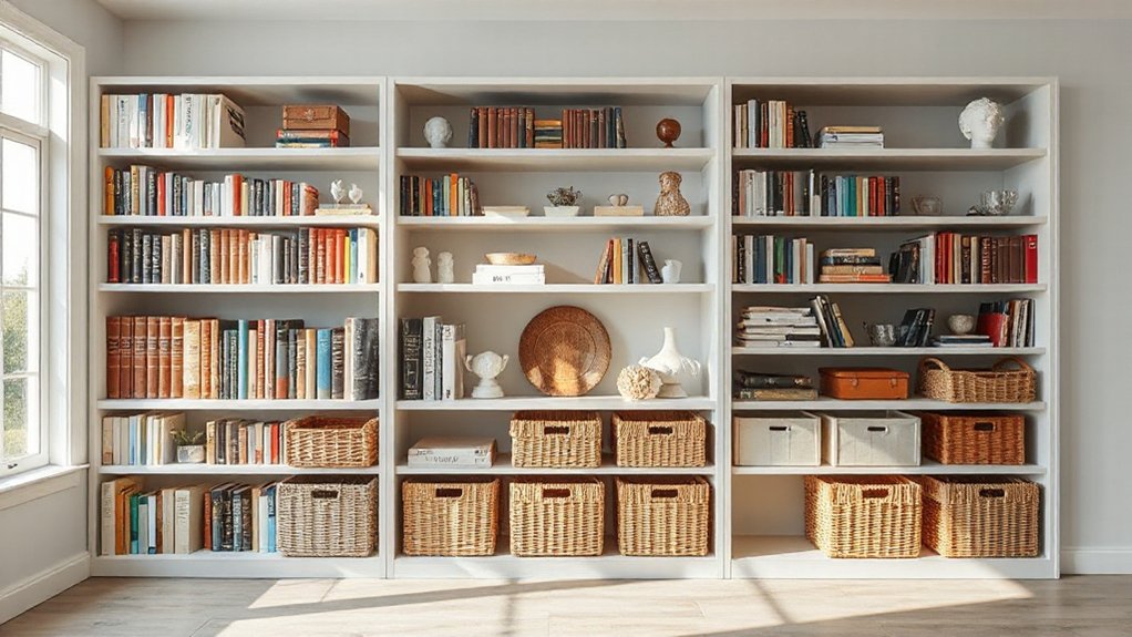
To organize your shelves, start by categorizing—books, decor, and storage boxes—so you can see where each item belongs and how much space it will need.
Organizing by category helps you plan functions and style without clutter. Use efficient storage containers for bulky items, and reserve decorative accents to highlight shelves’ focal points. Now, build a labeled system that you can maintain.
- Sort books by size or topic for cohesive rows
- Group decor by color or texture to create rhythm
- Use suited storage boxes behind doors or on lower shelves for hidden storage
Consistency is your ally; rotate items seasonally to keep the arrangement fresh and practical.
Lighting Tricks: Elevate Shelves With Practical Lights
Lighting is the simplest way to elevate shelves, guiding attention, improving visibility, and making every item feel intentional. You’ll maximize impact with practical choices that stay out of the way. Start with ambient illumination to create even, low-glare coverage that prevents harsh shadows and highlights texture across the display. Add task lighting above or beside key shelves where you read, corral small items, or assemble displays; choose adjustable fixtures to tailor brightness without overloading the scene. Consider LED strip lights beneath each shelf for a subtle glow that draws the eye to color harmony, while stock recessed up-lighting can lift corners and fade into the room. Keep cords tidy, and test placement at different times of day to guarantee consistent impact.
Maintenance Habits to Keep Shelves Intentional
Regular upkeep keeps shelves looking intentional and performing well. You’ll establish simple routines that prevent clutter from creeping in and maintain accessibility. Commit to short, daily checks: return items to designated spots, wipe surfaces, and dust before you restock. Over time, these habits reduce wear and make styling decisions clearer.
- Create a weekly Cleaning routines ritual to tackle dust, grime, and fingerprints on every shelf.
- Use a microfiber cloth and gentle cleaners to preserve finishes and avoid streaks.
- Implement a monthly dust prevention plan with lids, organizers, and clear labeling to sustain order.
Consistency matters more than intensity. Allocate a few minutes each day, keep a visible checklist, and adjust shelving as needs shift. Your shelves stay intentional and functional with deliberate, repeatable actions.
Budget-Friendly Hacks to Refresh a Space
Want a quick, high-impact refresh without breaking the bank? You can transform shelves and storage spaces with simple, practical tweaks. Start with budget hacks that make a visible difference: swap out bulky containers for uniform bins, label everything, and group items by function to reduce visual clutter. Refresh the height of displays using candleholders, baskets, or book stacks to create new focal points without buying new furniture. Use removable contact paper or paint swatches to refresh backsplashes or shelf liners, delivering instant contrast. Layer textures with fabric, jute, or felt to add warmth. Reorganize by frequency of use, storing seasonal items separately. For ongoing efficiency, designate quick-access zones and maintain a routine. These storage solutions deliver impact without overhauls.
Troubleshooting Common Styling Dilemmas
Shelving and storage setups rarely go off without a hitch, but most dilemmas have simple fixes you can apply in minutes. When items feel cluttered, reassess shelf organization and swap generic boxes for uniform containers. Keep decorative accessories deliberate, not decorative overload: choose 1–2 focal pieces per shelf and group others in odd numbers for balance. If weights seem uneven, relocate the heaviest items lower for stability and visual ground. Address visibility by using open storage for frequently used items and label crates to reduce rummaging.
- Rebalance with a heavier piece on the bottom shelf
- Swap mismatched containers for uniform, labeled options
- Highlight a single decorative accessory as the visual anchor
Edit, Evolve, and Renew: Keeping Shelves Inviting Over Time
To keep shelves inviting over time, make small, intentional updates a regular habit. Start with quick audits: rotate standout pieces, swap out seasonal items, and reassess your scale. Maintain shelf symmetry by mirroring heights and colors across sections, which instantly refreshes the look without a full redo. Practice storage segregation by grouping similar items, reducing clutter and improving findability. Replace dated decor with a few cohesive accents, then leave space to breathe—negative space matters. Update labels or front-facing storage boxes so you know where everything belongs. Set a quarterly rhythm to refresh textures, fabrics, or finishes, not a complete overhaul. Keep a minimalist mindset: edit, evolve, renew, and your shelves stay engaging and practical. Regular upkeep preserves balance, function, and visual appeal.
Frequently Asked Questions
How Often Should I Refresh Shelf Styling Seasons?
You should refresh seasonal decor about quarterly, aligning with seasonal changes. This styling frequency keeps spaces fresh without overhauling, ensuring cohesive looks. Plan ahead, rotate key pieces, and refresh accents as needed to maintain polished, practical shelving aesthetics.
What Storage Solutions Hide Clutter Most Effectively?
Hidden compartments and decorative baskets hide clutter most effectively, so you should prioritize designs with concealed storage and stylish organizers. Use decorative baskets for quick, tidy looks, and choose hidden compartments for discreet, long-term decluttering of essentials.
Which Heights Work Best for Small Spaces?
Quick stat: households save 25% more space when shelves use vertical optimization. For small spaces, target higher shelves first and stagger depths. You’ll optimize vertical storage, achieve color coordination, and keep everything reachable and visually balanced.
How Can I Balance Bold vs. Subtle Accents?
You balance bold vs. subtle accents by choosing decorative accessories that contrast with your backdrop while keeping color coordination tight; mix statement pieces with refined neutrals, and vary textures to maintain interest without overwhelming the space.
Can I Incorporate Tech Neatly Into Shelves?
Yes, you can; choose smart integration and hide cables with dedicated cable management. You’ll mount devices discreetly, run cords neatly, and balance tech with decor, ensuring a polished, practical shelvescape that feels seamless and thoughtfully organized.
Conclusion
You’ve built a home where shelves serve you, not the other way around. Keep it simple: rotate items, layer textures, and tether everything to a unifying palette. When in doubt, remove one piece to reinforce calm. Think of your shelves as a skyline—vary heights, tones, and openness to guide the eye. Like a well-tuned instrument, they’ll hum with order and personality, inviting you to return, glance, and breathe. The space breathes as you curate.
About the Author



