

Start with a clean slate and ruthlessly edit what goes on your open shelves, keeping only purpose-driven pieces. Establish a unified color story across all shelves, then group items into mini-collections you can rotate. Use hidden storage behind pretty fronts and mix textures to add depth without clutter. Harness negative space to breathe, choose storage-friendly accessories, and add subtle lighting to reduce the clutter look. Maintain a quick quarterly shelf edit to keep results fresh and functional, and you’ll discover more practical tips ahead.
Key Takeaways
- Start with a clean slate by removing nonessential items and grouping remaining objects into visual clusters for clarity.
- Establish a unified color story (2–4 hues) and repeat tones across storage, books, and decor for cohesion.
- Group items by function or theme, use odd-numbered arrangements (3 or 5), and maintain varying depths for rhythm.
- Control negative space with a plain-sight zone on each shelf to reduce visual noise and maintain calmness.
- Schedule regular edits to remove duplicates, refresh arrangements, and rotate seasonal accents to prevent clutter buildup.
Start With a Clean Slate: Ruthlessly Edit What Goes on Open Shelves
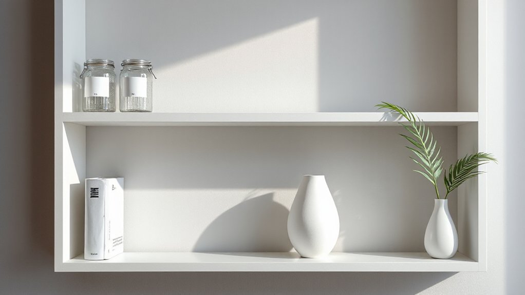
Start with a clean slate by ruthlessly editing what you place on open shelves. You control the focal point by prioritizing items that earn their spot with purpose, not sentiment. Begin by removing clutter and identifying essential pieces, then group remaining objects into visual clusters.
Respect color contrast, arranging tones so light and dark elements balance each other for readability at a glance. Consider shelf height as you position selections: place high-visibility items at eye level, with bulkier pieces anchored lower, lighter accents higher still.
Restrict the total to what you truly need; avoid duplicative shapes and excessive textures. This disciplined approach creates negative space that enhances functionality, highlights statement pieces, and prevents a chaotic, unfocused display from taking hold.
Establish a Unified Color Story Across All Shelves
Start by picking a unified color palette and carry it across every shelf, so your eye travels smoothly from one display to the next.
Use consistent shelf elements—matte black frames, neutral storage bins, and the same lighting fixture type—to reinforce that coherence.
Keep variations minimal and intentional, so the overall look reads as one curated story rather than a collection of separate pieces.
Unified Color Palette
Creating a unified color palette ties every shelf together, so choose 2–4 core hues and carry them across objects, backs, and accents. You’ll build a cohesive look by repeating these tones in storage boxes, cookbooks, vases, and dishware, then let neutrals support them.
Prioritize Color coordination to prevent chaos: mix warm and cool versions of your chosen hues, then keep patterns subtle and restrained. Palette consistency means even bold pieces reference the same palette, avoiding jarring mismatches.
Use contrasting textures—matte woods with glossy ceramics—to add depth without adding color. Schedule a quick audit: every item should either echo a hue or sit as a neutral spacer.
With deliberate repetition, you’ll achieve calm, organized shelves that feel intentional, not cluttered.
Consistent Shelf Elements
To establish a unified color story across all shelves, harmonize elements like storage bins, book spines, and decorative accents so they echo your core palette. You choose a few reliable hues and repeat them across every shelf, avoiding random pops.
Keep large pieces grounded in neutrals, then add small, intentional accents that mirror a single tint or undertone. Consistency isn’t sameness; it’s rhythm. Use similar materials and finishes for bins, frames, and book ends to knit the display together.
Introduce Vintage accents sparingly, ensuring they don’t dominate; they should feel curated, not cluttered. Include Personal mementos in a restrained cluster, sized to fit, to humanize the arrangement without stealing focus.
Review from a distance to confirm balance, adjust spacing, and maintain visual flow.
Group by Theme: Create Mini-Collections You Can Rotate
Group by theme lets you assemble mini-collections you can rotate without fuss. Keep items clearly aligned to each theme so you can swap pieces in and out as moods shift.
Use simple cues—color, texture, and form—to maintain theme cohesion while you refresh.
Mini-Collections On Display
Grouping mini-collections by theme keeps shelves dynamic and easy to refresh. When you curate mini collections, you create visual rhythm that readers can digest at a glance. Think in clusters: a color group, a material family, or a shared motif, rather than scattered singles.
Arrange items at varying depths to add dimensionality, but keep a clear focal point within each theme for visual harmony. Rotate these groupings seasonally or as your shelf evolves, rather than overloading a single surface.
Choose pieces that echo each other in scale, texture, or color to maximize visual harmony while preserving function. This approach delivers intentional display without clutter, reminding you that deliberate repetition and thoughtful spacing boost overall order.
Mini collections thrive when purpose guides placement.
Rotate With Ease
Rotate with ease by grouping items by theme and swapping pieces in and out as your shelf shifts. You create miniature collections you can rotate seasonally or by mood, so your display stays fresh without chaos.
Favor a clear color story: select prompts like color contrast to make each group pop without shouting. If one shelf leans warm, balance it with cooler accents nearby, preserving shelf symmetry as you reorder.
Keep a tight core of staples—a few repeat pieces that anchor every rotation—and add one or two accent items per cycle to refresh interest. Store excess pieces out of sight, swapping in when you crave a new vibe.
This disciplined approach preserves order while offering flexible styling latitude.
Theme Cohesion Tips
To keep your shelves cohesive, build mini-collections around a unifying theme and rotate them seasonally. Group objects by color stories, textures, or usage, then swap pieces every few weeks to maintain freshness without clutter.
Start with a core trio: a book set, a sculptural object, and a practical item (like a tray) that anchors the display.
Use Color contrast to create visual pops while staying within a limited palette, which sharpens the theme and reduces noise.
Incorporate Material variety to add interest without chaos; mix ceramic, wood, and metal with deliberate spacing.
Rotate entire groupings rather than single items to preserve balance.
Keep labels subtle or hidden; let the arrangement communicate purpose.
Reassess monthly, pruning what doesn’t serve the theme.
Use Hidden Storage Behind Pretty Fronts
Hidden storage behind pretty fronts keeps your shelves tidy without compromising style. When you want a clean look, choose cabinets with concealed storage that blend into the shelving unit.
Opt for doors in finishes that match your boards, or go with frosted glass for a hint of depth without glare. Use hidden compartments for seasonal or seldom-used items, freeing surface space for display pieces.
Keep the interior organized with dividers and labeled bins, so you can locate items without rifling through boxes.
Balance function and aesthetics by selecting hardware that feels subtle, not flashy. Remember: concealed storage should disappear into the design, not shout for attention, so your open shelves stay purposeful and visually calm.
Mix Textures for Visual Interest Without Clutter
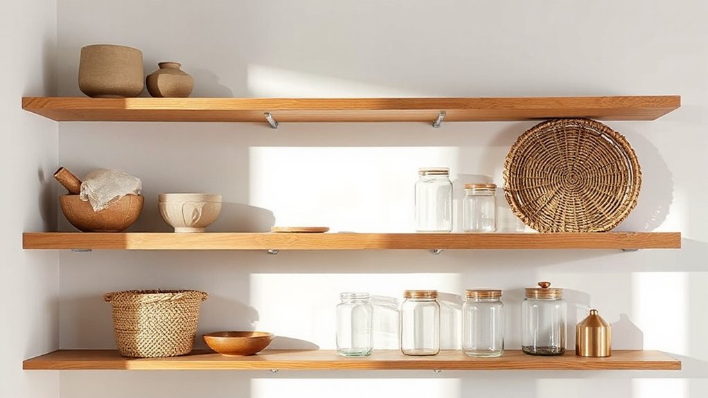
Moving beyond concealed storage, mix textures to add depth without creating clutter. You’ll achieve visual interest by pairing varied surfaces, tones, and finishes while keeping a cohesive color story. Use textural contrast to separate groups and guide the eye without adding bulk. Material layering creates momentum across shelves without crowding space.
- Combine matte and glossy surfaces for subtle tension
- Pair woven, ceramic, and metal accents for tactile variety
- Layer textiles like cotton, linen, or felt within storage bins
- Introduce wood tones with metal hardware for cohesion
- Vary scale: small decorative objects against larger pieces
Focus on a restrained palette, repeat a few textures, and let negative space breathe. This approach yields depth, order, and calm, with deliberate texture choices enhancing shelves rather than cluttering them.
Weight and Rhythm: Balance Heavy Objects With Light Pieces
To create balance, pair heavy and light pieces so their visual weights work together rather than compete. Let weight visuals anchor the shelf while light accents keep the rhythm fluid and approachable.
Use rhythm guides—spacing, proportion, and a repeating pattern—to steer attention without crowding.
Balance Heavy, Light Pieces
Striking a balance between heavy and light pieces is essential for a coherent shelvescape. You can guide the eye by pairing sturdy objects with delicate accents, creating visual rhythm without crowding. Aim for intentional weight distribution that feels grounded yet breathable. Use light pieces to soften bold corners and decorative accents to echo color or texture from the heavier items.
Shelf symmetry helps maintain order, but vary heights to avoid predictability. Practice in small steps and refine as you go.
- Place a dense object at one end, offset by a slim, tall piece on the other
- Pair a heavy book set with a delicate sculpture for contrast
- Echo color or material across light and heavy items
- Add a single, lightweight greenery element for airiness
- Balance mass with negative space to preserve breathing room
Weight Visuals, Rhythm Guides
Weight visuals guide the eye by pairing heavy objects with lighter pieces to create a balanced, cohesive shelvescape. You balance visual weight by grouping large, solid items with airy, delicate ones, so your display reads calm rather than crowded.
Use decorative accents to punctuate rhythm: a tall vase beside a small sculpture, then a stack of books with a light ceramic piece. Alternate textures and finishes to keep the eye moving without jarring shifts.
Think in thirds: place a dominant, heavy item, a lighter counterpoint, then a grounding element at the opposite end. If you want continuity, repeat a color or material across different shelves.
Maintain intentional gaps to avoid clutter, and let negative space act as a visual pause that reinforces rhythm.
Endcaps That Anchor the Shelf Look
Endcaps anchor the shelf’s look by signaling purpose and tying the design together. You’ll use these edge pieces as deliberate statements, not afterthoughts, to cue focus and balance throughout the display.
- Choose a unifying material or color for endcaps to mirror or contrast with core shelves.
- Place one high-impact item at each end to create clear anchor points.
- Balance vertical and horizontal weight at the ends for steadiness.
- Incorporate a scarce, meaningful object to avoid cluttered edges.
- Rotate endpiece selections seasonally to refresh the look without overhauling the entire shelf.
Endcap styling keeps attention where you want it and prevents drifting attention from the main displays. Use intentionality to maintain calm, cohesive shelving.
Create a Plain-Sight Zone: Designate a Quiet Area on Each Shelf
A plain-sight zone gives you a calm, intentional place on each shelf where the eye can rest. Designate a quiet area for minimal visual noise, then keep it free of clutter with purposeful spacing.
Use this zone to anchor your display: a single book, a small plant, or a neutral object can set the tone without competing items. Arrange items so their heights and profiles create a clean line, not a jagged scattering.
Preserve consistency by reserving space for decorative accents that feel cohesive across the shelf. Plan seasonal swaps within the zone to refresh the look without chaos.
This approach stabilizes your display, supports quick adjustments, and maintains an uncluttered, gallery-like feel.
Layer Objects in Odd Numbers for Harmony

Layer objects in odd numbers to create visual rhythm and balance. When you arrange items in threes or fives, you guide the eye and prevent clutter. Odd-grouped displays feel intentional and cohesive, even on compact shelves.
Prioritize color contrast to separate tiers and emphasize focal pieces, keeping shelf symmetry in mind for harmony.
- Groupings of 3 or 5 create rhythm without crowding
- Place a bold item at center to anchor the display
- Use varying heights within each odd set for depth
- Repeat a color or material across groups for cohesion
- Leave negative space around focal pieces to breathe
Remember: fewer, deliberate clusters beat crowded rows. Aim for calm, decisive placements that reinforce shelf symmetry and color contrast.
Display Everyday Items in Aesthetic, Not Random, Pairs
To keep shelves cohesive, display everyday items in deliberate, paired arrangements rather than random placements. You create visual rhythm by matching items in size, shape, or tone, then repeating those echoes across shelves.
Use intentional pairs—two bowls, two books with similar spines, or a mug and its matching saucer—so the display reads as curated, not cluttered. Favor creative color combinations that tie objects together without shouting contrast, and avoid overloading any one section.
Choose minimalist accessory choices: a single vase next to a stack of compact boxes, a small sculpture with a plant, or a framed print with a lone candle. Maintain balance by alternating height and proximity, ensuring gaps feel purposeful rather than empty.
Regularly reassess to keep the look fresh and cohesive.
Elevate With Vertical Stacking and Platforms
Vertical stacking adds height and focus without crowding shelves. You’ll use vertical stacking and platform layering to create rhythm, not chaos, on open shelves.
- Layer objects of varying heights to form visual islands
- Pair small items with taller shapes for contrast
- Use shallow platforms to elevate favorites without crowding
- Group items by function to readers’ eyes
- Leave negative space to frame statements and guides
Keep materials cohesive—metal, wood, glass—so textures mingle, not clash. Choose a single finish palette to reinforce order, then alternate between surfaces at different heights for depth.
When you introduce new pieces, swap them into elevated platforms first, then fill gaps below. This approach preserves airiness but adds intentional height, guiding attention where you want it and avoiding clutter through deliberate vertical stacking and platform layering.
Use Vertical Space: Stagger Heights Intentionally

Stagger heights intentionally to maximize impact without clutter. Use vertical space by varying shelf items’ heights, creating a rhythm that guides the eye. Place tall pieces toward the ends and shorter objects in the center to avoid a flat, crowded look. This is about vertical stacking with deliberate gaps, not random assortment.
Group items in threes or pairs to establish balance, then break the group with a single accent piece to draw attention. Keep color coordination in mind: repeat a few complementary hues at different heights to unify the display.
Reserve the highest shelf for a bold focal item, then taper down with varied textures and scales. Remember, precision beats abundance—edit ruthlessly so each item earns its place.
Incorporate Greenery to Airplay Freshness
Incorporating greenery instantly freshens shelves and softens hard angles, so choose greenery that thrives indoors and requires minimal maintenance. You’ll boost airiness while keeping clutter at bay with smart plant placement and deliberate greenery accents.
- Pick low-maintenance options (snake plant, pothos) for beginner-friendly plant placement.
- Group greens by height to create a flowing, layered look.
- Use trailing varieties to soften edges and fill gaps.
- Place plants near light sources without overexposing them.
- Label care needs subtly to maintain green decor without adding visual noise.
Keep pots cohesive in color and texture to unify the display.
Prefer uniform planters or a restrained mix to avoid competing focal points.
This approach preserves open shelving while inviting life.
Introduce Sculptural Focal Points Sparingly
To keep shelves feeling open after greenery, introduce sculptural focal points sparingly. You’ll heighten impact with a single, well-chosen piece rather than a clutter of objects.
Choose items that read as sculptural rather than decorative clutter: a strong silhouette, clean lines, and a materials-sense that echoes your room. Place one focal piece on a prominent shelf, then let surrounding items recede in size and density.
Sculptural focal points work because they anchor the eye, not overwhelm it. Favor artistic accents that feel intentional—a ceramic form, a metal sculpture, or a wooden objet d’art—over generic ornaments.
Maintain contrast by pairing the focal point with neutral props and ample negative space. Remember: restraint creates flow, and deliberate selection preserves the open, breathable vibe.
Balance Books With Art and Objects in 60/40 Ratios
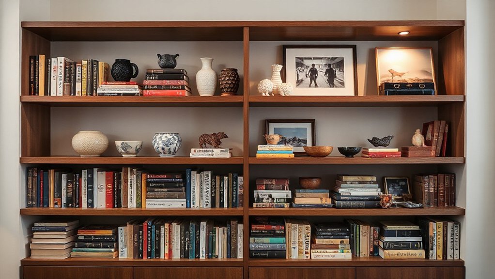
Aim for a 60/40 split by weight: keep fewer books than art or objects in view to create visual balance.
Let the shelves read as a curated display—books anchoring the base while art and objects float above or beside them.
Adjust until the combination feels intentional and easy to scan, not crowded or chaotic.
Books vs Art Balance
Balancing books and art keeps shelves from feeling crowded while still showcasing your personality; aim for a clear 60/40 split—60% books, 40% art and objects—to create visual rhythm without tipping into clutter. You’ll exploit color contrast and material contrast to unify the display and add interest.
- Align book spines by hue so art pops against a cohesive base
- Place a single bold artwork at eye level as the focal point
- Mix matte and shiny surfaces for tactile tension
- Use a few sculptural pieces to interrupt lines without crowding
- Rotate a small set of objects seasonally for fresh balance
Objects In View Ratio
When you apply the 60/40 rule to objects in view, you keep shelves feeling curated rather than crowded. Balance is about contrast, not sameness. Allocate 60 percent of visible items to books and functional pieces, and 40 percent to decorative accents or small art.
Prioritize items with inherent meaning or texture to anchor the look without overwhelming it. Think repeatable tones or shapes to create cohesion across shelves, then interrupt with a single contrasting piece for visual interest.
Rotate within the 60/40 framework to refresh without clutter. Use sturdy shelves and consider shelf durability when selecting heavier objects. Group items in pairs or triplets to enhance rhythm.
This method reduces visual noise while preserving personality and practicality.
Rotate Items Seasonally to Keep Freshness
To keep your shelves feeling fresh, rotate items seasonally so the display reflects current needs and aesthetics. By shifting pieces, you maintain relevance without overloading. Plan ahead, using a simple calendar to guide changes. Focus on balance, contrast, and function, swapping heavy items for lighter ones as seasons shift.
- Seasonal rotations keep visuals aligned with weather and mood
- Swap decorative accents every few weeks or with a new season
- Prioritize versatile pieces that mix easily across months
- Refresh color accents to echo natural shifts
- Limit total items on display to preserve uncluttered openness
This approach sustains a Freshness refresh, avoids stagnation, and reinforces a thoughtful, practical open-shelf system.
Harness Negative Space to Breathe
Negative space isn’t empty—it’s intentional breathing room that sharpens your display. When you harness it, you prevent visual overload and let each item stand out with purpose.
Begin by pairing pieces so negative space forms deliberate pauses between clusters, not gaps you ignored. Favor a mix of tall and short accents, but avoid crowding the shelf with sameness; variation creates contrast that reads as calm, not cluttered.
Use negative space to guide the eye: position key objects at eye level, with breathing room around them. This practice supports visual breathing—our term for how space between items reduces fatigue and improves comprehension.
Keep lines clean, edges aligned, and colors restrained. Less is more: your shelf will feel intentional, polished, and easy to navigate.
Choose Storage-Friendly Accessories and Bins
Choosing storage-friendly accessories and bins keeps shelves tidy and functional, so pick pieces that corral items without crowding. You want Decorative accents and Functional containers that look cohesive yet serve a purpose.
- Select uniform sizes for stacked organization
- Use labeled jars for small items
- Opt for clear bins to reveal content at a glance
- Choose matte or matching finishes to unify the display
- Reserve a few decorative pieces to soften the look
Prioritize items that add purpose without stealing space. Place functional containers at the front or on the edges to reinforce order. Alternate textures to avoid flat visuals, but keep color limited to a single palette. Regularly rotate items to maintain a fresh, clutter-free vibe.
This approach delivers practicality with style, ensuring shelves remain both usable and polished.
Lighting Loops: Add a Subtle Glow to Reduce Clutter Look
Lighting loops quietly illuminate your shelves, creating a soft glow that signals order without shouting clutter.
Place ambient light thoughtfully—behind or beneath pieces—to blur edges and unify colors, aiming for a cohesive flow.
Consider subtle lamp or strip placements that emphasize Subtle Glow Tactics and guide the eye through the display.
Subtle Glow Tactics
Subtle glow tactics use gentle lighting loops to visually smooth clutter and create a cohesive, airy feel. You’ll leverage subtle glow and ambient lighting to blend objects, avoid harsh shadows, and guide the eye through open shelving with quiet continuity.
- Use a low-wlicker LED strip along the back edge for soft, even illumination.
- Place a compact, warm-toned lamp at one end to anchor the display.
- Pilot a dimmer to shift mood without attracting attention.
- Highlight grouped items with focused, minimal glare.
- Keep cords tucked and color-consistent to maintain calm.
This approach keeps shelves readable, prioritizes function, and preserves visual flow. Subtle glow reinforces a tidy, intentional look without shouting for attention.
Ambient Light Placement
Ambient light placement on open shelves should anchor the display while keeping the look airy. You’ll balance illumination with restraint, using mounted LEDs or thin strips tucked behind brackets to create a subtle halo.
Aim for a gentle ambient glow that outlines objects without washing out details. Position lights toward the back or top of shelves to cast soft shadows on the items below, adding depth without glare.
Avoid direct, bright spots that flatten textures or reveal every dust mote. Dim the fixtures to maintain a cohesive mood after sundown, matching with wall color and overall decor.
Use warm color temperature to preserve color accuracy. This approach emphasizes intentional lighting, reduces clutter perception, and enhances material quality through deliberate contrast.
Maintenance Moment: A Quick Quarterly Shelf-Edit Routine
A quarterly shelf-edit keeps your Open Shelving looking purposeful and organized, so you’ll always see what really matters. You’ll perform a focused sweep, discard what’s dated, and reallocate items that better serve your current needs. This is shelf maintenance with purpose, not a purge. Use a simple rule: what survives stays within arm’s reach and speaks to your routine.
- Identify duplicates and remove the least-used pieces
- Update labeling or styling for consistency
- Group like items for immediate recognition
- Dust surfaces and check condition before returning
- Schedule the next edit and note any growing gaps
This routine reinforces clutter control while preserving function, ensuring you maintain a clean, intentional display.
Frequently Asked Questions
How Often Should I Rotate Shelf Contents for Freshness?
You should rotate shelf contents every 2–4 weeks to keep things fresh. This decor arrangement approach keeps items purposeful and tidy, while shelf maintenance thrives on a simple, practical routine you can stick with.
What Colors Best Minimize Visual Clutter Together?
Colors that minimize clutter: embrace monochromatic schemes or color blocking with cohesive hues. You’ll create calm, unified shelves by repeating tones across items, avoiding busy patterns, and pairing solids with subtle textures for visual balance and perceived order.
Can Height Variation on Shelves Increase Perceived Space?
Height variation on shelves can enlarge perceived space. Use dynamic vertical spacing and varied decorative accents to create rhythm, drawing the eye upward. You’ll maximize openness, balance weight, and keep clutter out with intentional, practical styling choices.
Which Items Should I Hide Behind Cabinet Fronts?
Hide items behind cabinet fronts for a cleaner look. Use decorative accents and functional containers behind doors, keeping everyday essentials visible on open shelves. This hides clutter while preserving style and practicality in your open shelving.
How Do I Measure When a Shelf Is “Too Busy”?
Measure until every item breathes; when you crave a clean line, you’re too busy. For decor organization, aim visual balance with spacing, scale, and function, not excess. Keep essentials, group by purpose, and declutter periodically.
Conclusion
You’ll keep shelves serene by editing ruthlessly, editing again, editing always. You’ll unify color, unify texture, unify mood. You’ll group by theme, group by collection, group by rotation. You’ll hide clutter behind fronts, you’ll reveal beauty with light, you’ll balance openness with order. You’ll store smart, store neatly, store accessibly. You’ll maintain momentum with a quarterly ritual, a quick reset, a simple refresh. You’ll live with calm, you’ll live with clarity, you’ll live with confidence.
About the Author



