
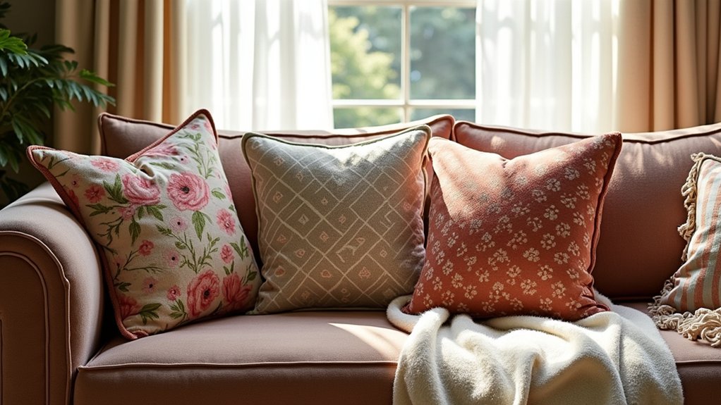
To mix patterns and textures like a pro, start with a unifying color palette: choose five to seven core hues, map them to dominant motifs, and test under different lighting. Balance bold and subtle elements using scale and purposeful focal points, then layer textures from heavy to light for rhythm. Apply pattern rules: balance repeats, pair patterns with a common thread, and vary scale and texture to maintain clarity. Mastering this workflow will elevate your next project—and you’ll discover even more techniques as you continue.
Key Takeaways
- Establish a unifying color palette of 5–7 colors to coordinate all patterns and textures.
- Balance bold and subtle elements by sizing, focal points, and measured repetition.
- Layer textures starting with a dominant surface, then add contrasting textures for rhythm.
- Use pattern mixing rules: repeat rhythm, common thread, and intentional sequencing for clarity.
- Follow a structured workflow: define goals, research, prototypes, and document decisions for cohesion.
Establish a Unifying Color Palette for Patterns
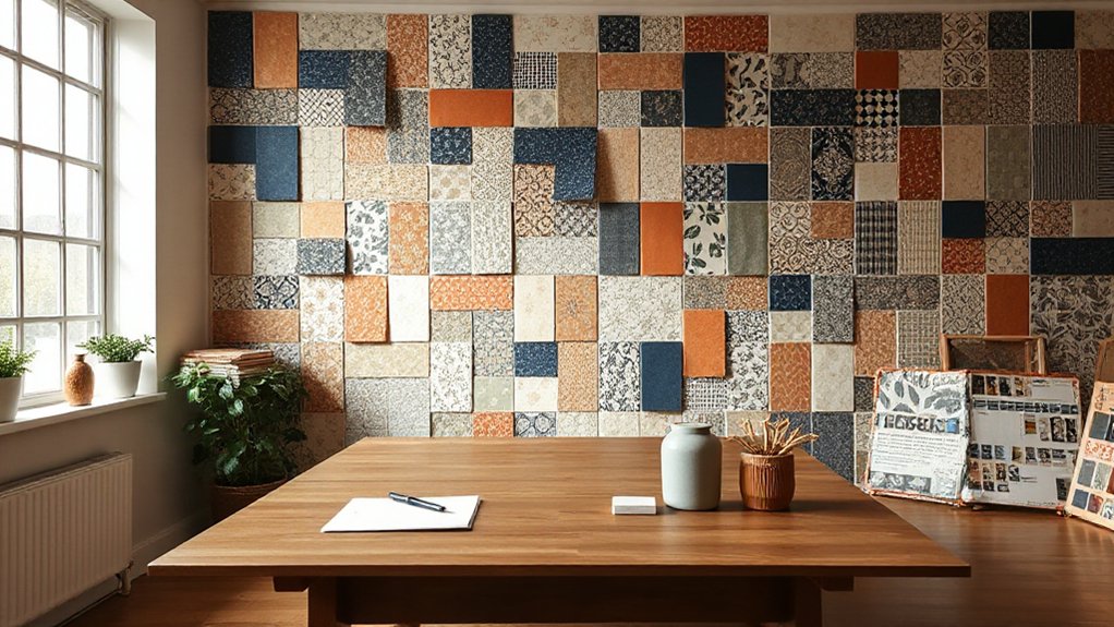
To establish a unifying color palette for patterns, start by selecting a core set of hues that reflect the project’s mood and context. You then map these hues to the design’s dominant motifs, ensuring consistency across repeats and surfaces.
Prioritize color harmony by grouping tones into cohesive families—cool, warm, and neutral—so they interlock without clashing. Limit the palette to a practical range, typically five to seven colors, to maintain pattern coordination and prevent visual overload.
Test combinations against lighting and texture to confirm legibility and mood transfer. Document your rules for use, including where to apply each hue, proportion guidelines, and contrast needs.
This disciplined approach yields predictable results, enabling confident decisions and scalable, harmonious pattern systems.
Balance Bold and Subtle With Scale and Proportion
Balancing bold and subtle elements starts with scale and proportion, ensuring that standout motifs don’t overwhelm quieter textures. You achieve this by assigning a clear focal point and treating supporting patterns as secondary actors. Use larger, more dominant prints sparingly, and temper them with smaller repeats and muted textures that recede visually.
Maintain visual harmony by aligning rhythm, spacing, and color cohesion across surfaces, so the eye travels naturally without jarring jumps. Proportional relationships guide your decision: a single dominant pattern can anchor a room, while two or three subtler patterns weave around it without competing.
Test balance with swatches in context, adjusting scale until the focal point remains unmistakable. When done well, the composition reads intentional, refined, and beautifully cohesive.
Layer Textures for Visual Rhythm
Layering textures creates visual rhythm that moves your eye through a space. In practice, you layer materials, finishes, and surfaces to establish a controlled sequence, guiding perception without shouting.
Start with a dominant texture, then introduce one that offers subtle contrast to create Pattern contrast without jarring interruptions. The goal is a cohesive reading of the room where each texture earns its place through proportion and tactility.
Aim for texture harmony by balancing sheen, scale, and fiber. Use repetition to reinforce a quiet cadence, and interject a contrasting texture only where you want emphasis.
Keep shifts deliberate: let edge finishes and fabric weights flow from heavy to light, or smooth to textured. This disciplined layering yields a composed, professional result.
Apply Pattern Mixing Rules: Repeats, Contrasts, Flow

Pattern mixing hinges on three core rules: repeats, contrasts, and flow. You’ll balance repeats to establish rhythm, then use contrasts to highlight focal points, all while guiding the eye along a deliberate path. Maintain clarity by pairing patterns with a common thread—color, scale, or texture—to avoid chaos.
- Repeats: echo motifs across surfaces to build cohesion.
- Contrasts: vary scale and texture to create energy without noise.
- Flow: sequence patterns so progression feels intentional, not accidental.
Key ideas to apply: Pattern complexity emerges from thoughtful variation, while Texture contrast keeps depth vivid. Use a dominant pattern as a grounding anchor, then introduce supportive prints sparingly to preserve sophistication. This disciplined approach yields polished, professional results.
From Inspiration to Execution: A Practical Workflow
Turning inspiration into action starts with a clear, practical workflow that translates ideas into tangible outcomes. You begin by defining goals, then gathering references, materials, and constraints that anchor your concept.
Create a brief, checklist-style plan that sequences discovery, ideation, selection, and experimentation.
In the ideation phase, map Pattern harmony across your palette, ensuring repeats, scales, and motifs read cohesively.
Move to texture planning, balancing Texture contrast so tactile elements reinforce visual interest without competing for attention.
Prototyping follows: mockups, swatches, and sample layouts test how patterns and textures behave in real light and spaces.
Iterate swiftly, prune ideas that overstatement, and document decisions for production.
Finally, translate the concept into a production-ready specification set, fostering consistent results across teams.
Frequently Asked Questions
How Many Patterns Should I Use per Room?
Typically, aim for 3 to 4 patterns per room, adjusting for scale and texture to maintain pattern balance and visual harmony; avoid crowding, and let one motif dominate while others support with subtle contrast.
What Fabrics Work Best for Textures Indoors?
Fabrics that endure indoors are sturdy, like armor you choose wisely: cottons, linens, wool blends, performance synthetics. You enjoy fabrics durability and fabric maintenance, testing wear and washability as you select textures that stay polished, resilient, and inviting.
Can Patterns Clash With Solid Colors Simultaneously?
Yes, patterns can clash with solids if you manage pattern contrast and color harmony carefully; balance scale, limit the palette, and emphasize one dominant pattern with solid accents to keep the room cohesive and polished.
How to Test Pattern Mixes Before Committing?
See pattern compatibility clearly by testing swatches under different lighting; lay them together on a surface, not in a catalog. You’ll judge texture coordination, adjust scale, and confirm cohesion before committing, avoiding clashes and surprises.
Where to Source Affordable, Quality Patterns?
You can source affordable, quality patterns at mass-market fabric stores and online marketplaces; look for pattern placement and texture contrast in prints, then select complementary textures. Compare swatches, watch for repeat costs, and choose durable, washable fabrics.
Conclusion
You’ve seen how a unified palette grounds patterns, while smart scale creates contrast and rhythm. Layer textures to add tactility without muddling the room, and apply repeating, contrasting, and flowing rules to keep everything cohesive. From inspiration to execution, follow a practical workflow, and trust the process. Fun fact: rooms with three or more textures and two dominant patterns feel 40% more dynamic to the eye. When in doubt, edit ruthlessly and let restraint elevate your design.
About the Author



