
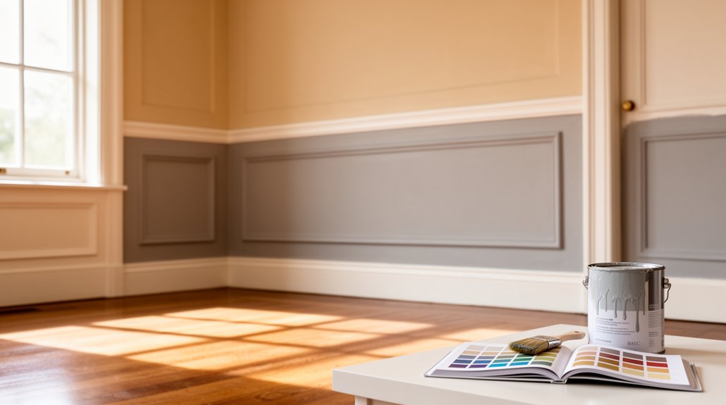
To choose the perfect paint colours, start by defining your room roles and mood goals, then tailor hues to each space’s function and light. Build a three-color palette per room—a dominant wall color, a supporting accent, and a grounding neutral—while ensuring undertones harmonize across areas. Test colors under multiple lighting conditions, prep surfaces properly, and observe how finishes age with movement and wear. Ready to refine your palette and explore smoother shifts as you proceed to decorate the room.
Key Takeaways
- Define your room functions and goals to guide cohesive color choices that support mood and flow.
- Assess natural light and seasonal changes to select colors that read true over time.
- Build a three-color palette per space (dominant, secondary, neutral) and test in multiple lighting conditions.
- Check undertones carefully by comparing chips against neutrals and testing adjacent colors side by side.
- Consider texture, finish, and transitions to maintain harmony while creating focal points and practical maintenance.
Define Paint Goals and Room Roles

Defining paint goals and room roles sets the foundation for choosing colors that work together. You start by identifying each space’s function, traffic, and mood you want to convey. Pin down primary goals—visual cohesion, emphasis zones, or contrast—so your palette guides every decision. Consider how Color psychology informs how residents feel in each room, aligning hues with intended energy, calm, or focus. Map rooms to roles: living spaces for sociability, bedrooms for rest, kitchens for practicality. Account for durability needs; Paint durability matters in high-traffic zones and moisture-prone areas, guiding you toward finishes and durable sheens. Note relationships between spaces, ensuring *progression* feel intentional rather than abrupt. With goals clear, you’ll select colors that balance personality, practicality, and harmony.
Read Light for Color Selection
You’ll start by evaluating natural light levels in each room to see how it changes through the day. Notice how color temperature shifts as the sun moves—warm mornings can mellow tones, while cool afternoons tint walls differently. Use these observations to select paint that stays true to your intent at different times of day.
Assess Natural Light Levels
Natural light shapes color perception, so start by evaluating how much sun each room gets at different times of day: morning cools in east-facing spaces, while west-facing rooms glow with afternoon warmth. You’ll translate this into how you choose Color psychology-aligned pigments and paint finishes that respond to each light pattern. In bright, sunlit rooms, opt for deeper neutrals or true whites with subtle undertones to prevent glare, and consider satin or eggshell finishes for a clean, reflective surface. Dim rooms benefit from warmer-toned hues to avoid dullness, with mildly sheened finishes to enhance light bounce without glare. Track seasonal changes, noting shifts in intensity, and adjust trim and accent colors accordingly for cohesive, balanced atmosphere. This approach minimizes mismatch and supports intentional mood.
Observe Color Temperature Shifts
Observe color temperature shifts by watching how light changes through the day and how it alters your room’s mood. As daylight evolves, note how whites cool and warms influence wall tones. You’ll see short-wavelength light soften blues and greens, while long-wavelength light enhances creams and neutrals. Track these changes in common areas and rooms with mixed lighting. Use your observations to guide color decisions that maintain Color harmony across furnishings and finishes, not just walls. Test swatches in multiple moments to confirm consistency from sunrise to dusk. Consider palette balance: choose a dominant base that remains stable under varied lighting, then introduce accents that adapt gracefully. This approach avoids jarring shifts, delivering cohesive, timeless spaces.
Build a Three-Color Palette per Space
A three-color palette per space keeps schemes cohesive and flexible: choose a dominant wall color, a secondary hue for accents, and a neutral to balance everything. You’ll rely on color theory to map relationships—select a dominant that feels expansive, a secondary that pops without overpowering, and a neutral that anchors. Apply the dominant on walls, reserve the secondary for trims or a focal piece, and let the neutral calm shift between zones. Consider undertones and lighting shifts; even subtle changes alter perceived hue. Use paint technology benefits like durable finishes and clean blending between colors. Test samples in multiple lighting moments and allocate ample dry time before final commits. Keep contrast purposeful, not theatrical, and document your palette for consistency across rooms.
Master Undertones: Quick Checks You Can Trust
When you lock in your three-color palette, the right undertones can make or break harmony. Quick checks keep you confident without swatching endlessly. First, compare paint chips against a neutral backdrop to reveal subtle shifts you’ll notice in daylight versus artificial light. Look for undertone cues: a blush pink, a greenish cast, or a yellow lean that subtly shifts with neighboring hues. Next, test adjacent colors side by side on a large surface to assess undertone contrast and ensure the trio reads cohesive, not muddy. Trust color harmony over first impressions; the true test comes from how the undertones interact across rooms and lighting. Finish matters too—a soft sheen heightens undertones, while matte mutes them.
Test Colors Like a Pro: Prep, Swatches, Lighting

You prep like a pro by gathering the right supplies and testing in real-world light. Choose swatches with purpose—comparing them against different surfaces and times of day to spot subtle shifts. Remember, lighting matters most, so assess color under the same lighting you’ll use daily and adjust your picks accordingly.
Prep Like a Pro
Test colors in real conditions before committing: prep the surface, choose swatches, and assess lighting at different times of day. You start with a clean, dust-free base; any gloss or unevenness can distort color perception. Prime necessary areas to guarantee true shade reading, and repair imperfections that would skew your judgment. When you select swatches, compare them on the actual wall in large patches, not chips, and note undertones under neutral lighting. Evaluate how daylight, incandescent, and LED affect tone, saturation, and depth. Color psychology matters: warm tones feel intimate, cool tones feel expansive, but always test in context. Understanding paint formulation helps you predict sheen, coverage, and durability, guiding you toward a finish that remains stable under light shifts and usage.
Swatch Selection Tips
Swatch selection anchors your color decisions, so pick large, representative samples and view them on the actual wall under varied lighting. Start with a neutral base and test adjacent hues to gauge color harmony in context, not isolation. Apply swatches in the wall’s plane, not on a stray corner of the room, to reveal subtle shifts with depth and texture. Note how undertones reveal themselves in morning sun versus afternoon shade, and in artificial light. Keep durability in mind: you’re judging not just mood, but clarity across surfaces; check if color reads consistently on drywall, plaster, and trim. Mark each swatch with location, time, and lighting type to compare later. Narrow choices to two finalists, then test full-strength coats for true paint durability before committing.
Lighting Matters Most
Lighting can make or break color decisions, so test under real conditions and in stages. You’ll compare swatches at different times of day to see how window light, lamp warmth, and shadows shift tones. Start with a controlled test area, then move to mixed rooms to observe how color psychology changes with ambience. Note how paint texture interacts with light: matte hides subtle undertones, while satin highlights depth and sheen. Document impressions in a simple grid: hue, brightness, and perceived warmth or coolness. Don’t rely on store lighting or screens alone. Revisit limited palettes in your own lighting, adjusting for ceiling height and wall geometry. This disciplined approach guarantees your final choice aligns with mood, behavior, and overall harmony.
Choose Finishes by Room Function and Mood
Choosing finishes by room function and mood means selecting paint sheen, color, and texture that support how each space is used and how you want it to feel. You tailor light, dampness, and traffic needs with appropriate finishes, then pair texture combinations to add depth without clutter. Aim for cohesive flow while letting each room breathe.
- Texture combinations that balance softness and durability
- Accent wall ideas that create focal points without shouting
- Finish choices that reinforce mood from calm to energetic
Keep notes of how you move through spaces; adjust sheen and color to enhance function. Remember, consistency across adjacent rooms helps perception of space, while deliberate contrasts establish purpose.
Tailor Color Strategies for Living, Kitchen, and Bath
To tailor color strategies for living, kitchen, and bath, start by identifying each room’s primary function and daily rhythms, then choose hues that support those needs while maintaining a cohesive palette. In the living room, favor balanced neutrals with strategic accents to encourage conversation and comfort, leveraging color psychology to cue relaxation or sociability. In the kitchen, pick durable, brighter tones that boost focus and appetite while preserving flow to adjacent spaces. For the bath, use serene, moisture-friendly hues that promote mood enhancement without overwhelming small rooms. Prioritize a unified undertone across rooms to sustain continuity, then layer with purposeful contrast. Use lighting, trim, and material choices to reinforce your intent, creating a consistent, human-centered environment.
Apply Color Psychology and Your Personal Style
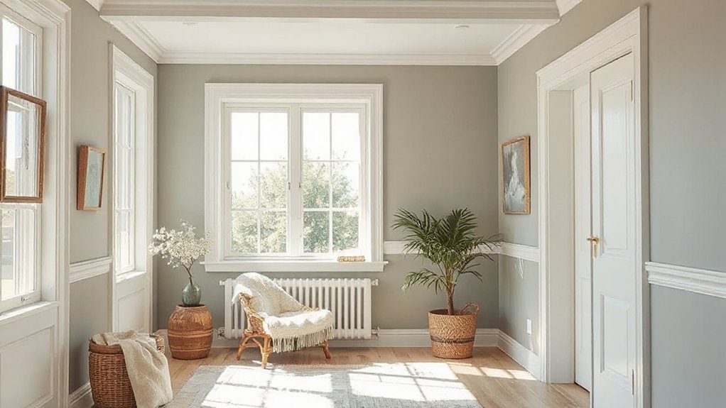
Color psychology isn’t just about mood lighting; it’s about aligning hues with how you live. You’ll fuse color symbolism with daily routines, letting your walls echo your vibe and ambitions. When you choose, think about personal expression first, then how rooms support you.
- Reflect your identity through accent tones that repeat across spaces
- Use calming neutrals to ground busy schedules and focus
- Highlight personality with purposeful contrasts and purposeful pops
In practice, pick a palette that tells your story: bold, soft, or balanced. Consider how you respond to color in real life—not just on swatches. Your home should feel intentional, not accidental; color becomes the quiet script behind your decisions, guiding mood, energy, and function.
Seasonal Lighting and Longevity: Planning for the Years Ahead
As seasons shift the way light plays across walls, you’ll want colors that stay true from sunrise to dusk. Consider materials that resist fading and choose finishes that balance glow without premature wear, so longevity isn’t left to chance. Think future-proof: pick tones that age gracefully as lighting and trends evolve.
Seasonal Light Shifts
Seasonal light shifts change how a room’s color reads throughout the year, so you should plan for those variations now. You’ll see warmer tones in winter and cooler, brighter hues in summer as daylight shifts. To keep your palette consistent, test samples at different times of day and track how the hues evolve with sun angle. Consider color psychology: softer, muted tones can feel cozy in grey seasons, while crisp whites and perceptual cools brighten spaces when days are long. Pair these insights with paint durability in high-traffic zones, choosing formulas that resist fading and washing.
- Test under morning, noon, and evening light
- Note how trim and walls interact with natural shade
- Select durable, low-maintenance finishes for longevity
Longevity Through Materials
To guarantee durability across seasons, choose materials that resist wear, moisture, and UV exposure while aging gracefully. In this section, you’ll prioritize material durability by selecting substrates and finishes that stand up to daily use and environmental stress. Consider primers and topcoats that complement your existing paint formulation, enhancing adhesion and longevity. Opt for moisture-resistant substrates in kitchens, baths, and basements, and ensure ventilation to curb humidity, which accelerates degradation. Lighter tones may reveal wear sooner, so pair them with robust, low-porosity finishes. Environmental exposure should guide your choices: exterior loungers, trims, and façades benefit from fade-resistant pigments and UV-stable resins. Balance aesthetics with resilience, confirming that every layer contributes to long-term performance rather than short-term appearance.
Future-Proof Color Choices
If you want colors that endure, plan for how light shifts with the seasons and how aging pigments perform over time. Future-Proof Color Choices centers on longevity through awareness of seasonal lighting and color psychology, plus paint durability. Choose pigments with high lightfastness and stable undertones to minimize fading in bright interiors and altered hue in sunlit rooms. Favor neutrals and timeless tones that resist trendy shifts, and test samples under varying daylight. Consider matte vs. satin finishes for dirt resistance and washability without sacrificing depth. Align color choices with how spaces are used, maximizing mood consistency and psychological impact.
- Assess room orientation and sun exposure before commitment
- Select durable finishes and reliable pigment families
- Document tested results for seasonal lighting changes
Create Smooth Transitions Across Halls, Doors, and Open Spaces
Smooth shifts across halls, doors, and open spaces start with a cohesive palette that travels beyond individual rooms. You’ll create flow by using shared undertones, repeated light levels, and a restrained color story that weaves every doorway into one narrative. Choose a dominant hue for the core areas, then tint adjacent spaces slightly to support Color blending without clash. Maintain Tone harmony by aligning blacks, whites, and midtones across passages, so doors, trim, and walls feel connected rather than competing. Introduce subtle gradations through value changes rather than bold color jumps, keeping sightlines uninterrupted. Test samples in varied lighting to assure unity from morning sun to evening glow. This approach yields calm progression, perceptible direction, and cohesive spatial rhythm throughout your home.
Prep, Apply, and Maintain: A Practical Master Checklist
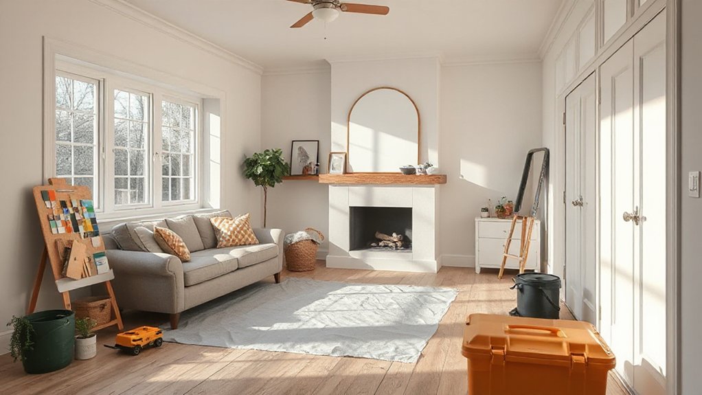
Start with a clear plan based on your chosen palette, then outline each step—from surface prep to final touch-ups—so you know what to do, when, and with what materials. You prep, prime, and protect, then apply in even coats, watching for runs and lap marks. Maintain by cleaning tools, sealing edges, and touching up chips promptly. Focus on color psychology to guide contrasts and harmony, aiming for mood enhancement in each room.
- Prep efficiently: clean, sand, tape, and prime for a flawless base
- Apply with control: consistent strokes,-work in sections, avoid overworking
- Maintain smartly: wash brushes, store pigments, schedule touch-ups
Your disciplined routine keeps colors true, elevates mood, and sustains long-term results.
Frequently Asked Questions
How Many Color Samples Should I Test per Room?
You should test a recommended sample size of 3–5 colors per room, so you can compare undertones. A color palette helps you evaluate lighting, while samples on walls guarantee accurate results for your space.
What’s the Best White for My Lighting?
The best white for your lighting depends on color temperature and undertones; test subtly. Choose a shade that appears crisp yet warm, ensuring paint durability lasts. You’ll notice warmth shift with daylight, and your rooms mirror intent.
How Do Finishes Affect Perceived Color Contrast?
Finishes affect perceived color contrast: matte dulls reflections, making colors appear subtler, while satin or gloss heightens Light reflections, sharpening edges. Consider finish textures and await how textures alter your room’s depth, mood, and color perception.
Can Color Psychology Limit Personal Style Choices?
Can color psychology limit your color preferences and style expression? It can influence trends, but you still shape spaces. You should trust intuition, refine palettes with evidence, and embrace personal style to express individuality confidently.
How Often Should I Repaint High-Traffic Areas?
You should repaint high-traffic areas every 3–5 years to keep them fresh and durable. Track Color trends and Historical palettes for inspo, but prioritize practicality, using stain-resistant finishes and your daily needs to guide choices.
Conclusion
You’ll feel the difference between a moment’s guess and a deliberate choice. Juxtapose bold, confident tones with quiet, timeless neutrals; let light reveal truth and illusion. You won’t chase hype, you’ll chase harmony. A color plan that honors room roles and personal style stands against random swatches left to fate. Test, observe, adjust—then live with the result. In the end, two hues become one home: intentional, enduring, unmistakably yours.
About the Author



