
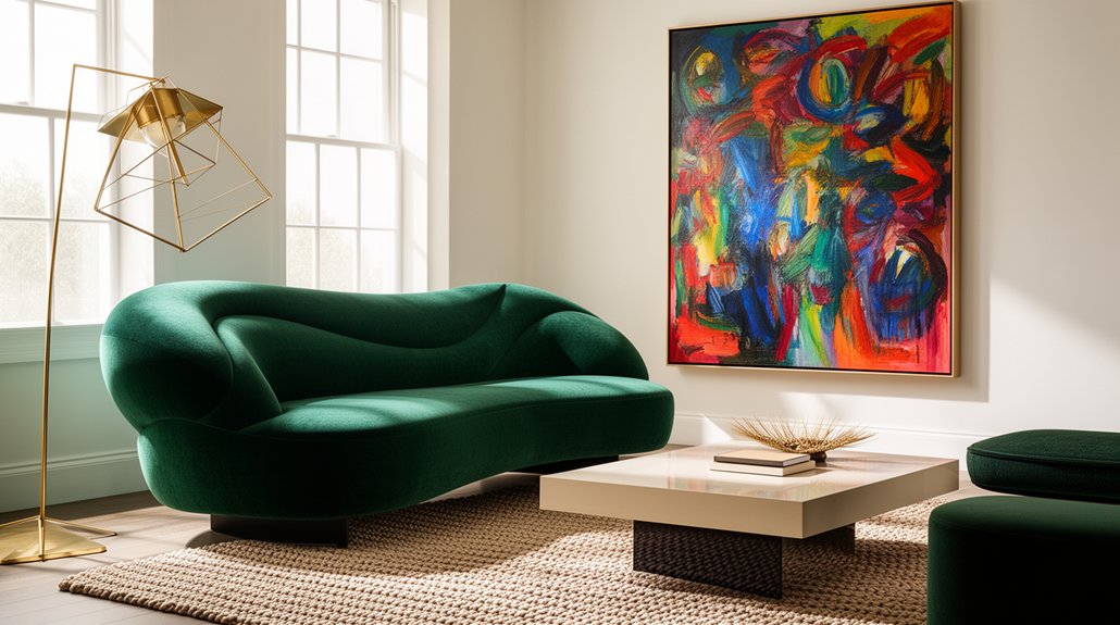
Choose one hero piece to ground the room, then build around it with coordinated color, texture, and scale to create a bold, cohesive statement. Define the focal area and place the hero at eye level to anchor the space. Layer colors and textures that echo the hero, vary accessory heights, and mix finishes for depth. Light the piece strategically with dimmers and spotlights. Test, tweak, and personalize to balance function and drama as you go—more tips await.
Key Takeaways
- Define a single hero piece and place it at eye level to anchor the room and guide the eye.
- Choose a focal area with contrasting color, texture, or scale to create visual interest.
- Layer accessories with varying heights, finishes, and textures to enhance depth around the hero.
- Use strategic lighting and dimmers to highlight texture, line, and the focal piece.
- Ensure cohesion by aligning color, scale, and repetition of motifs for balanced functionality.
Define Your One Hero Piece and Why It Sets the Tone

Your one hero piece should anchor the room and set the tone for everything else. You choose it with purpose, so it acts as the focal point that guides every other element. Before you select, define its role: does it ground the space, spark conversation, or convey your personality? Once identified, you shape a clear visual hierarchy—let the hero lead, with secondary pieces supporting without competing. You’ll balance scale, proportion, and placement so the eye lands here first, then travels outward. Keep color, texture, and finish intentional to reinforce the piece’s dominance while remaining cohesive with the rest of the design. You guarantee the hero isn’t loud for loud’s sake; it’s refined, purposeful, and unmistakably yours.
Select Colors and Textures That Support the Hero
Color harmony ties your hero piece to the rest of the room, so choose shades that echo or complement its undertones without competing. Mix textures that add depth—think matte, gloss, and tactile fabrics—to enhance the hero without stealing attention. Use a concise guide to balance color and texture, ensuring the hero remains the focal point while the accessories support a cohesive whole.
Color Harmony Points
When selecting colors and textures to support the hero, focus on those that enhance its presence without competing for attention. Color harmony points guide you to pair neutrals with a chosen accent, ensuring the hero remains the room’s focal ride. Prioritize color contrast to create clear separation between the hero and supporting elements, so the centerpiece reads with definition rather than distraction. Use hue coordination to unify disparate textures, balancing matte and sheen without overstatement. Choose fabrics and finishes that echo the hero’s undertone, reinforcing coherence while preserving visual energy. Limit chroma in surrounding pieces, allowing the hero’s color to dominate through thoughtful contrast. The result is a polished, cohesive space where the statement piece leads confidently.
Texture Impact Guide
Texture often acts as the bridge between a hero piece and supporting elements; choose tactful textures that enhance presence without competing for attention. You select colors and textures that reinforce the focal piece, not overpower it. Start by pairing fabric patterns with solid surfaces to create controlled contrast and visual balance. Favor material contrasts—soft textiles against sleek materials—to add dimension without distraction. In practice, align the scale of textures with room size: larger textures for expansive spaces, finer details for intimate rooms. Use repetition to unify the ensemble, so your hero remains dominant. Avoid clashing patterns and overly busy surfaces. Limit the palette to two or three tones, letting texture carry the nuance. Finally, test under different lighting; subtle shifts reveal texture’s true impact.
Master Scale and Proportion to Amplify Drama
Mastering scale and proportion is the quickest way to amplify drama in a room. You enforce impact by aligning a statement piece with the room’s proportions, then balancing surrounding elements to support it. Begin with a focal anchor—large artwork, oversized sculpture, or a substantial furniture piece—and field it with complementary surfaces that don’t compete. Balancing symmetry can create calm certainty, while deliberately breaking it adds tension; choose one approach to suit your mood. Incorporate contrast through materials, textures, or color relationships to heighten visual interest without overwhelming the space. Keep lines clean and avoid crowding; negative space becomes part of the drama. Measure height, width, and depth so every element plays its part, not outshines it. Prioritize cohesion over quantity to achieve a confident, curated result.
Light the Hero: Spotlight the Statement With Strategic Lighting
Strategic lighting makes your statement piece sing. You sculpt focus with purpose, choosing fixtures that shape the space rather than overwhelm it. Position light to reveal texture and line, not glare, so your piece reads as intentional art. Use a mix of ambient glow sources to create a soft, welcoming backdrop while you reserve high-impact lamps for emphasis nudges—think a gallery approach, not a showroom flood. Dimmer controls are your ally, letting you adjust mood as the room shifts from day to night. Consider color temperature for warmth or contrast, ensuring the piece remains the focal point without competing shadows. Let shadow play highlight contours, depth, and nuance, enhancing perceived value and sophistication.
Weave Cohesion: Accents, Balance, and Flow

Weave cohesion by balancing accents, color, and scale so every piece feels intentional within the room. You shape flow by aligning accents with the overall palette and the room’s architecture, not by randomly placing objects. Favor deliberate accent placement to highlight focal points—shelves, art, or a standout chair—while the rest remains supportive. Maintain color coordination across textures and finishes, so tones repeat or gently contrast without shouting. Balance means pairing bold pieces with quieter surfaces to prevent visual overload; use scale to ensure objects sit comfortably within sightlines and pathways. Keep transitions seamless by repeating motifs—patterns, metals, or wood tones—throughout. This approach yields a cohesive, intentional space where each statement piece reinforces the room’s rhythm and harmony.
Test, Tweak, and Personalize Your Look
Try several looks first by testing different arrangements and lighting to see what truly feels right. Refine your choices by adjusting materials and scale until the balance lines up with your space and routines. Then personalize now by integrating pieces that reflect you, ensuring every element supports your everyday use and taste.
Test and Refine Looks
To refine your look, test a few arrangements and then tweak what doesn’t feel right until it does. Start with furniture placement that encourages flow and function, not just aesthetics. Move major pieces and observe sightlines, entry points, and focal walls. Next, layer decorative accents in small, purposeful increments—swap vignettes, switch lamps, swap textiles—to judge impact without overcluttering. Evaluate scale, balance, and rhythm: does a bold piece dominate or complement the room’s tone? Document responses briefly to guide decisions rather than guessing. Aim for cohesion across zones, ensuring each item reinforces the overall mood. Give yourself a brief cooling-off period after changes, then reassess with fresh eyes. Refined looks emerge from deliberate testing, measured tweaks, and consistent alignment with your design goals.
Tweak Materials and Scale
When you tweak materials and scale, start by evaluating tactile and visual weight across the room. You’ll test how different textures interact, from matte to glossy, and how weighty objects anchor or float within spaces. Prioritize material contrast to create focal points without shouting; pair soft fabrics with hard surfaces to refine depth and interest. Adjust scale balancing by varying heights, widths, and proportions among statement pieces so no single element dominates. Consider rhythm: alternate dense textures with lighter, airier materials to maintain balance. Move pieces incrementally, noting how changes affect light reflection, acoustics, and perceived spaciousness. Document results, then reinforce successful tweaks with cohesive finishes and consistent color undertones for a poised, intentional look.
Personalize Your Space Now
Personalize your space now by testing ideas, tweaking details, and aligning them with your unique style. To optimize impact, pick one focal area and experiment with contrasting elements—color, texture, scale—until you feel the room resonates. Assess how artwork placement guides attention: center a statement piece at eye level, or create a dynamic grid with smaller works for a curated gallery vibe. Don’t hesitate to move pieces, then pause to observe how daily activities change the room’s mood. In parallel, invest in accessory layering: alternate metallics with natural textures, blend vintage finds with contemporary silhouettes, and vary heights to add depth. After each adjustment, evaluate comfort, flow, and cohesion, ensuring the space remains functional while expressing your personality.
Frequently Asked Questions
How Can You Measure the Shelf Life of a Statement Piece?
You can estimate shelf life by inspecting artistic contrast and testing material durability; monitor cracks, fading, and sturdiness over time, noting wear patterns. Keep records, replace fraying or weakened pieces, and factor climate, usage, and maintenance into longevity expectations.
What Budget Changes Are Wise When Adding a Hero Item?
Invest smart: you allocate 60% to the hero item’s luxury upgrade, 40% to supporting pieces. After a story of a standout lamp, you see Budget prioritization and luxury upgrades align, ensuring lasting impact without overspending. You stay intentional.
How to Avoid Overpowering a Small Room With One Piece?
To avoid overpowering a small room, you scale balance by choosing a statement piece that respects the space, using color contrast thoughtfully to keep focus intact and avoid crowding. You maintain balance, letting color contrast guide the eye.
Can Multiple Heroes Coexist Without Clashing Aesthetics?
Yes, multiple heroes can coexist without clashing aesthetics. You balance Color coordination and Style blending by choosing a unifying palette, varied textures, and distinct silhouettes, ensuring each piece stands out yet supports the whole scene.
What Are Quick Fixes if the Piece Feels Off-Harmonized?
If the piece feels off-harmonized, adjust color coordination and texture balance first. You can tweak lighting, introduce a nearby neutral, or swap a small accessory to restore flow while maintaining your focal statement.
Conclusion
You’ll stand in a room where a single piece commands the scene, like a lighthouse guiding calm seas through a storm. Colors hum around it, textures whisper at your touch, and every scale kisses the eye with intentional drama. Strategic light follows the piece, casting shadows that soften edges and reveal intent. When you blend accents, balance, and personal warmth, your space breathes — cohesive, confident, unmistakably yours. Your statement piece isn’t just decor; it’s the story you live in.
About the Author



