

To decorate with natural textures for an organic interior style, start with a calm base of warm neutrals and introduce materials like linen, wool, wood, stone, and clay. Layer textures—soft fabrics, matte finishes, and tactile accents—while keeping a cohesive palette of three to five hues. Favor sustainable sources, mix textures with restrained contrasts, and let aging add character. Layer lighting to highlight texture, and maintain the space with mindful care; you’ll discover how the spaces evolve gracefully as you progress.
Key Takeaways
- Emphasize natural textures like linen, wool, wood, and stone to create warmth, calm, and tactile interest in organic interiors.
- Layer textures with varied fabrics (cotton, linen, wool, velvet) and finishes (oils, waxes, matte sealers) for depth and cohesion.
- Use a restrained color palette (3–5 hues) with warm neutrals and cool undertones to let materials shine.
- Pair rugged textures (stone) with smooth finishes (clay, wood) and balance warm wood tones with cooler metals for harmony.
- Prioritize sustainable materials and natural aging, ensuring care, environment control, and thoughtful layering for a timeless, serene space.
What An Organic Interior Looks Like With Natural Textures
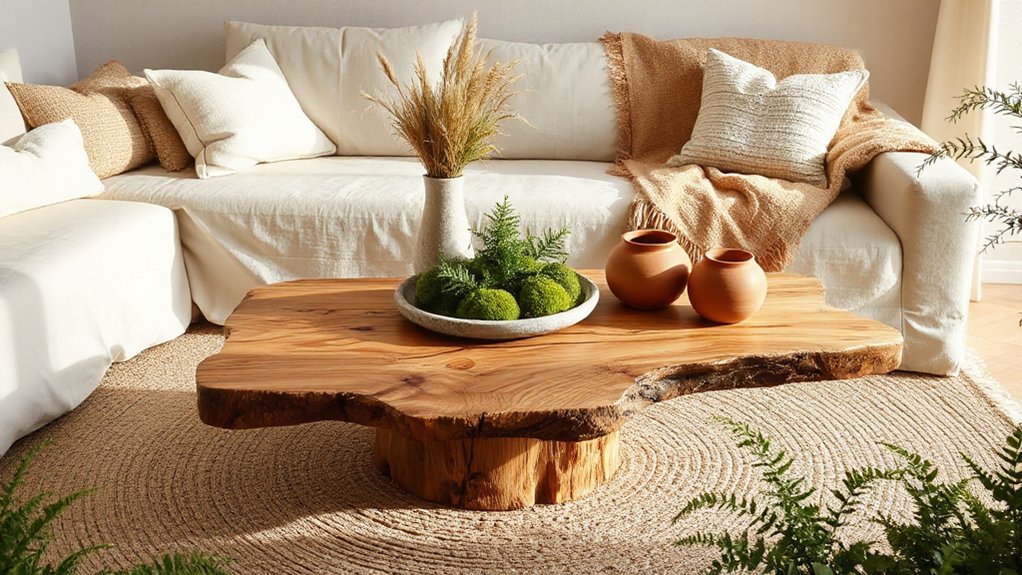
Natural textures bring calm and warmth to an organic interior, grounding the space with tactile cues like linen, wool, wood, and stone. You maintain a cohesive mood by selective color coordination, pairing earth tones with muted accents to preserve subtle harmony. Texture contrast matters: smooth surfaces against rough fibers, matte finishes beside gentle sheen, create visual interest without shouting. You’ll notice how linen drapes soften a concrete wall, or a wool rug anchors a room with warmth against cool ceramic tile. Keep patterns restrained and scale varied, so none competes with the other. Consistency across furnishings ensures unity; let natural light reveal the fabrics’ depth. The result feels intentional, serene, and genuinely connected to nature.
Choosing Textures: Wood, Stone, Clay, Textiles
You’ll explore how Wood Texture Tone sets the mood while Stone and Clay mixes add contrast and warmth. Consider how these textures interact with textiles to balance softness and structure in a room. This discussion will help you pair woods, stones, and clays with fabric choices for cohesive, natural appeal.
Wood Texture Tone
Wood texture tone sets the foundation for warmth and cohesion in a space, guiding how other materials read and feel. You’ll notice how grain, shade, and finish shape perception, influencing depth and balance. Aim for consistent tonal scaffolding to maximize textural contrast and material harmony across surfaces.
- Match warm woods with complementary textiles and stone accents to elevate contrast without overpowering.
- Vary finishes subtly to create movement while preserving a cohesive mood.
- Prioritize board orientation and grain direction to reinforce flow and rhythm.
- Use curated, natural rations of sheen to maintain sophistication and tactile richness.
Stone And ClayMixes
Stone and clay mixes bring tactile warmth and earthy grounding to a space, balancing the hardness of stone with the sculptural softness of clay. You’ll create texture depth by pairing rugged stone with smooth, matte clay finishes that age gracefully. Use clay mixes for sculptural vases,壁?—no, keep to furnishings and surfaces: plastered walls, ceramic tiles, and refined ceramics that invite touch. Aim for texture contrast across materials: a rough granite countertop against a polished terracotta backsplash, or a chalky lime plaster wall beside a sleek stone sculpture. Keep color restrained to emphasize form rather than hue. Integrate textiles sparingly to spotlight the clay’s tactility. This approach guarantees cohesion without busy clutter, delivering a polished, restrained organic look that feels timeless and thoughtfully composed.
How To Choose A Color Base For Natural Textures
Choosing a color base for natural textures starts with understanding temperature and contrast. You’ll set a foundation that lets organic materials speak clearly, without overpowering them. Prioritize color harmony and deliberate hue selection to keep spaces calm and cohesive.
- Start with warm neutrals (beige, taupe) to anchor stone, ceramic, and wood without competing textures.
- Opt for cool undertones (soft gray, blue-gray) to create subtle contrast that reads refined.
- Balance light and dark values so textures read as a unified whole rather than busy patches.
- Limit the palette to three to five hues, allowing each texture to contribute its natural nuance.
This approach yields timeless sophistication, ensuring natural elements shine through rather than fight for attention.
Layering Textures For Depth And Warmth
Layered textile textures create immediate visual interest, while warm materials invite you to linger. Use a mix of fabrics, leathers, and natural fibers to build depth, balancing sheen with matte finishes. Play with the palette to emphasize dimension: lighter tones recede, richer hues advance, and subtle contrasts amplify warmth.
Layered Textile Textures
Layering textile textures adds depth and warmth to a space by combining varied fabrics, weights, and finishes. You’ll create visual interest and tactile contrast by mixing cotton, wool, linen, and velvet with careful scale and sheen. This approach hinges on Textile layering and Texture contrast, so you guide the eye through deliberate pairings and subtle *shift*.
1) Balance lightweight and heavyweight fabrics to prevent visual heaviness while maintaining coziness.
2) Vary textures in each zone—sofa, throws, pillows, and window coverings—for cohesive rhythm.
3) Favor natural tones and tactile finishes that reflect the room’s organic sensibility.
4) Use neutral backdrops to let textures speak, then introduce a restrained accent color.
Warmth Through Materials
Warmth comes from how you combine materials, not just the colors you choose. You layer textures to create tactile depth, pairing rough with smooth and matte with sheen. Think locally sourced wood, natural fibers, and stone with subtle metallic accents to catch light without shouting. Seasonal color should influence your palette, not overwhelm the texture game, letting earthy tones anchor the room while accents shift with the season. In modern minimalism, restraint matters: select a few material stories and repeat them across cushions, throws, and surfaces for cohesion. Avoid overfilling; each piece should earn its place. The result is inviting warmth that feels deliberate, not cluttered, and comfort that persists beyond trends, while maintaining a clean, refined aesthetic.
Depth With Palette Play
Texture depth comes from thoughtful palette play: choose colors that echo your materials and let undertones nuance each layer. You achieve warmth by balancing hue, saturation, and texture so every surface speaks in a controlled chorus. Focus on color harmony first, then introduce texture contrast to carve dimensionality without shouting.
- Pair matte and gloss finishes within a cohesive color family to emphasize subtle depth.
- Layer warm neutrals with accent tones drawn from natural textures for cohesive contrast.
- Use darker undertones in trims or furniture to ground lighter textiles and walls.
- Test scale and proportion, ensuring fabrics, woods, and metals share a unifying undertone for clarity.
Lighting Natural Textures For Warmth

To illuminate natural textures effectively, choose lighting that emphasizes their irregularities and depth rather than flatly illuminating everything. You’ll create warmth by layering sources: a dim, indirect base with targeted highlights on textiles, stone, and timber. Prioritize Sustainable lighting that reduces glare while revealing tactile detail, using warm color temperatures to mimic sunset hues. Mix ambient illumination with selective task light to sculpt shadows and depth without washing textures flat. Consider fixtures in natural materials—woven shades, clay or stone sconces, or timber pendants—that echo the textures you feature. Dimmer controls are essential, enabling you to adjust mood without sacrificing texture definition. Guarantee consistency across rooms so warmth feels intentional, cohesive, and inviting rather than disparate. This approach sustains comfort while honoring organic materials.
Mix Wood And Metal Without Visual Clash
To mix wood and metal without visual clash, balance grain and shine so neither dominates. Pair warm wood tones with cooler metal finishes to create contrast that reads cohesive, not conflicting. You’ll guide the eye by aligning texture and sheen, keeping contrast intentional and restrained.
Balance Grain And Shine
Are you balancing grain and shine to keep wood and metal from clashing? You can achieve harmony by treating wood and metal as partners, not rivals. Focus on grain contrast and shine balance to guide decisions.
- Align finishes: pair a matte wood with brushed metal to keep glare low and texture focused.
- Vary scale: choose large grain on wood with small, subtle metal detailing for visual rhythm.
- Repetition over matching: echo a single wood tone in hardware or frames to knit elements together.
- Lighting cues: soft, warm light enhances natural grain while minimizing reflective hotspots.
Contrast Warmth And Chill
Finding warmth and chill in wood-and-metal pairing is about thoughtful contrast, not competition. You weave warmth with metal’s coolness by choosing finishes that harmonize rather than clash. Start with a shared undertone—waxed oak paired with brushed bronze, or a charcoal steel next to honeyed timber—to create Seasonal contrast without jarring shifts. Let Texture layering play a lead role: mix smooth metal with textured wood, or add a matte wall backdrop to soften reflections. Keep scale in mind; larger panels balance smaller hardware, while subtle grain echoes across materials unify the look. Introduce soft textiles and warm lighting to blur the line between hot and cool. The result: cohesive, dynamic spaces where every element complements, never competes.
Calm Textural Focal Points
Calm textural focal points anchor a room by showcasing natural materials in a restrained, deliberate way. You create focus without clutter, letting texture do the talking and guiding the eye with quiet confidence. In this approach, the goal is a purposeful sensory experience that feels effortless and cohesive, not busy or loud.
1) Select a single material as the anchor and frame it with restrained accents.
2) Pair surfaces with subtle contrast to emphasize texture without competing tones.
3) Use light to sculpt form, revealing the depth of each material.
4) Keep scale consistent so every detail supports the overall calm, tactile rhythm.
This balance—textural contrast rendered softly—delivers a refined sensory experience you can live in daily.
Linen, Cotton, Wool, And Other Natural Fabrics
Natural fabrics like linen, cotton, and wool bring tactile richness and breathable comfort to any room, elevating slow, textural moments without shouting for attention. You’ll choose linen for airy drape and visible texture, cotton for everyday softness, and wool for grounding warmth. Prioritize sustainable fibers; they reduce environmental impact while preserving performance. Mix weights to create depth—loose-weave linen paired with a smooth cotton, then layer a chunky wool throw for contrast. When choosing colors, opt for natural hues that age gracefully and pair with varied textures. Seek eco friendly dyes when a pop of tone is desired, ensuring subtle saturation without compromising sustainability. Maintain a crisp approach: limit synthetic blends, and let the fabric’s inherent character lead your styling. Your space stays calm, tactile, and authentically refined.
Finishes For Natural Textures That Age Gracefully
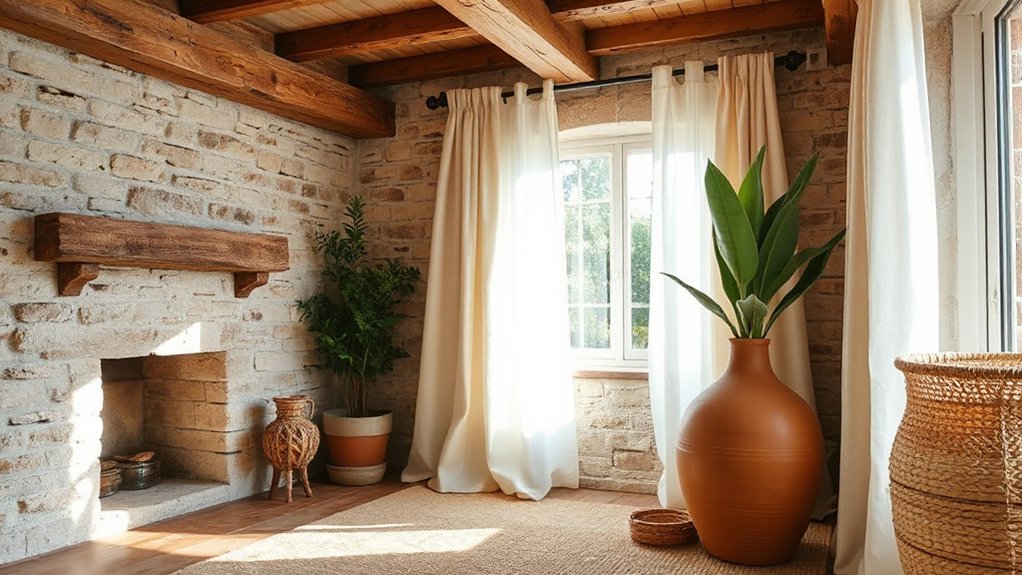
As you choose finishes for natural textures, prioritize patina that ages gracefully, developing character over time rather than revealing wear. You’ll find timeless natural finishes—oil, wax, and low-sheen sealers—enhance warmth while preserving the material’s integrity. Start with a tested, light touch and observe how the surface patinas, guiding future refreshes and updates.
Patina That Ages Gracefully
Patina that ages gracefully arrives from finishes designed to evolve with use, revealing depth and character over time. You’ll notice texture gains warmth as surface marks mellow, inviting touch and attention. This approach favors materials that weather predictably, avoiding glare and artificial shine. Patina aging becomes a signature, not a byproduct, of lived-in spaces that feel honest and inviting. Graceful aging supports a serene palette, where subtle shifts create visual rhythm without distraction.
- Choose finishes that patina with use, prioritizing oils, waxes, or breathable sealants.
- Allow natural marks to accumulate, letting age tell your space’s story.
- Maintain a balanced environment to encourage even development.
- Pair with textiles and woods that complement evolving tones.
Timeless Natural Finishes
Timeless finishes favor natural textures that age gracefully, embracing the character that emerges with use. You’ll achieve this by choosing surfaces that endure, not just look good at first glance. Favor subtle patinas over flash-in-the-pan gloss, allowing wood, stone, and textile grains to signal their age with quiet dignity. Prioritize eco friendly finishes that protect without masking texture, so the material’s inherent feel remains honest to touch and sight. Consider waxes, oils, and low-VOC sealants that deepen color gradually while preserving breathability. Sustainable materials, like FSC-certified wood and natural fiber textiles, pair well with timeless finishes, ensuring a cohesive, long-lasting look. Test finishes on inconspicuous sections to confirm tone and texture, then apply consistently for effortless, enduring sophistication.
Pairing Greenery With Natural Textures
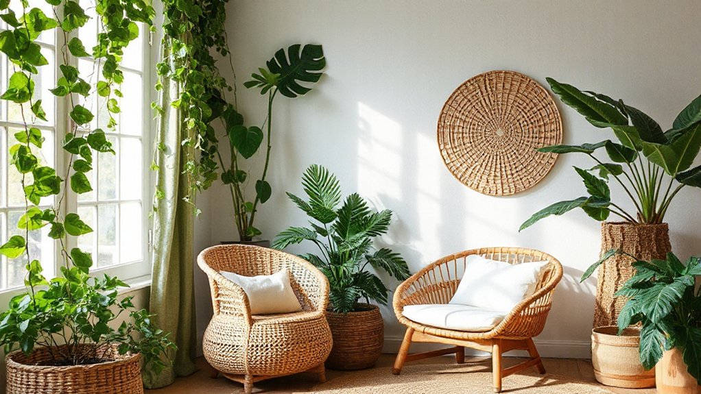
To pair greenery with natural textures, start by choosing plants that echo the materials in your space—think a fern beside woven rattan or a jade plant near linen curtains. You’ll create harmony by letting plant shapes reflect textures, not overpower them. Keep the palette muted to spotlight Eco friendly materials and Botanical accents.
- Pair tall, arching greens with vertical wood grain for balance.
- Place low, leafy clusters beside textured fabrics to soften edges.
- Group plants by similar hues to maintain cohesive color flow.
- Use natural pots that mirror your room’s materials for unity.
Ethical Sourcing For Natural Textures
Ethical sourcing for natural textures guarantees beauty with responsibility. You deserve products that reflect your values, from seed to shelf. Prioritize suppliers who demonstrate transparent traceability, fair labor practices, and verifiable certifications. Seek materials produced through sustainable harvesting, where ecosystems aren’t depleted and biodiversity is protected. Ask for documentation that confirms origin, harvesting methods, and renewal rates. Favor collaborations with artisans and brands committed to long-term stewardship rather than quick profits. Opt for eco friendly materials that minimize chemical additives and waste, and prefer recyclable or compostable packaging. When in doubt, compare life-cycle assessments and third-party audits. By choosing responsibly sourced textures, you reinforce a thoughtful design narrative that honors both your space and the planet.
Small-Space Texture Tricks Without Clutter
When you’re decorating a small space, texture can punch above its weight without adding clutter. You’ll rely on deliberate, streamlined choices that read as intentional design rather than accumulated excess. Use only a few high-impact textures to orchestrate depth while preserving flow. Eco friendly finishes and sustainable sourcing guide every pick, ensuring responsible charm without compromise.
1) Choose layered textures through a single material family (linen, jute, or wool) to keep cohesion tight.
2) Install wall treatments that skim surfaces—textured plaster or subtle beadboard—avoiding bulk panels.
3) Opt for multi-use textiles: throws or pillows that double as accents and insulation.
4) Select furniture with tactile surfaces (rammed earth, ceramic glaze, or wood grain) to add warmth without crowding.
Care Tips To Preserve Natural Textures

Natural textures deserve careful upkeep to keep their warmth intact. To preserve their character, establish a simple routine focused on texture maintenance and natural preservation. Start by choosing rotation-friendly cleaners—murniture-specific formulas for wood, stone, or fibers—and test on inconspicuous areas. Dust regularly with a soft cloth to prevent buildup that dulls surfaces. For woven materials, vacuum using a gentle attachment and avoid over-wetting; for wood, wipe with a lightly damp microfiber, then dry promptly. Control humidity to prevent cracking or warping, and shield textiles from direct sunlight to minimize fading. Address spills immediately with blotting, not rubbing, to avoid fraying. Schedule seasonal inspections, tighten loose joinery, and replace worn cushions. Consistent care sustains tactile richness and overall interior quality through natural preservation.
Real-Room Case Studies: Organic Texture Styling
Case studies from real rooms reveal how organic textures quietly elevate a space, proving that materials like burlap, linen, cork, and untreated wood can anchor design without shouting. You’ll see how texture-rich interiors breathe with tactful restraint, balancing form and function for lasting appeal. Real-world examples demonstrate how eco friendly materials support sustainable design without compromising style or comfort. You’ll notice how natural fibers age gracefully, how cork floors soften acoustics, and how layered textiles create warmth with minimal effort.
- A linen-draped lounge pairing low-profile cork furniture for a tactile, eco-conscious focal point
- A burlap-wrapped wall treatment paired with softened lighting for subtle contrast
- Reclaimed wood accents balancing modern pieces with organic texture
- Layered textiles and plants reinforcing sustainable design principles and serenity
Frequently Asked Questions
How Do I Avoid Overdoing Natural Textures in a Small Room?
Avoid overdoing it by choosing a primary texture, then contrast with smooth surfaces. Use a restrained color palette, scale patterns, and light. Incorporate decor tips like texture pairing sparingly, and balance with cushions, throws, and natural lighting.
Can Natural Textures Influence Acoustic Comfort Effectively?
Yes, natural textures can help, but you’ll maximize effect with intentional choices. Use sound absorption materials and acoustic panels strategically, balancing aesthetics with function to reduce echo and create calmer, more comfortable spaces.
Which Natural Textures Age Best in Kitchens or Bathrooms?
Natural textures age best in kitchens and bathrooms when you prioritize natural material sourcing and texture durability considerations, selecting sealed, treated surfaces that resist moisture; think quartz, porcelain, slate, and sealed timber for enduring, low-maintenance beauty.
Are There Budget-Friendly Sources for Authentic Textures?
Yes, you can: look for eco friendly materials and recycled decor, budget-friendly options that don’t compromise texture or authenticity. Prioritize recycled wood, cork, jute, and stone, and source from reputable, sustainable makers to guarantee lasting quality.
How Do I Maintain Natural Textures Without Chemicals?
You can maintain natural textures without chemicals by choosing Eco friendly finishes and ensuring Sustainable sourcing. Use untreated or low-impact materials, sealants sparingly, ventilate well, and routinely clean with non-toxic products for long-lasting, safe organic styling.
Conclusion
You’ll find that natural textures don’t just decorate; they ground your space. When wood, stone, clay, and textiles meet thoughtful lighting and mindful sourcing, your room breathes warmth and authenticity. Probe the theory that texture equals temperature: prove it by layering depth with a calm color base and tactile surfaces, then test how small touches reduce clutter without dulling character. Stay disciplined, but curious—let organic textures evolve into a timeless, comfortable everyday environment.
About the Author



