

When choosing paint for modern homes, start with a base neutral that reads true under varied light and undertones you can harmonize with flooring and fixtures. Pair grays with warm undertones for depth, and ground rooms with earthy tones accented by bold highlights. Use crisp whites to define architecture, then layer textures—stone, timber, woven fabrics—to add tactile interest. Test colors in real rooms, note lighting shifts, and maintain cohesive palettes by room. If you keep exploring, you’ll uncover even sharper combination strategies.
Key Takeaways
- Use a cool or neutral base with balanced undertones to anchor modern interiors and pair well with crisp whites and natural textures.
- Combine midtone grays with warm accents (peach, cream, honey) for warmth without overwhelming the modern palette.
- Layer earthy neutrals (terracotta, olive, charcoal) with saturated accents or metallics to create defined, contemporary contrast.
- Employ whites strategically to highlight architecture while varying sheens (matte, satin) for depth and subtle warmth.
- Test colors in real rooms at multiple times of day and under varied lighting to ensure cohesive, durable color reading across spaces.
Choosing a Base Neutral: Undertones, Light, and Room Feel
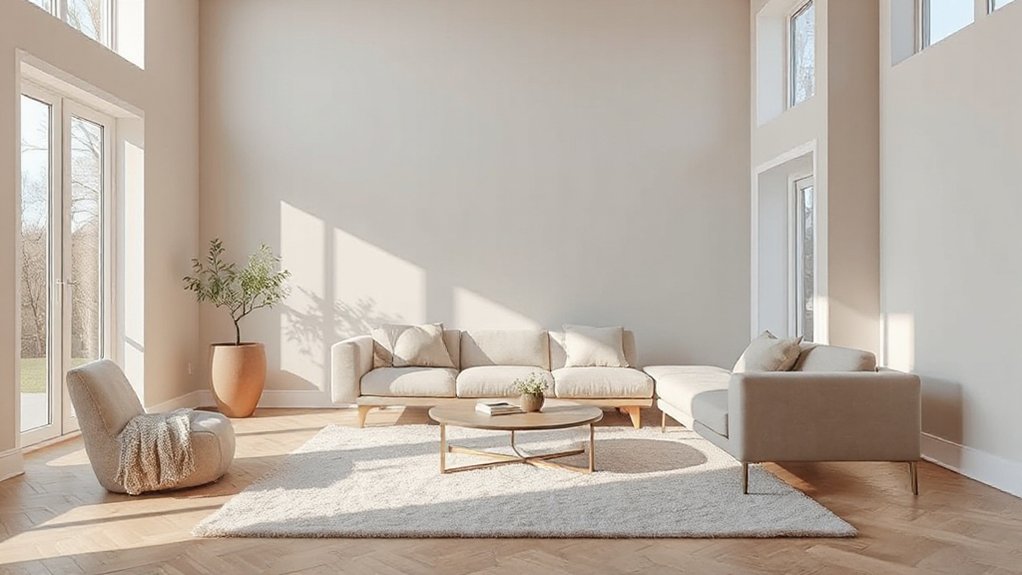
Choosing a base neutral starts with understanding undertones, light, and how the room feels. You select a foundation that supports future accents and stays versatile under different lighting. Identify undertones first: cool, warm, or neutral, then test samples at multiple times of day to confirm consistency. Light quality dramatically shifts perception, so your base should maintain balance in both bright and dim settings. Prioritize a color that complements flooring, cabinetry, and fixtures without competing with focal elements. Your decision should streamline accents rather than complicate them, enabling predictable coordination with Accent wall ideas and ceiling paint choices. Use a high-quality, low-reflectance finish for walls to preserve a calm backdrop. Document the undertone, lighting notes, and room function for future updates and resale appeal.
Pair Grays With Warm Undertones for Depth
Pairing grays with warm undertones adds depth without sacrificing versatility. When you select charcoal, greige, or taupe with subtle peach, cream, or honey notes, you create visual warmth that anchors modern spaces. This approach supports strong color psychology, guiding occupants toward calm, inviting environments while maintaining a contemporary edge. Use midtone grays as anchor walls and layer with warm accents to avoid flat interiors. In paint application, test large swatches on multiple walls and observe under varied lighting; warm undertones shift through morning sunlight to dusk, affecting perceived depth. Pairings should stay cohesive with furniture and textiles, ensuring contrast rather than clash. Prioritize clean lines, matte or satin sheens, and consistent finish across main surfaces to preserve clarity, sophistication, and enduring appeal.
Earthy Tones With Bold Accents
Start with an earthy backdrop to ground modern interiors, then introduce bold accents to create visual punch. Pair warm, natural tones with saturated hues or metallics to sharpen contrast without overpowering the space. Use clear tone pairings to guide how each accent reads in lighting and scale, ensuring the overall palette stays cohesive.
Earthy Backdrop, Bold Accents
Earthy backdrops set a warm, grounded stage, while bold accents inject energy and focus without overpowering the room. You’ll balance muted walls with saturated furniture and decor, creating contrast that reads as intentional rather than busy. Favor earthy undertones—terracotta, olive, charcoal—as the foundation, then layer in bold accents through textiles, artwork, and hardware. Natural textures—slipcovered fabrics, raw wood, woven rugs—add depth and authenticity, preventing flatness in large, open spaces. Ambient lighting enhances the palette, using warm bulbs and layered sources to sculpt mood without altering color perception. Keep finishes cohesive: matte walls with satin or semigloss trim ensures subtle shine where needed. This approach yields a timeless, modern environment, where earthy calm supports bold, design-forward moments.
Tone Pairing for Modern Homes
Inspired by earthy backdrops, you’ll fuse warm base tones with bold accents to guide the room’s rhythm. Tone pairing hinges on hierarchy: reserve earthy neutrals for walls, let the bolds define focal points, and keep contrast deliberate to maintain flow. Use color psychology to cue mood—softer earths for calm, richer ochres for energy—while bold accents anchor the space without overpowering it. Guarantee paint durability by selecting high-quality, low-VOC finishes that resist wear in high-traffic zones. Test palettes under natural light to confirm true saturation, and document first-tick impressions for future tweaks. Maintain consistency across rooms to reinforce the modern, cohesive look.
- Color psychology-driven contrasts for mood control
- Durable finishes optimize longevity in busy areas
- Consistent palettes ensure cohesive, modern flow
Crisp Whites for Architectural Contrast
Crisp white hues create immediate architectural contrast, sharpening lines and defining form. Pair these light-reflecting surfaces with bold textures or dark accents to amplify depth and visual clarity. This approach emphasizes precision, modernity, and material honesty in contemporary homes.
Crisp White Hues
A crisp white palette provides architectural clarity and contrast, making structural details pop and spaces feel cleaner. You’ll feel deliberate, not sterile, as light bounces between surfaces, defining planes and textures with precision. Crisp whites work because they’re versatile, pairing with bold accents while preserving a sense of calm. Consider color psychology: white communicates openness and focus, shaping how you experience scale and mood. Historical influences show how traditional trims and modern panels can coexist in a single scheme, reinforcing timelessness without heaviness.
- Use white sheens strategically to highlight coving, molding, and architectural edges
- Layer whites with warm and cool undertones for depth and subtle warmth
- Balance whites with natural materials to avoid clinical stiffness
Architectural Contrast Tones
Architectural contrast tones rely on crisp whites to define structure and sharpen edges without overwhelming space. You’ll use these tones to create clear silhouettes, letting architectural lines read as intentional statements rather than background. Crisp whites provide a calm backdrop that highlights form, texture, and material palettes, while avoiding visual fatigue in high-traffic areas. Pair the whites with selective pops of color to emphasize architectural features, avoiding heavy contrast that can feel dated. Consider vintage hues as accent moments to add personality without overpowering the architecture, ensuring the space remains cohesive. Color psychology suggests whites evoke clarity and perceived brightness, helping rooms feel larger and more purposeful. Maintain restraint: let the contrast do the talking, not decor clutter.
Light-Reflecting Surfaces
When you choose light-reflecting surfaces, crisp whites become the tool for shaping space, not just a color decision. In modern design, Reflective finishes amplify natural light, creating perceived height and clarity. You’ll leverage white as a canvas for architectural contrast, letting shadows and textures define depth. Embrace color layering by pairing whites with subtle warm or cool accents to avoid flatness while preserving a clean aesthetic. Precision in sheen and undertone matters: choose whites with slight warmth for living areas, cooler whites for galleries or kitchens, and high-gloss for architectural features. Use reflective surfaces strategically to enhance daylight performance and spatial rhythm without overpowering adjacent tones.
- Reflective finishes guide light across surfaces, boosting brightness and perceived size.
- Color layering with whites creates dimensional contrast through texture and shade.
- Precise undertones and sheen levels prevent flatness while preserving modern clarity.
Texture and Material Pairings That Elevate Color

Texture and material pairings can dramatically elevate color in modern homes. You shape rooms by pairing finishes with hues that echo or contrast the palette, creating depth and focal points. Favor clean lines and restrained textures to keep color from overwhelming interiors. Consider decorative wall finishes to add subtle warmth or graphic interest without competing with paint. Textured surface options—stone, brick, timber, or tactile plaster—anchor color schemes and guide light reflection, improving perceived saturation. Balance gloss, matte, and satin sheens to temper brightness across walls, ceilings, and trim. Choose materials that complement your lighting strategy, ensuring color reads consistently from key vantage points. Prioritize durable, low-maintenance options for high-traffic zones, and align texture choices with architectural context for cohesive, timeless results.
Testing Color in Real Rooms: Lighting, Swatches, Placement
Testing color in real rooms requires a disciplined approach: evaluate lighting, sample swatches, and plan placement before you commit to finish selections. You’ll verify how Lighting effects shift tones at different times of day and confirm the palette remains cohesive across textures. Swatch testing is essential, not decorative. Compare multiple strips under the actual light in the space, and note how undertones appear on walls, trim, and accents. Map placement by evaluating furniture scale, ceiling height, and natural shadows to prevent color clashes. Document findings to guide final selections with confidence.
- Assess Lighting effects during morning, noon, and evening for true color perception
- Use Swatch testing in situ, not from store displays
- Map placement to maintain balance and readability of hues
Cohesive Palettes by Room Type: Living, Kitchen, Bath
Cohesive palettes by room type guarantee your living, kitchen, and bath feel deliberate and unified, not generic. You tailor each space to a shared core, yet respect function and light. In living areas, lean on color psychology to evoke warmth or calm, pairing neutrals with restrained accent hues to support seating layouts and conversation zones. In kitchens, choose durable bases and serum-like accents that emphasize efficiency, while ensuring contrast supports visibility at work surfaces. Bathrooms benefit from cohesive damp- or humidity-tolerant tones that read clean and spa-like, with subtle uplifts for mirrors and art. Historical color schemes offer timeless cues—stone grays, warm whites, muted greens—reinterpreted for modern materials. Maintain consistency through trim, cabinetry, and hardware to reinforce unity across all rooms.
Tips for Undertones, Saturation, and Longevity

Undertones, saturation, and longevity are foundational to durable, well-balanced color schemes. You’ll optimize undertones to guarantee harmony, preventing clashes between trim, walls, and cabinets. Start by testing in multiple lighting conditions, noting how Undertone harmony shifts from warm to cool as daylight changes. Apply Saturation balancing to keep color intensity consistent across rooms; avoid overpowering hues in small spaces. Prioritize finishes and primers that preserve color integrity over time, boosting longevity without sacrificing depth. Use mid-range saturations for large areas and reserve bold accents for focal points, then re-evaluate after seasonal lighting shifts. Regular touch-ups help maintain consistency, preventing fade or drift in hue accuracy.
- Undertone harmony guides pairings across fixtures
- Saturation balancing preserves depth without overwhelm
- Longevity-focused prep and finishes safeguard color fidelity
Frequently Asked Questions
How Do Lighting Changes Affect Perceived Color in Rooms?
Natural light makes colors appear cooler and more true to tone, while Artificial lighting shifts them warmer or harsher. You’ll notice changes across time and fixtures, so test swatches under both lighting conditions to manage room mood effectively.
Can Color Psychology Influence Your Paint Choice?
Yes, color psychology can influence your paint choice, you’ll feel the color’s huge emotional impact every day, and color therapy principles guide selections, delivering industry-backed, decisive results for mood-altering, space-defining rooms you design.
Should Ceilings Be Painted Differently From Walls?
Yes, you can paint ceilings differently to enhance depth. Use ceiling textures to add interest and choose paint finish options that lessen glare, aligning with wall tones. Favor matte or satin for walls and lighter, low-sheen ceilings.
How Often Should You Repaint to Maintain Color Freshness?
You should repaint every 5–7 years to maintain color freshness. This schedule minimizes color fading and maximizes paint durability, especially in high-traffic areas. Inspect annually for wear, touch up as needed, and plan full refreshes accordingly.
What’s the Best Way to Test Colors Outdoors First?
“Test colors outdoors first by applying small samples on bare siding and near lighting corners, then observe over 24–48 hours.” You’ll use outdoor testing methods and sample color palettes to evaluate hue, undertone, and fade risk confidently.
Conclusion
Imagine this: you’ve toured a spectrum of neutrals, layered textures, and bold accents, watching spaces transform before your eyes. Yet the final move still awaits—the exact paint you’ll commit to. Will it whisper with soft undertones, or shout with crisp contrast? The choice you make now ties rooms, lighting, and mood into one cohesive story. Trust your eye, test relentlessly, and stay curious. The right shade isn’t just color—it’s anticipation of the next design move.
About the Author



