
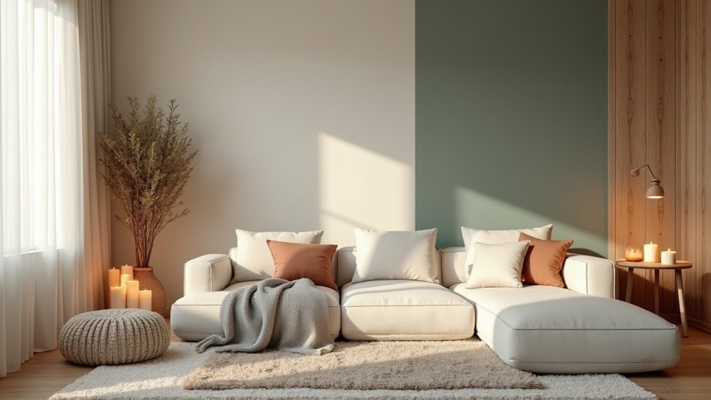
To craft a calm, cozy home, start with soft neutral walls—creams, taupes, and warm grays—that act as flexible backdrops under varied light. Layer earthy tones like olive, sage, terracotta, and charcoal for grounding, keeping lighter tints on walls and reserving deeper hues for accents. Pair matte walls with glossy surfaces and woven textures to create depth, and use one dominant color with two neutrals plus textured accents. Curious about practical testing steps and palettes? We’ve got you covered.
Key Takeaways
- Use soft neutrals (creams, taupes, greiges) as versatile foundations to promote rest and subtle sophistication.
- Favor earthy tones (warm taupe, olive, sage, terracotta) for grounding, with lighter wall shades and darker accents.
- Employ calm color psychology: cool blues recede space, warm greens soften energy, and restrained saturation reduces chaos.
- Pair matte walls with glossy surfaces and textured fabrics to create depth without overstimulation.
- Test three cohesive palettes (warm neutrals, cool neutrals, earthy tones) in different light conditions before full-room application.
Foundations: Why Calm Colors Work in Home Design

Calm colors work in home design because they regulate mood at a glance. You approach color strategically, focusing on foundations that set daily experiences. Color psychology guides your choices, linking hues to motivation, rest, and focus, so you can design spaces that sustain well‑being.
You evaluate lingering psychological effects: soft blues reduce perceived chaos, earthy greens ground rooms, and warm grays soften contrast without overpowering light. You seek balance, avoiding aggressive saturations that demand attention.
By prioritizing calm tones, you create visual flow across rooms and a cohesive narrative for your environment. You acknowledge that brightness, temperature, and texture influence perception just as much as pigment.
This foundation supports purposeful palette decisions, enabling you to craft serene, functional interiors with predictable, measurable outcomes.
Soft Neutral Palettes for Relaxing Spaces
Soft neutral palettes refine the calm you established earlier, offering versatile backdrops that maximize rest and subtle sophistication. You’ll notice these tones create cohesion with varied lighting, keeping spaces serene without feeling monotonous.
In practice, choose warm neutrals—creams, taupes, and greiges—that read as flexible foundations for furniture, textiles, and art. Color psychology supports this approach: understated hues reduce visual noise, supporting mindful relaxation and focus.
When you need a focal moment, introduce bold accent walls sparingly to anchor rooms without overpowering the calm. Use texture—linen, wool, and matte finishes—to add depth without color overwhelm.
Balance is key; let soft neutrals govern the palette, reserving color for intentional, controlled emphasis that sustains a tranquil, inviting atmosphere.
Grounding With Earthy Tones: Which Shades to Choose
Earthy tones ground a space by weaving nature-inspired color into the room’s foundation. In this approach, you select hues that resemble soil, stone, and timber, then apply them with intention to establish balance.
Prioritize colors like warm taupe, olive, sage, terracotta, and charcoal—shades that feel grounded yet adaptable. Consider the emotional impact through color psychology: earth-inspired greens reduce visual fatigue and invite calm, while rich browns enhance perceived stability.
Use lighter tints for walls to maintain airiness, reserving deeper accents for architectural features, furniture, or architectural trim to create contrast without overwhelming. Your goal is mood enhancement through cohesive, thoughtful saturation.
Avoid gimmicks; let natural hues guide the palette, ensuring every surface supports serenity, functionality, and timeless appeal.
Pairing Color With Texture and Light: Practical Techniques

Pairing color with texture and light hinges on purposeful contrasts that enhance both depth and energy in a space. You’ll use texture to anchor color, selecting materials with tactile contrast—matte walls against glossy surfaces, woven fabrics against smooth levellers—to create subtle, legible shifts in perception.
Let color psychology guide you: cooler tones recede, warmer tones advance, and midtones balance. Introduce texture contrast through upholstery, rugs, and wood grain, ensuring each element plays a distinct role without competing.
Light consideration matters: diffuse daylight softens bold hues, while artificial lighting can shift tone; calibrate warmth and brightness to preserve the intended mood.
Apply restraint: pair one dominant color with two supporting neutrals, then refine with texture-led accents for cohesive, calm energy.
Palettes to Try and In-Home Testing Steps
Here are the palettes to try and how to test them in your home. Start with three cohesive schemes: warm neutrals, cool neutrals, and soft earthy tones.
For each palette, select a primary wall color, then build with two accent shades and one neutral trim. Use color psychology principles: warm hues evoke comfort and approachability; cool tones promote calm and focus; earth-inspired greens and browns nurture grounded mood enhancement.
Apply test swatches in multiple lighting moments—morning, noon, and evening—and observe perceived temperature, depth, and mood shifts. Track responses in a quick log: note fatigue, relaxation, and overall ambiance.
Move to small test areas before full-room commitment, ensuring consistency with existing fabrics and furniture. Conclude with a restrained, practical selection aligned to your lifestyle.
Frequently Asked Questions
How Do Color Undertones Affect Mood in a Calm Home?
Color undertones influence mood by evoking subtle associations you notice subconsciously; warm undertones comfort, cool undertones sharpen focus. This is color psychology in action, guiding mood enhancement as you curate spaces that feel quiet, grounded, and intentionally soothing.
Can Bold Accents Still Feel Cozy in Soft Palettes?
Yes, bold accents can feel cozy in soft palettes when you balance color properly. Use an accent wall sparingly, pair warm neutrals with your bold hue, and maintain a cozy atmosphere through texture, depth, and measured contrasts.
Do Lighting Types Change Color Perception Over Time?
Yes, lighting types alter color perception over time; ambient lighting shifts how hues read as color temperature changes. You’ll notice warm temps soften edges while cool temps sharpen details, creating contrasting moods as daylight morphs through the room.
Are There Regional Color Trends That Stress Calmness?
Regional color trends do emphasize calmness, shaping your choices through cultural symbolism and local preferences. You’ll notice Regional color preferences reflect community values, while Cultural color symbolism informs how spaces feel, guiding you toward soothing, region-aligned palettes.
How to Test Colors for Kids’ Safety and Durability?
You test colors by choosing non toxic finishes and child safe pigments, then verify durability with wipe tests and abrasion resistance. You document results, follow safety data sheets, and select finishes rated for frequent kid contact for lasting protection.
Conclusion
You’ll notice the quiet harmony when a room’s calm palette mirrors the light’s cadence—the exact moment a soft neutral pairs with an earthy undertone just as your coffee cools beside a sunlit window. It’s not chance; it’s a deliberate alignment of texture, daylight, and color. When the tester swatches whisper “this feels right,” you’ve uncovered a truth: calm and cozy lives where cohesive tones meet everyday moments, effortlessly guiding every heartbeat of your space.
About the Author



