

In 2025, UK homes lean toward calm neutrals with expressive accents, creating spaces that feel focused and comforting. Expect earthy greens for grounded living rooms, terracotta warmth in kitchens, and soft blues in bedrooms to foster calm and better sleep. Durable, low-VOC finishes support long-term upkeep, while texture and layering replace loud color blocks for depth. Plan with a core neutral palette and strategic accents, then test in light. Curious about how to apply this across rooms? You’ll find practical steps ahead.
Key Takeaways
- 2025 shifts toward calmer, grounded tones that support wellbeing, with texture used to create contrast instead of loud color blocks.
- Grounding greens (olive, sage, moss) and warm earths (terracotta) dominate interior palettes across trims, walls, and kitchens.
- Soft blues in bedrooms promote restful, serene environments while light–shadow dynamics influence color perception through glazing and daylight.
- Neutrals with restrained saturation form versatile backdrops; bold accents are curated as focal points to maintain coherence.
- Vintage and retro accents are used strategically to refresh spaces, pairing saturated tones with crisp neutrals for clarity.
What UK Color Psychology Says About 2025

Color psychology in the UK for 2025 points to a shift toward calmer, more grounded tones that foster wellbeing and focus. You’ll notice colors chosen for living spaces emphasize balance, legibility, and reduced cognitive load, aligning with evidence on mood regulation. Cultural symbolism informs the preference for hues tied to serenity and safety, while pragmatic palettes support productivity in work zones. Historical influences surface in how revival-era greens and muted ochres reappear, recontextualized for modern interiors with softer saturation. You’ll prioritize contrast through texture rather than loud color blocks, preserving clarity of space. This approach reinforces intentional design, where color guides behavior and perception without overwhelming you. In sum, 2025 tactics fuse cultural meaning with timeless hues to optimize daily performance.
The Core Palette: Calm Neutrals With Expressive Accents
You’ll start from Calm Neutral Foundations as the backbone, establishing a versatile base that supports evolving colour stories. Pair that with Expressive Accent Palettes to inject personality without sacrificing balance, letting bold hues punctuate spaces thoughtfully. Harmonious Texture Combinations tie it all together, ensuring depth and tactility while preserving a cohesive, modern UK home aesthetic.
Calm Neutral Foundations
Soften the backdrop of UK interiors with calm neutrals that anchor the space, then layer in expressive accents to inject personality. Calm neutrals form the Foundation: nuanced beiges, soft greys, and warm whites create visual steadiness while maximizing light. You’ll leverage color symbolism to convey mood without overpowering, using airy tones to enhance openness and grounded hues to suggest reliability. Paint durability matters here: choose finishes with low sheen for depth and easier touch-ups, ensuring longevity in high-traffic areas. Strategy rests on coherence, not saturation, so align undertones with natural materials and architectural features. Use these principles:
- Select a cohesive trio of neutrals to anchor walls, ceilings, and trim.
- Pair warm undertones with cool accents for balanced contrast.
- Test light outdoors and indoors to confirm color symbolism aligns with purpose.
Expressive Accent Palettes
Expressive Accent Palettes bring personality to the core neutrals, using saturated colors that energize spaces without overpowering them. You’ll harness color psychology to calibrate intensity, ensuring accents reinforce mood rather than clash with foundations. Treat accent palettes as purposeful punctuation: a single dominant hue paired with supporting tones to guide flow, rhythm, and focal points. When you select schemes, prioritize balance over boldness; the goal is vibrancy with restraint. Use complementary or analogous relationships to maintain coherence across rooms, avoiding competitive clashes. Materials and lighting influence perception, so you’ll test color in practice rather than theory, noting how textures soften or sharpen the expressive tones. Document responses, adjust saturation, and align accents to activity zones, architectural features, and furniture scale for cohesive, impactful interiors.
Harmonious Texture Combinations
Harmonious Texture Combinations balance the calm core palette with selective expressive accents, using tactile layering to sustain visual interest without overwhelming the space. You’ll blend Textural contrasts across fabrics, surfaces, and finishes, ensuring each element supports the others. Pattern layering creates narrative depth without chaos, guiding the eye naturally through rooms.
- Establish a neutral base with matte, low-sheen textures to anchor the scheme.
- Introduce contrasting tactile elements—warmer wool, cool linen, and rugged stone—sparingly for focal points.
- Pair subtle patterns with solids, allowing one feature to lead while others recede.
This approach yields refined cohesion: calm neutrals punctuated by controlled expressive accents, delivering depth, warmth, and subtle sophistication.
Earthy Greens for Grounded Living Rooms
Earthy greens anchor living rooms with a grounded, nature-inspired mood, pairing olive, sage, and moss tones to create depth without overwhelming the space. You’ll find these hues offer versatility across trims, upholstery, and feature walls, while preserving visual calm. Choose sustainable pigments for environmental impact without sacrificing saturation; layered greens read calmer when paired with neutrals like warm whites or stone grays. Eco friendly pigments help maintain air quality and long-term durability, supporting a conscientious design approach. In practice, test a dominant olive backdrop with lighter sage accents and a moss-rich focal piece to avoid flatness. Maintain balance through texture and natural materials, ensuring wood, linen, and ceramic finishes reinforce the grounded, earthy narrative. This palette supports both modern silhouettes and timeless, durable interiors.
Terracotta and Warm Earth Tones in Kitchens
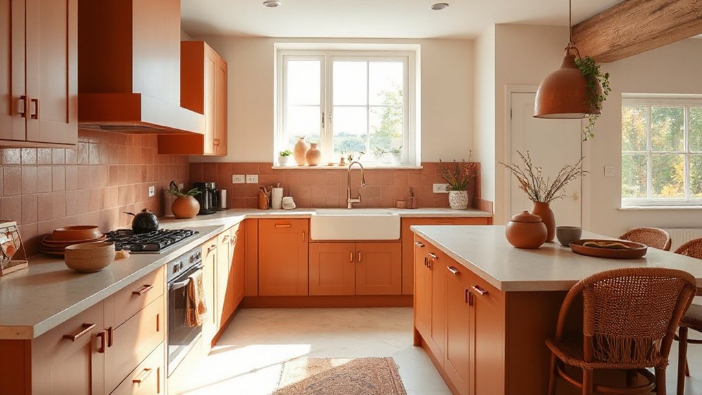
Terracotta and warm earth tones inject kitchen warmth while maintaining a clean, modern edge. An earthy hues palette supports durable finishes and cohesive flow with adjoining spaces. Consider how pigment depth, material texture, and lighting interplay to shape mood and practicality.
Terracotta Kitchen Warmth
Terracotta and warm earth tones in kitchens create a grounded, inviting atmosphere that anchors the room’s design. You’ll achieve cohesion by pairing terracotta accents with understated surfaces, balancing warmth with contrast. In practice, consider these moves:
1) Select warm kitchen palettes that integrate terracotta through cabinetry, backsplashes, and hardware.
2) Use neutral countertops and metallic accents to prevent overwhelm while preserving character.
3) Introduce texture with matte ceramics, stone, or wood to deepen the tactile quality and read as refined, not rustic.
This approach emphasizes intentionality over trendiness, ensuring the space reads as cohesive and durable. Terracotta accents can anchor the focal zones, while complementary lighting enhances depth. The result is a practical, stylish kitchen that feels both welcoming and timeless.
Earthy Hues Palette
To create an earthy hues palette in kitchens, you’ll settle on terracotta and warm neutrals as the core—grounding tones that anchor the space and read as time-tested. You’ll pair these with subdued greens and soft ochres to create depth without overpowering light. This approach emphasizes durable, low-maintenance finishes that ages well, ensuring longevity in daily use. Nature inspired accents—like woven textures, ceramic crocks, and linen textiles—bring tactility and contrast to surfaces, enhancing warmth without clutter. Organic material integration, including wood cabinets or shelves and stone countertops, reinforces an earthy cadence that remains timeless. Keep color shifts subtle, testing swatches in natural light to confirm cohesion across textures. The result is a balanced, resilient kitchen that supports practical cooking rhythms and deliberate, serene aesthetics.
Soft Blues for Tranquil Bedrooms

Soft blues bring a calm equilibrium to bedrooms, balancing light and space to create a tranquil retreat. You’ll harness color symbolism to cue relaxation, shaping a sleep environment that reduces cave-like shadows and promotes focus on rest. In practice, cool tones with subtle warmth support perceived airiness, aiding daytime brightness without overstimulation. Use a deliberate mix of hues to avoid monotony and guarantee depth.
- Layer light and mid blues to craft nuanced gradients that read as expansive rather than cold.
- Pair with white or cream accents to reinforce clarity and keep the room feeling open.
- Introduce textiles—linen, cotton, and wool—in complementary tones to reinforce tactile calm and cohesion.
Off-White Foundations That Feel Fresh and Warm
Off-white foundations offer a fresh warmth that can brighten spaces without shouting color. You’ll notice a subtle brightness balance that preserves depth, making rooms feel both airy and grounded. This timeless base pairs with varied accents to achieve a clean, contemporary look.
Fresh Yet Warm Hues
Fresh, warm off-white foundations combine brightness with coziness, making rooms feel airy without seeming sterile. You’ll notice these hues support a calm, versatile backdrop that supports varied palettes while avoiding clinical impressions. Color psychology backs this approach, linking soft whites to relaxation and focus, and to an open, breathable ambiance. The emotional impact remains steady: you feel lighter yet grounded, with spaces that invite daily use and subtle elegance.
- Build contrast with natural materials (wood, textile, stone) to deepen warmth.
- Pair with muted pastels or earthy tones for dimensionality without losing clarity.
- Test lighting at different times to ensure the hue preserves brightness without appearing cold.
This strategy keeps environments analytical, concise, and intentionally balanced.
Subtle Brightness Balance
To balance subtle brightness with warmth, off-white foundations should read as clean yet enveloping. You’ll guarantee this by selecting hues with restrained color saturation that preserve a soft, airy feel while avoiding clinical coldness. Prioritize pigments that reflect daylight without shifting aggressively as light adapts across rooms and seasons. Evaluate color saturation relative to architectural material, furniture, and textiles so the backdrop remains quiet yet nuanced. Consider how light adapts: from morning sun to evening lamp, the foundation should subtly shift without dominating the scene. This approach yields a versatile canvas for layering texture, pattern, and art. The result is a refined brightness that feels contemporary, welcoming, and adaptable, supporting cohesive design narratives throughout the home.
Timeless Off-White Foundations
Timeless off-white foundations anchor a space with warmth while remaining invigoratingly clean. You’ll notice this shade pairings well with natural materials, creating a fresh, inviting base for any palette. In practice, subtle undertones prevent flatness, while crisp edges maintain modern clarity. Consider how color application across walls, ceilings, and trim influences perceived room size and coherence. For durability, choose a formulation designed to resist yellowing and scuff marks, ensuring longevity in high-traffic areas. The result is a versatile backdrop that supports evolving accents without demanding repaint cycles.
- Color application decisions anchor tonal balance across surfaces.
- Paint durability sustains finish integrity under daily use.
- Coordinating textures elevate warmth without compromising cleanliness.
Natural Materials to Add Color Depth
Natural materials infuse color depth by revealing subtle, earthy undertones that respond to light and space. You’ll leverage natural textures and organic pigments to craft nuanced palettes without overpowering rooms. Rely on materials like timber, stone, cork, linen, and unfired clay to introduce varying warmth, grain, and patina that shift with context. Use these textures as anchors for colour stories, allowing muted tones to appear richer and more complex. Pair organic pigments with neutral bases to prevent saturation from flattening the scheme; the result gains depth through inherent variation rather than heavy application. Prioritise durability and tactility, choosing finishes that age gracefully. In practice, test swatches in situ, observe under different lighting, and refine selections to sustain a cohesive yet evolving atmosphere.
Light and Shadow: How Windows Change Hue Perception

Windows don’t just frame rooms; they tint them. You’ll notice light shifts hue as it passes through glass, coatings, and frames, altering color perception throughout the day. This isn’t whimsy; it’s a measurable effect driven by color temperature, angle, and indoor reflectance. Window illusions occur when ambient tones amplify or dampen pigments, changing perceived saturation and warmth.
- Track daylight hours to anticipate shifts in upholstery and wall tones.
- Choose glazing with neutral bias if you want consistent color accuracy indoors.
- Use furnishings that counterbalance unintended tints, keeping schemes cohesive.
Understanding these dynamics helps you design with intention, rather than react to transient shifts. In practice, you’ll optimize mood and clarity by aligning window behavior with your target palette.
Finishes That Elevate 2025 Color Choices
Finishes can sharpen or soften a palette; when chosen with purpose, they elevate 2025 color choices by amplifying depth, texture, and light response. You evaluate finishes as design instruments, not afterthoughts, ensuring each surface communicates intent. Matte finishes emphasize calm, reduce glare, and heighten color truth through even diffusion. Satin or low-luster sheens balance reflection with practicality, supporting movement across rooms while maintaining perceived color consistency. Textured plaster and lime-based renders introduce tactile nuance, altering color perception with angles and light. Paint application matters as much as pigment selection: systematic priming, skilled layering, and controlled edge work preserve color clarity and avoid muddy results. Consider color symbolism to align finishes with mood; choose finishes that reinforce desired narratives, not merely trends.
Pairing Neutrals With Bold Accents
Pairing neutrals with bold accents hinges on balance, not parity. You shape cohesion by controlling contrast, scale, and intent, ensuring the bold acts as an accent, not a surprise ending. In color mixing terms, neutrals provide a stable stage while the accent cues focus attention. Your aim is deliberate restraint, repeating key hues sparingly to avoid fatigue. Consider these principles:
- Use a single bold color as a focal accent and repeat it across furniture, art, and textiles.
- Vary lightness and saturation within the neutral base to maintain depth without shouting.
- Test proportions in small samplings before full-room application to verify accent pairing harmony.
Color mixing success hinges on proportionality; bold elements must enhance, not overwhelm.
Texture and Pattern: Adding Depth Without Overwhelm

Texture and pattern should add depth without crowding the eye; when used thoughtfully, they create dimension that supports color and form rather than compete with them. You’ll balance texture and pattern by prioritising restraint: select one dominant texture and limit pattern to one cohesive motif per room. Textured fabrics, such as wool throws or linen upholstery, ground schemes with tactile interest without shouting. Pattern layering works best when contrasts remain subtle—pair a fine, repeating motif with a larger, quieter one to avoid visual clutter. Use lighting to emphasise texture, letting shadows reveal nuance. Keep color palettes quiet and cohesive, allowing texture and pattern to carry the room’s rhythm. Align materials to architectural lines for a calm, sophisticated finish.
Brit-Inspired Retro Hues You’ll Use
Brit-inspired retro hues bring a confident, horizon-wide palette to 2025 homes, pairing nostalgic warmth with modern clarity. You’ll leverage vintage accents to create focal points that feel purposeful rather than dated, balancing warmth with restraint. This approach sharpens rooms into confident spaces, where retro color schemes provide direction without overpowering contemporary forms.
- Highlight retro color schemes with strategic accents that reference heritage while staying contextually fresh.
- Pair saturated tones with crisp neutrals to maintain legibility and avoid gloom.
- Use tonal variation within a single palette to add depth without clutter.
This method prioritizes clarity and control, delivering a mood that’s distinctly British yet globally resonant. Your connection to the past becomes a designed asset, not nostalgia for nostalgia’s sake.
Color Zoning by Room: Purpose, Palette, and Flow
Color zoning in each room drives purposeful contrasts and clear function, guiding how you assign palettes to create flow from one space to the next. Start with a core palette for shared zones, then layer accents to signal shifts and activities, keeping the scheme cohesive rather than repetitive. This approach emphasizes flow-driven choices that reinforce room purpose while preserving visual unity across the home.
Purposeful Room Zoning
Purposeful room zoning uses color to define function and flow within an open plan. You segment spaces by tone, saturating hues to cue use while preserving cohesion. This approach relies on deliberate palettes, consistent lighting techniques, and strategic accents that guide movement without enclosure. You’ll create visual walls that don’t close, supporting creative storage solutions and seamless progressions between zones.
- Define each zone with a distinct yet harmonious color base, then reinforce with subtle highlights.
- Use lighting techniques to reinforce function—task lighting at work areas, warm ambient hues for relaxation, and cool accents to delineate circulation.
- Maintain a unifying thread—repeat a shared undertone across rooms to guarantee continuity.
This method delivers clarity, efficiency, and a calm, cohesive rhythm throughout the home.
Flow-Driven Palette Choices
Because room color should drive function, flow-driven palette choices align hues with each space’s purpose while preserving a cohesive overall narrative. You’ll segment by room, prioritizing progression that support movement and mood. Start with a core neutral base to anchor adjacent zones, then layer purposeful accents that reflect activity, light, and acoustics. Color mixing becomes a practical tool: choose complementary undertones to prevent clash as you move from kitchen to living area, or from study to bedroom, ensuring a unified trajectory. Consider pigment depth and finish for each zone, balancing warmth with daylight variations. Paint durability matters in high-traffic areas; select washable, scrubbable finishes for utility spaces and softer sheens for retreat zones. The result: a rational, adaptable scheme that respects function and maintains coherence.
Lighting’s Role in Reading Color Correctly
Lighting is the hinge between perception and accuracy: without proper illumination, even the most carefully chosen palettes drift from intent. You’ll notice how lighting shapes color perception and reveals true undertones beyond swatches.
- Distinguish daylight from artificial light to assess how hues shift across fixtures.
- Favor bulbs with consistent color rendering (CRI) to preserve intended palettes.
- Calibrate task and ambient lighting to minimize glare, enhancing true color reading.
In practice, analyze rooms at different times of day, and compare wall, trim, and furniture under each scenario. You’ll rely on controlled lighting to evaluate warm versus cool tones, avoiding misreads that stems from uneven luminance. By prioritizing lighting effects, you assure your choices translate faithfully, maintaining coherence across spaces and ensuring the palette reads as designed.
Durable Paint Finishes for UK Homes
Durable finishes matter most when you’re shaping UK homes that withstand weather and wear, so we’ll compare options like water-borne acrylics, elastomerics, and alkyds for longevity and ease of maintenance. We’ll examine UK weather resilience—from damp winters to UV exposure—to identify finishes that resist peeling, cracking, and fading while keeping cleanability in check. This discussion starts by weighing durability benchmarks and how each finish performs in real‑world conditions, so you can choose with confidence.
Durable Finishes Overview
Durable paint finishes are essential for UK homes, delivering long-lasting protection against wear, moisture, and everyday impacts while maintaining colour fidelity. You’ll prioritise durability by balancing performance, finish, and ease of maintenance, ensuring interiors and exteriors resist peeling and staining over time. The overview highlights key options and their trade-offs, guiding efficient selection without overpromising. Consider coating systems that combine adherence, flexibility, and washability.
- Eco friendly coatings offer lower environmental impact while keeping UV resistance and surface integrity.
- Textured finishes provide depth and conceal substrate imperfections, with controllable abrasion resistance.
- Layering strategies optimize lifespan, enabling easy touch-ups without full redecoration.
In practice, match finishes to room function, substrate, and desired aesthetic, then assess lifecycle costs and VOC content for informed choices.
UK Weather-Resistant Options
Could you imagine a coating that weather-proofs walls while keeping colour fidelity over years of UK climate? In evaluating UK weather-resistant options, you focus on performance metrics that matter for durability and aesthetics. Rainproof coatings explain long-term resistance to rain splash, wind-driven moisture, and staining, while maintaining gloss retention and colour stability. You’ll compare acrylic, elastomeric, and silicone-modified finishes for substrate compatibility, breathability, and lifecycle costs. Assess UV resistance, mildew prevention, and washability, since seasonal shifts demand easy maintenance without colour fade. Weatherproof fabrics in primers and topcoats offer complementary protection for timber, brick, and render. Conclude with recommendations: select systems balancing film integrity, adhesion, and minimal maintenance, optimized for typical UK exposure, to sustain vivid palettes across years.
Sustainable Choices: Low-VOC and Eco-Friendly Colors
Choosing low-VOC and eco-friendly paints is essential for healthier homes and a lower environmental footprint; they reduce indoor air pollution without sacrificing color and durability. You’ll find that performance and sustainability aren’t mutually exclusive when you prioritise Eco pigments and VOC reduction across schemes.
- Select formulations with low-VOC certs and clear pigment sources to sustain rich tones without compromising air quality.
- Prioritise water-based systems that deliver durable finishes and easier maintenance while minimising off-gassing.
- Align color choices with natural light and space, leveraging sustainable pigments to preserve hue integrity over time.
These practices support healthier interiors, clearer air, and long-term environmental benefits. Eco pigments and VOC reduction are the keystones for responsible, stylish UK homes in 2025.
Budget-Smart Ways to Achieve 2025 Hues
Budget-smart strategies let you achieve 2025 hues without overspending. You can align on-trend tones by prioritising wall colour as the focal point, then supporting with cost-efficient accents. Start with a clear palette plan: pick one dominant shade and two companions to minimise waste and simplify decisions. Use budget friendly accessories like cushions, throws, and decor to test colour perception before committing to larger surfaces. When updating ceilings, trims, or feature walls, consider DIY paint techniques to maximize impact per litre. Techniques such as color washing, dry brushing, or accent wedges let you refine depth and warmth without costly systems. Track leftover materials for future refreshes, and compare paint brands for durability and coverage to avoid over-purchasing.
From Mood Board to Real Rooms: An Implementation Roadmap
Turning a mood board into real rooms requires a clear, actionable plan. You translate concept into steps, prioritising color pairing and mood creation with disciplined execution.
1) Translate palettes into room roles. Assign dominant, secondary, and accent colors per space, ensuring contrast and flow across zones.
2) Establish sampling and procurement cadence. Limit swatches to core hues, test in lighting, and confirm finishes before committing, avoiding costly missteps.
3) Implement in staged milestones. Complete a base layer first, then textiles, then accents, validating mood alignment at each phase.
This roadmap keeps decisions data-driven, reduces backtracking, and aligns design intent with budget realities. By treating color pairing as a system, you maintain coherence while enabling scalable updates as trends evolve.
Frequently Asked Questions
How to Test Color Lighting at Different Times of Day?
To test color lighting at different times of day, you measure lighting ambiance with daylight simulation tools, comparing presets at morning, noon, and evening; you document color accuracy, glare, and mood shifts to guarantee consistent results across conditions.
Which Paints Best Tolerate UK Humidity and Mold Risk?
Can you pick paints that tolerate humidity and mold risk? Opt for Eco friendly finishes and mold resistant coatings, choosing breathable, stabilized formulas, latex emulsions, and fungicidal additives to minimize moisture-induced damage and preserve interior air quality.
Can Color Trends Be Tailored to Small Spaces?
Yes, color trends can be tailored to small spaces. You’ll use color psychology to influence perceived space, and align with your personal color preferences, making ceilings lighter and accents strategic to maximize brightness and coherence.
Do Sustainable Paints Affect Finish Durability?
Yes, sustainable paints can affect finish durability, but properly formulated eco friendly finishes often match conventional longevity. You’ll get solid color longevity if you choose low-VOC, durable binders, and follow curing instructions—no shortcuts.
How to Mix Trends With Existing Furniture?
To mix trends with existing furniture, choose a cohesive color palette pairing and adapt with furniture repainting techniques. You balance modern hues with timeless pieces, analyze contrasts, and apply precise finishes for durable, stylish updates.
Conclusion
You’ll see 2025’s palette sweep through UK homes like a confident tide: calm neutrals anchoring bold accents, earthy greens grounding the gaze, terracotta warmth sealing cozy kitchens, and soft blues turning bedrooms into serene sanctuaries. Durable, low-VOC finishes won’t just protect walls; they guard your mood. Eco choices aren’t fringe features—they’re the new default. Master the budget with smart swaps, then watch your space transform from blank canvas to living manifesto, painting your life with purposeful color.
About the Author



