
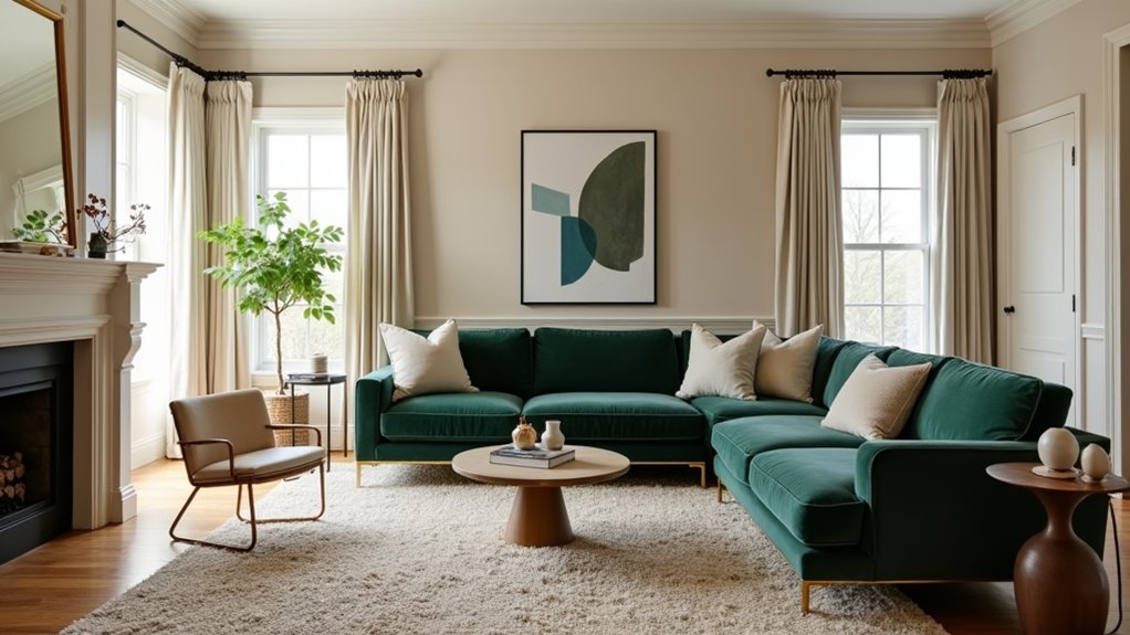
Set a luxe budget up front and prioritise what truly matters: seating, lighting, and textures. Layer warm, varied lighting and use richer textiles like velvet or bouclé to add depth. Choose a restrained color story with two neutrals plus a deeper accent, and keep finishes cohesive across walls, floors, and cabinetry. Place focal pieces for easy sightlines, define zones with rugs, and mix budget finds with durable investment pieces. Stay cohesive and uncluttered, and you’ll reveal high-end vibes fast—there’s more to explore.
Key Takeaways
- Set a clear budget by room, prioritizing essential elements like seating, lighting, and textures before showpieces.
- Layer lighting with ambient, task, and accent sources using warm bulbs to create warmth and depth.
- Use cohesive color palettes with two neutrals and a deeper accent, ensuring consistent finishes across spaces.
- Define zones with rugs and thoughtful furniture placement to guide traffic and highlight focal points.
- Curate art, mirrors, and sculptural accents to anchor rooms, ensuring each piece enhances mood, texture, or contrast.
Set a Luxe Budget and Priorities Up Front

Setting a luxe budget and priorities up front keeps your project focused and affordable. You’ll begin with clear numbers for overall spend, then allocate by room and function.
Practice honest Budget planning by listing must-haves, nice-to-haves, and contingencies, so you don’t chase fleeting trends.
Next, set priority setting rules: fund essential elements first—seating, lighting, and textures—before splurging on show pieces.
Establish a realistic timeline and decision deadlines to avoid scope creep.
Track every purchase, compare alternatives, and use invoices to verify costs.
Reserve a separate line item for unexpected fixes.
Layered Lighting on a Budget: Warmth, Depth, and Drama
Layer warmth with lamps to create inviting corners without breaking the budget. Build depth by layering ambient, task, and accent lighting to sculpt spaces and highlight features.
Add budget-friendly light accents to finish the look with punch and drama.
Layer Warmth With Lamps
Layering warmth with lamps instantly upgrades a space without breaking the bank. You don’t need expensive fixtures to create depth or a welcoming vibe.
Start with a versatile base: a dimmable main lamp and two supplemental sources at different heights. Use warm bulbs (2700–3000K) to cultivate an ambient glow that softens sharp edges and textiles.
Place a floor lamp beside seating for task light, and a table lamp near art or a console to guide the eye. Lamps with fabric shades diffuse light and reduce glare, boosting coziness.
Mix metals and textures to add subtle contrast without clutter. Aim for even distribution so no area feels underlit, and your space gains a cohesive, cozy ambiance that reads luxurious on a budget.
Depth Through Layered Lighting
Depth through layered lighting builds atmosphere by combining multiple light sources at different intensities and heights. You configure a primary ceiling fixture with a dimmer, add floor or table lamps for height and warmth, and tuck bias lighting behind architectural features. This mix creates ambient ambiance, guiding your eye through the space without glare.
Include task lighting near work areas, so you stay productive without sacrificing mood. Use warm bulbs for a cohesive tone, and vary beam spreads to sculpt depth—narrow spots highlight decorative accents, broader washes soften surfaces.
Control and balance are essential: adjust each layer until shadows feel intentional, not random. Finally, keep fixtures elegant and coordinated; the right combination elevates budget spaces with subtle, luxe detail.
Budget-Friendly Light Accents
Budget-friendly light accents can transform a space without breaking the bank, using simple, well-placed pieces to add warmth, depth, and drama. You’ll achieve this with layered but affordable options that emphasize function over flash.
Start with warm ambient glow sources, like dimmable LEDs or warm white fixtures, to create a soft, inviting base. Pair these with targeted accent illumination—small, directional lamps or under-cabinet lighting—to highlight architectural features, artwork, or textures.
Use mirrors and light-colored surfaces to amplify the glow without extra fixtures. Keep scale in mind: choose compact, multipurpose luminaires that blend with decor.
Finally, balance daylight and artificial light to maintain consistency, avoiding harsh contrasts. This practical approach delivers luxury through thoughtful placement, not spending.
Rich Textiles, High-Impact Fabrics, and How to Use Them
Rich textiles and high-impact fabrics can instantly elevate a room, but the key is restraint and deliberate placement. You’ll boost luxury by choosing a few well‑edited pieces rather than overloading the space.
Start with elegant drapery in a rich but muted tone; hang beyond the window frame to create height and drama without overwhelming walls. Pair with plush upholstery in a complementary texture, like velvet or bouclé, to anchor seating without shouting.
Limit patterns to one focal fabric and keep others solid or tonal. Use large-scale textiles sparingly on accents—throws, pillows, or a single statement chair—to avoid clutter.
Balance sheen and matte finishes, and always test under real lighting. Prioritize fit, proportion, and cleanliness for lasting impact.
Color Stories That Read Expensive on a Budget

Color choices can make a room feel layered and expensive without overspending; the secret is pairing restrained palettes with subtle depth. You’ll achieve this by selecting a core color story—two neutrals anchored with a deeper accent—that reads elegant rather than flashy.
Start with a light, warm base and introduce contrast through undertones in textiles and finishes, not loud hues. Build cohesion with consistent undertone across walls, flooring, and cabinetry. Use variations in sheen—matte walls, satin trim, a glossy surface—to add dimension without noise.
Choose budget-friendly accents in small doses: lamps, art, throw pillows, and ceramics that echo the palette. Track color momentum with samples, ensuring the palette stays unified across rooms for a refined, inexpensive look.
Color palettes anchor the luxe perception.
Strategic Furniture Placement for Luxe Flow
Think about Furniture Placement Zones to shape how you move through a space without collisions or dead ends.
Use Flow-Enhancing Arrangements that guide traffic while maximizing seating and sightlines.
Position the Focal Piece strategically to anchor the room and set the luxe mood from the moment you enter.
Furniture Placement Zones
Strategic furniture placement zones guide flow and function, so you can move through rooms with ease while still feeling luxurious. You tailor furniture arrangement to create clear zones for conversation, work, and display, avoiding clutter that disrupts the visual rhythm.
Start with a focal point and orient seating to encourage easy eye contact and dialogue, not obstructed pathways. Use rugs to anchor each zone and define boundaries without breaking sightlines.
Balance scale by pairing lighter, smaller pieces with sturdier, grounded anchors, maintaining cohesion across spaces. Plan zone optimization by aligning major pieces with architectural cues—windows, doorways, and alcoves—so traffic naturally follows logical routes.
Keep circulation clear and lighting layered to enhance mood and depth, ensuring practical luxury without overcrowding.
Flow-Enhancing Arrangements
Flow-Enhancing Arrangements optimize movement and sightlines through deliberate furniture placement. You design rooms that flow, not clump, by aligning paths with main sightlines and keeping traffic clear of key surfaces.
Place seating to face focal points without creating barriers, and use rugs to define zones while preserving openness. Maintain symmetry or intentional asymmetry to anchor balance, but avoid overcrowding.
Choose compact, functional scales for each piece, prioritizing uninterrupted lines from entry to seating. Color harmony guides your selection—tie neutrals to accent tones for cohesion and perceived space.
Keep corners free from clutter, enabling easy navigation and visual breath. Space optimization comes from multi-use furniture and strategic negative space, ensuring every item earns its keep and contributes to a luxurious, uncluttered feel.
Focal Piece Positioning
To anchor a luxurious look, place your focal piece where it can immediately capture attention without blocking movement. Focal piece positioning matters because a well-placed centerpiece guides circulation and defines zones.
Choose a statement focal points that secures the room’s rhythm, such as a sculptural sofa, a bold oversized artwork, or a luxe coffee table. Position it at eye level and within sightline from the main entry, but avoid crowding walls or corners.
Confirm surrounding furniture aligns to create purposeful pathways, not dead ends. Use symmetry or deliberate asymmetry to reinforce balance, keeping negative space intentional.
When traffic flows smoothly, the eye rests on the focal point, elevating perceived value. Reassess layout after minor changes to maintain strong statement focal points.
Elevate With Accessories: Art, Mirrors, and Standout Pieces
A carefully chosen mix of art, mirrors, and standout pieces can instantly elevate a room, drawing attention where you want it most. Focus on Art curation to guarantee cohesion with your palette, style, and scale. Choose a few bold pieces to anchor walls, then complement with smaller works for rhythm and balance.
When placing mirrors, consider mirror placement to maximize light and create the illusion of space without clutter. Position mirrors opposite windows or seating to reflect textures and color layers, not just for vanity.
Keep standout pieces intentional—one or two sculptural accents or a striking console can anchor a seating area. Resist filler; each item should enhance mood, contrast, or texture, delivering impact while maintaining budget-friendly restraint.
Mix Inexpensive Favourites With Invest-In-It Staples
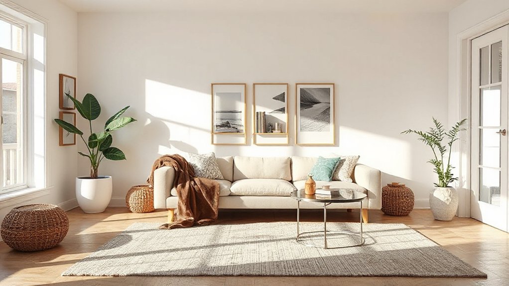
Smart mixing is how you get a luxe feel without blowing your budget: pair affordable finds with a few high-impact, investment pieces you’ll use year after year. You’ll balance budget boutique items with durable staples like a solid sofa, quality lighting, and timeless hardware.
Choose luxury accents—think a sculptural lamp, a refined rug, or a metal coffee table—that anchor rooms without overwhelming them. Place investment pieces where they’re used daily, and let cheaper pieces handle seasonal shifts.
Crowd fewer, purposeful accessories rather than clutter. Create cohesion through aligned finishes and a consistent color palette so inexpensive pieces read as curated, not disposable.
The Power of Texture: Shine, Matte, and Subtle Patterns
Texture is your first cue to luxury, balancing shine, matte, and subtle patterns to add depth without clutter. Use a mix of reflective surfaces, velvety finishes, and restrained prints to create contrast that feels rich rather than busy.
Start by pairing one high-shine piece with matte accents and a quiet pattern to anchor the room.
Texture Tactics: Shine
If you want a room that reads as polished rather than precious, incorporate surfaces that catch light with controlled shine. Start with high-fire ceramics, lacquered panels, or glass tiles to reflect daylight and lamps without overwhelming the space.
Pair these with subtle metal accents—brushed brass, nickel, or bronze—that echo luxury materials without shouting. Use decorative finishes on furniture frames and lamps to add depth without adding cost.
Prioritize scale and placement: a single glossy surface can balance matte textures elsewhere, preventing glare. Keep edges clean and avoid busy patterns that distract from shine.
Maintain restraint; too much reflectivity reads as showy. The goal: a cohesive, refined glow that feels intentional, not flashy.
Matte Magic: Subtle Patterns
Matte surfaces bring depth without glare, turning subtle patterns into tactile interest that stays quiet yet intriguing. You’ll leverage matte finishes to soften strong lines and create a cohesive backdrop for budget-friendly luxuries.
Choose fabrics with matte textures—velvet, brushed cotton, linen blends—to add dimension without shouting. Pattern plays best when understated: micro-weaves, tonal stripes, or faint geometrics appear richer when they aren’t glossy.
Pair matte surfaces with clean edges and a restrained color palette to amplify sophistication. Use subtle textures on rugs, cushions, and wall panels to introduce depth without overwhelming the space.
Accessorize with metallic accents sparingly; they won’t compete with the matte narrative, yet they’ll catch eyes deliberately.
The result: refined, approachable elegance rooted in thoughtful material choice. matte finishes, subtle textures.
Create Cohesive Scales and Proportions Across Rooms
To create cohesive scales and proportions across rooms, start by choosing a unifying measurement or concept—such as ceiling height, furniture footprint, or a consistent color tempo—and carry it through each space. You’ll establish scale harmony by repeating that anchor in furniture sizes, rug proportions, and window treatments.
Maintain proportion balance by pairing large furniture with lighter surroundings and allocating generous negative space around each piece. Use a common rhythm: align legs, align edges, and stagger heights to avoid monotony.
Clip extraneous clutter that disrupts the reading of scale. Test your plan in a quick mock layout, then adjust dimensions before buying.
With disciplined repetition, rooms read as a single, refined suite rather than disjointed spaces.
Upgrades That Feel High-End: Paints, Finishes, and Hardware
Upgrading the look of a space often comes down to the details you choose. You can push a luxurious feel with careful picks in paints, finishes, and hardware that don’t break the bank.
- Choose mid-tone, breathable paints with low sheen for depth and easy touch-ups.
- Opt for budget-friendly finishes that mimic high-end metals, like brushed nickel or matte black.
- Prioritize hardware with clean lines and consistent finishes across doors, drawers, and fixtures.
- Invest in a few statement pieces (molding, a hardware set, or an accent wall) to anchor the room.
Quick-Style Audit: Reassessing a Space for Luxe Coherence

A quick-style audit helps you spot where your space feels cohesive—and where it doesn’t—so you can tighten the look without overhauling everything. Begin by scanning three zones: dominant surfaces, supporting accents, and circulation paths.
Check if finishes, textures, and color tones repeat in a controlled way, creating spatial harmony rather than competition. Look for clutter hotspots that disrupt line and scale, and note items that feel out of place or misaligned with your core palette.
Prioritize Artistic layering by pairing a few glossy, matte, and tactile surfaces instead of stacking mismatched bits. Guarantee lighting reinforces cohesion: avoid isolated pools of brightness or dim corners.
Finally, edit relentlessly: remove or relocate pieces that don’t contribute to the intended luxe look, preserving intentional flow.
Frequently Asked Questions
How Can I Measure Budget Impact Before Purchases?
To measure budget impact before purchases, you implement budget planning and expense tracking. You compare projected costs to your limit, assess total value, and adjust choices now, ensuring each item stays within your target. Reassess periodically as prices change.
What Unseen Costs Should I Anticipate When Styling?
“Trust but verify,” you’ll learn: hidden fees and sourcing challenges shape your styling budget. You’ll anticipate shipping, return, and accessory markups, negotiate quotes, and set contingencies so you avoid cash-flow headaches while achieving a luxe look.
Which Fakes Convincingly Mimic Luxury Textures?
You’ll want luxury fabric and faux finishes that fool the eye: look for high-shear weaves, dense nap, and realistic grain. Choose matte textures, avoid obvious sheen, test under lighting, and pair with solid, well-constructed frames for credibility.
How Long Will Inexpensive Upgrades Stay Chic?
Affordable elegance lasts you years if you pair timeless trends with careful upkeep; you’ll stay chic by revitalizing accents seasonally, not overhauling, and choosing durable materials. You’ll keep your space practical, confident, and consistently on-trend.
Which Apps Help Plan Cohesive Room Palettes Quickly?
Most people launch color coordination projects with mood boards in under 15 minutes, and you can, too. Use apps like Palette Planner and Canva to swiftly craft cohesive palettes, aligning colors, textures, and mood boards for your space.
Conclusion
You don’t need a mansion to feel luxe—smart choices trump price tags. Start with a clear budget, then layer lighting, texture, and cohesive color. A small room can read grand with high-contrast accents and well-scaled furniture. A quick stat to keep in mind: lighting accounts for up to 40% of perceived space quality, so shading, warmth, and layering matter more than pricey decor. Prioritize flow, proportion, and finish consistency, and your budget-burnished space will feel premium, not cheap.
About the Author



