

To achieve a polished look, start with a cohesive color base—neutral neutrals with 1–2 accents—and test them in natural light to guarantee harmony. Choose well-scaled furniture that fits the room’s width and function, avoiding oversized pieces in narrow spaces. Limit clutter by curating purposeful decorative accents, and layer textures and lighting with warm dimmers to add depth. Use repeatable materials and clean sightlines to unify zones, and know that more tips await if you keep exploring.
Key Takeaways
- Avoid clutter: curate a few high-quality, purposeful accessories and maintain clean surfaces to prevent visual chaos.
- Balance color and finishes: limit accents to two supporting hues and use neutral bases with cohesive undertones.
- Respect scale and proportions: choose furniture that fits the room’s size, pairing tall pieces with low visuals for balance.
- Layer lighting thoughtfully: combine ambient, task, and accent lighting with dimmers to prevent harsh glare.
- Plan sightlines and transitions: ensure cohesive edge silhouettes and repeat unifying elements to foster flow.
Defining Polished Design: What It Looks Like in Real Rooms
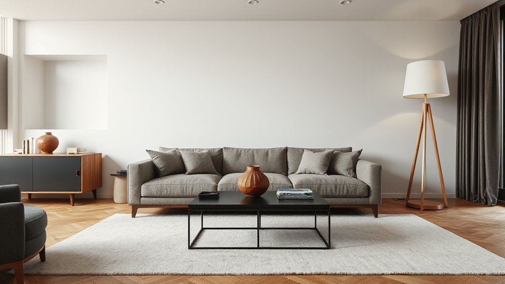
Polished design isn’t about gloss alone; it’s about purposeful restraint that elevates a space. You identify a clear hierarchy: quiet structural moves, refined materials, and deliberate texture.
In real rooms, polished design exists where decorative accents are purposeful, not decorative for decoration’s sake. Choose pieces that reinforce function and line, then let subtle contrasts—matte vs. sheen, warm wood vs. cool stone—forge depth.
You’ll avoid clutter by curating a few high‑quality items rather than many, ensuring each element earns its place. Color psychology guides your choices, steering mood with accessible palettes and balanced saturation.
Keep scale consistent across zones, harness natural light, and align hardware, furnishings, and textiles to a cohesive story. The result feels effortless, controlled, and genuinely refined.
How to Choose a Cohesive Color Palette for Every Room
A cohesive color palette starts with a clear goal: establish mood, define each room’s role, and guarantee that every element reads as part of a single story. You’ll prioritize color harmony and deliberate palette selection across spaces, ensuring consistency without sameness.
Focus on a baseline neutral, then layer with 1–2 accent colors for variety.
- Establish a unifying base: a calm neutral that travels between rooms to knit the scheme.
- Choose two complementary accents: one saturated hue and one muted variant for depth.
- Test in real light: observe how shadows and daylight shift your Palette selection throughout the day.
Keep swaps intentional: repeat key tones in textiles, finishes, and art to reinforce cohesion and polish.
How to Avoid Color Clashes With Practical Pairing Rules
You already know how to establish a cohesive palette; now, prevent clashes by applying practical pairing rules that help every room read as intentional.
Begin with Color harmony as your guide: select tones that share undertones (warm vs. cool) and keep the dominant color on walls or large surfaces. Limit accents to two supporting hues to avoid visual competition, and repeat a unifying color across textiles, art, and accessories.
For paint selection, favor satin or eggshell finishes in low-sheen neutrals to reduce glare and unify reflections. Test color pairs in large swatches for natural light shifts, not tiny chips.
Use contrast intentionally—dark woods with lighter walls or vice versa—to delineate zones. Document your palette to maintain consistency, especially when introducing new elements.
Mastering Scale: Picking Furniture Proportions That Fit

Mastering scale starts with choosing furniture that fits your space and your functions. Assess seating proportions first, then confirm room-appropriate sizing for each piece to maintain balance.
Keep proportions, scale for seating, and overall rhythm in sync as you plan tight layouts or open rooms.
Proportions That Fit
Choosing furniture with the right proportions starts with measuring space and then selecting pieces that read as a coherent whole. You’ll achieve Proportions harmony by balancing scale with room dimensions, ceiling height, and traffic flow, ensuring each piece feels grounded yet proportional. Focus on furniture sizing that complements other elements, not dominates them.
Use these guiding steps:
1) Compare silhouettes to room width, avoiding oversized blocks in narrow corridors.
2) Pair tall pieces with low-lying furniture to maintain visual balance.
3) Prioritize scale consistency across zones to preserve cohesion and rhythm.
Apply precise measurements and sketch sightlines before buying. Avoid cluttered vignettes that disrupt harmony, and re-evaluate each item’s footprint in real life, not just on a showroom floor.
This disciplined approach yields a polished, cohesive space with deliberate proportioning.
Scale For Seating
Scale for seating starts with sizing that supports flow and function. When you pick seating, prioritize proportions that complement room width, traffic paths, and focal points. You’ll assess scale by pairing seating with surrounding pieces so aisles stay clear and sightlines stay intact.
Regarding seating comfort, choose cushions and support that align with how you sit and lounge, not just how they look. Opt for a mix of seating heights to create a dynamic, usable conversation cluster without blocking access to windows or doors.
Upholstery choices should balance durability with feel—select fabrics that resist wear in high-traffic areas while preserving a refined look. Measure before you buy, and test in place to guarantee comfort, scale, and flow align with the room’s intent.
Room-Appropriate Sizing
Ever wonder how to guarantee your furniture fits the room without crowding it? Mastering room-appropriate sizing starts with proportional thinking: scale pieces to both wall height and traffic flow, not just function. Prioritize furniture ergonomics so seating and surfaces support comfortable use without overpowering space.
- Measure first, visualize second: map wall lengths, doorway clearances, and clearance around seating.
- Choose a trio of anchor pieces sized to the room, then add lighter accents to balance proportion.
- Check sightlines and circulation: maintain at least 36 inches between large items for easy movement.
This approach keeps rooms breathable, cohesive, and polished. By sizing with wall height in mind and prioritizing ergonomics, you prevent crowded feels and awkward layouts.
How to Prevent Furniture Overload in Small Rooms
Start by decluttering the space to reveal its true footprint and create room to move.
Prioritize essential pieces that serve a daily function and fit the room’s scale, then trim anything that doesn’t support those needs.
Use multi-functional furnishings to maximize utility without adding bulk, keeping pathways clear and sightlines open.
Declutter The Space
Decluttering a small space starts with ruthless prioritization: only keep furniture that serves a clear function or enhances daily workflow. You’ll trim invisible clutter first, then reveal usable surface and flow. Focus on practical, not decorative, pieces, and keep a consistent scale to preserve space perception. Clutter reduction hinges on disciplined removal and a clear plan for what stays.
1) Identify essential functions: seating, resting, storage.
2) Limit surfaces: one primary work zone, one display, one buffer.
3) Use vertical solutions: wall shelves, hooks, and wall-mounted consoles.
Practice daily maintenance: return items after use, bin mismatched objects, and re-evaluate quarterly. This supports space organization and prevents overload, ensuring a polished, breathable room.
Prioritize Essential Pieces
To prevent furniture overload in small rooms, prioritize pieces that earn their keep by clearly supporting daily routines and essential functions. Choose a compact sofa or daybed with clean lines that doubles as seating and an occasional sleep surface. Then add a slim coffee table with hidden storage to reduce clutter.
Evaluate each item for its primary task: seating, storage, or work. Limit decorative clutter to one focal point per space.
Plan furniture placement to maintain clear circulation—aim for at least 2.0 to 2.4 meters of path width in living areas. Use wall treatments to visually expand the room—light, unified tones or vertical patterns can add height without bulk.
Avoid oversized godsends; every piece should justify its footprint.
Use Multi-Functional Furnishings
Multi-functional furnishings are essential in small rooms because they maximize usefulness without adding bulk. You’ll streamline layouts by choosing pieces that serve more than one purpose, reducing clutter while preserving function. Focus on smart configuration, not extra decoration, to keep sightlines open and rooms breathable.
- Select storage-enabled seating that hides essentials, like ottomans or benches with compartments.
- Opt for coffee tables or consoles with built-in shelves or drawers to minimize additional furniture.
- Choose transformable pieces, such as wall beds or nesting units, to adapt to daily needs without crowding standard-term space.
These multi-functional furniture choices embody space-saving solutions, promoting fluid movement, cleaner surfaces, and a cohesive design. Implement thoughtfully to maintain polish without sacrificing practicality.
Lighting That Works All Day, Not Just at Night
How can your lighting serve you from morning to night? Begin with daylight-aware design: choose bulbs that mimic natural light as the day progresses, and pair with dimmers to adjust intensity without jars of glare.
Position key fixtures to illuminate work zones during daylight and switch to softer, warm tones after sunset. Use a lighting plan that supports mood enhancement by aligning color temperatures with activities—cooler temps for focus, warmer temps for relaxation.
Incorporate daylight harvesting where possible—translucent window treatments and strategic mirror placement amplify natural light. Maintain consistency across rooms to prevent visual chaos, and avoid overlit scenes that drain energy.
Finally, test plans at different times, refining based on real use to sustain comfort and efficiency all day.
Layering Light: Ambient, Task, and Accent in Balance

Layer lighting in layers, balancing ambient, task, and accent to suit how you use each space.
Start by ensuring ambient light is even and soft, then add task light where you read, cook, or work.
Finish with accent cues that highlight architecture or color without glare.
Align your levels so no single source dominates, and place accents to guide the eye toward use and mood.
Layering Light Levels
Layering light levels is essential for both function and mood: you should balance ambient, task, and accent lighting so the space reads as cohesive rather than cluttered. To achieve steady light balance, plan sources that complement each other and adjust intensity by zone.
- Map zones: identify where you read, cook, and relax, then tailor ambient, task, and accent layers per area.
- Calibrate brightness: use dimmers, warm colors, and equal color temperatures to prevent harsh contrasts.
- Vet shadows: place fixtures to avoid glare and ensure even illumination across surfaces.
This approach keeps sightlines clear, supports tasks, and enhances architectural details without overcrowding. Layering light levels yields a polished, functional look that remains visually calm.
Balanced Ambient And Task
Balanced ambient and task lighting starts with clarity about what each layer should do: ambient provides the overall glow, while task lighting sharpens visibility for specific activities.
In a balanced setup, you choose fixtures that distribute even brightness without glare, then layer focused light where you need it most. Place ambient sources to soften shadows and unify color warmth across rooms, not to overpower detail.
Add task lighting at desks, work surfaces, and reading nooks to support precise tasks without creating contrast hotspots.
Consider material pairing to guarantee finishes reflect or absorb light as intended, preserving color accuracy.
Align plans with your lighting design goals, using dimmers to adjust mood and function.
Keep proportions calm, avoid over-illumination, and test in real use to confirm comfort.
Accent Lighting Strategically
Accent lighting adds depth and focus, rounding out a balanced scheme by highlighting features without overpowering ambient glow. You’ll use accent lighting to sculpt drama, draw attention to art, and define architectural cues, while maintaining harmony with lighting layers.
- Position and aim thoughtfully: place fixtures to avoid glare, target focal elements, and mirror ceiling height for even distribution.
- Calibrate intensity: keep accent brighter than ambient but dim enough to prevent harsh contrast; use dimmers to adapt with different tasks and times.
- Choose complementary fixtures: select styles that echo your room’s aesthetic, ensuring finishes and color temperatures blend with task and ambient lighting.
This approach delivers controlled emphasis, depth, and polish without clutter.
Texture as a Unifying Thread Across Rooms
Texture acts as the unifying thread that ties disparate rooms together, and you can harness it by repeating a few core materials—wood, fabric, and natural stone—throughout the home.
In practice, aim for cohesive textures rather than identical surfaces; this is where textural contrast elevates polish. Begin with a consistent base—light or dark woods—and mirror it in furniture frames, cabinetry, and trim.
Layer tactile elements, from woven textiles to suede, to create tactile layering without visual clutter. Introduce a shared material palette in textiles and accessories to steer the eye across spaces, while keeping color restrained to maintain calm continuity.
Mixing Materials Without Visual Chaos: A Simple Guide
To keep visual harmony when mixing materials, balance textures across rooms so no single element dominates.
Pair metals with woods thoughtfully, using a unifying color or finish to tie disparate pieces together.
Start with one grounding material and introduce a second at low contrast to avoid visual chaos.
Balance Textures Across Rooms
Balancing textures across rooms starts with a clear materials map: choose one unifying material (like wood or linen) as the backbone, then layer two or three contrasting textures as accents. You’ll achieve Textural contrast and Material harmony by pairing durable surfaces with softer textiles, then anchoring with a darker anchor piece to ground the scheme.
- Establish a dominant texture foundation that repeats across key zones to maintain flow.
- Introduce two distinct textures as accents, ensuring one is tactile and the other visual.
- Place touches of the accent textures in sightlines to reinforce cohesion without saturation.
Keep finishes matte rather than glossy to reduce glare, and apply consistent scale across rooms to avoid visual chaos while preserving interest.
Pair Metals With Woods
Pairing metals with wood creates warmth and edge in equal measure, but it must be intentional to avoid visual clutter. To master metal pairing, choose a dominant metal and support it with one secondary finish to keep contrast cohesive.
Start with wood accents—a walnut conference table, oak shelf brackets, or ash flooring—then introduce metals sparingly through hardware, lighting, or framing. Aim for tonal harmony: cool-toned metals pair best with lighter woods, warm metals with richer wood tones.
Limit the palette to two metals max to prevent chaos. Practice symmetry in placement to read as deliberate rather than flashy. Consider finish consistency—prefer brushed or matte textures for a refined look.
Finally, test sparsity: remove one metal element if the room feels wired. Focus on balance, restraint, and purposeful accents.
Achieving Flow: How to Guide the Eye Through a Space
Achieving flow in a space means guiding the eye so movement feels natural and intentional. You’ll create continuity by aligning lines, repeating shapes, and balancing color across zones. Color harmony and furniture placement are your core tools for seamless transitions.
- Plan sightlines from entry to focal areas, placing larger pieces to frame views without crowding.
- Repeat a unifying element—material, finish, or color—at gradual intervals to knit rooms together.
- Use scale and spacing to encourage a natural path, avoiding abrupt stops or jarring focal points.
Keep surfaces uncluttered and ensure energy moves through seating arrangements, consoles, and art.
Consistency in edges and silhouettes reduces visual noise, enhancing perceived polish. This approach preserves rhythm and focus, so your space feels intentional rather than segmented.
Rug Strategy to Ground and Connect Rooms

Ground rugs anchor each zone, creating a visual foundation you can trust as you move through walls and thresholds.
Pair rooms by using rug sizes that define shared walkways and align furniture edges to reinforce flow.
Start with scale and placement that maintain proportion across shifts, so each space feels connected yet distinctly grounded.
Ground With Rugs
Rugs ground a space by anchoring furniture and defining flow, and they can visually link adjacent rooms if you choose sizes, shapes, and placements with intention. You’ll create cohesion by selecting runs that align with furniture lines and doorways, avoiding awkward gaps. Consider texture and scale to emphasize height or calmness, then pair with decorative bowls and indoor plants to finish the vignette.
- Choose a rug size that fits under key furniture edges to establish a clear boundary.
- Repeat a subtle pattern or color across adjacent rooms to whisper continuity.
- Vary pile height and layer rugs only when you can maintain crisp transitions.
These steps keep the look polished while grounding spaces with purposeful, practical detailing.
Connect Room Pairs
Pair adjacent rooms with rug choices that visually connect and ground the space. When you link rooms, choose rugs that share a unifying color or pattern scale, so connections feel intentional rather than jarring.
Aim for consistent pile height to avoid awkward step changes at thresholds, and guarantee rug sizes establish clear buffers around furniture. In each zone, anchor seating with a rug that fits the main problem area, then repeat a similar proportion in the adjoining room to create a cohesive flow.
Consider Art placement to reinforce a shared story across spaces, using pillows or throws for subtle color echoes.
Plan Furniture arrangement to align with sightlines, keeping pathways clear while the rug defines the gathering area across rooms.
Scale And Placement
Pairing adjacent rooms with a grounded rug strategy starts with scale: choose size and placement that anchor the seating area while guiding sightlines across thresholds. You’ll achieve furniture placement harmony by respecting scale balance, ensuring the rug underpins the arrangement without overpowering it.
1) Ground the main seating group with a rug large enough to allow at least the front legs of all furniture to rest on it, creating cohesion rather than separation.
2) Align rug edges with architectural cues—sofa length, coffee table, or doorway thresholds—to unify pathways and improve flow.
3) Consider alternates for traffic zones, using smaller runners that maintain scale balance while connecting rooms.
This approach yields precise, purposeful rooms with grounded, visually connected surfaces and clear focal points.
Window Treatments That Enhance Light and Proportion
Window treatments can transform light and scale by directing daylight where you want it and framing the view to enhance proportion. You achieve this with precise fabrication and proper placement.
Start by aligning curtain rods with the window’s hemline to preserve architectural lines and avoid visual clutter.
Choose window framing that complements the room’s proportions—narrow frames for intimate spaces, wider frames for expansive vistas.
Opt for light filtering fabrics to soften glare without dulling color or texture, and consider plantation shutters or cellular shades for controllable light levels.
Mount treatments slightly outside the window reveal to extend perceived width and height, then balance with proportionate hardware.
Finally, test daylight at different times to confirm consistent, pleasant illumination throughout the day.
Art and Accessories: Strategic Placement for Intentional Reads
Use placement deliberately to guide how a room reads at a glance: anchor sculptures and framed works at eye level, with a clear rhythm that leads the eye through a sequence of focal points. Art placement and accessory selection define hierarchy, so choose pieces that reinforce your narrative and avoid visual clutter.
Begin with a dominant piece, then layer smaller items to support it without competing attention. Balance scale, texture, and color across surfaces to maintain coherence and prevent fragmentation.
- Establish a clear focal sequence by arranging 1–2 anchor works, then supporting objects.
- Vary depth and material to create tactile contrast while preserving a unified palette.
- Reassess periodically to guarantee each item contributes meaningfully to the overall read.
Clutter Control With Welcoming Storage Solutions

Clutter can undermine the perception of a room, so implement welcoming storage that hides mess without sacrificing warmth. You’ll achieve this with purposely designed pieces that blend function and mood: closed cabinets with soft-close doors, multi-purpose ottomans, and shallow shelves tucked above eye level.
Prioritize storage optimization by grouping related items in labeled, accessible zones, reducing visual noise and decision fatigue. Use hidden pull-outs for seasonal decor, cords, and manuals, so everyday surfaces stay clear.
Choose textures and colors that complement the room’s palette, ensuring storage reads as intentional furniture rather than an afterthought. Limit visible containers; opt for uniform bins or woven baskets.
Finally, schedule quick 5-minute resets daily to preserve clutter elimination and maintain a polished, welcoming atmosphere.
Personal Style Without Theme Exhaustion
You don’t need a single theme to pull a room together; personal style can shine through even with varied influences. You can curate a cohesive vibe by anchoring spaces in thoughtful choices rather than a strict motif. Focus on how you feel in each area, letting personal expression guide accents, textures, and finishes.
This approach supports a natural Style evolution—your tastes adapt without chaos. Use these steps to maintain balance:
- Start with a neutral backbone, then layer color and texture to echo your personality.
- Rotate a few statement pieces over time to refresh without overhauling.
- Align lighting and materials to unify disparate elements, clarifying intent.
Be intentional, resist trend-driven clutter, and let your rooms reflect you with clarity and confidence.
Budget-Smart Upgrades That Look Expensive
Smart upgrades can transform a space without draining your budget by focusing on perceptual improvements—like color, texture, and finish—rather than wholesale replacements. You’ll notice impact from simple choices: refreshed color schemes with neutral bases, layered textiles, and cohesive hardware.
Prioritize artistic expression through curated accents—art, ceramics, or sculptural pieces that echo your style without overwhelming the room. Opt for sustainable materials where possible: cork flooring, low-VOC paint, and responsibly sourced wood tones.
Refinish existing furniture with quality waxes or stains to elevate perceived value without new buys. Upgrade lighting thoughtfully; a single well-chosen fixture can unify disparate elements and create depth.
Maintain restraint in scale and repetition to avoid clutter, ensuring each item reinforces the room’s intended mood and perceived expense.
Quick 30-Minute Edits for Instant Impact
Boost instant impact with fast, targeted edits that don’t require a remodel. You can sharpen rooms in minutes by focusing on color balance, texture, and lighting, letting your space feel intentional rather than cluttered. Begin with a deliberate swap of textiles and art to amplify artistic expression without overhauling fixtures. Choose sustainable materials for pillows, throws, and rugs to reinforce a cohesive, ethical palette.
- Rebalance contrast with a single anchor piece and harmonizing accessories.
- Layer textures—wool, linen, and cotton—adding warmth and depth without heavy furniture.
- Refresh lighting for mood and function, pairing warm bulbs with a dimmer to sculpt space.
These small, purposeful edits create polish fast, while preserving sustainability and personal expression.
Troubleshooting Polished-Look Pitfalls
Polished looks can slip into rigidity when details don’t align with real use, so identify common pitfalls before they derail your design intent. You’ll often overemphasize perfection, creating a space that feels staged rather than livable.
Pitfalls include neglecting scale, which makes furniture feel bulky or undersized, and underestimating maintenance, which turns refined surfaces dull quickly. To troubleshoot, check for textural contrast—avoid a sea of smooth, glossy finishes with no tactile variation.
Balance color harmony by embedding warm and cool tones thoughtfully, so accents don’t clash or vanish. Overloading accessories can compete with architecture; curate with intention, ensuring each piece earns its place.
Finally, test lighting at different times of day; shadows can reveal mismatches in material or proportion that quiet polish hides.
Next Steps: Build Your Personal Polished Plan
To move from pitfalls to a workable plan, start by defining your polished design priorities and how you’ll live with them. You’ll translate personal style into concrete choices, align decisions with your daily rhythms, and set measurable goals. Use budget tips to balance ambition with feasibility, and track every swap against value, longevity, and ease of maintenance.
- Clarify nonnegotiables and nice-to-haves to guide purchases.
- Allocate a practical budget by room, prioritizing high-impact updates.
- Create a lean timeline that fits your lifestyle and avoids scope creep.
With this framework, you maintain control, avoid impulse buys, and ensure every element serves function and form in equal measure. You’ll finish with a cohesive, low-stress plan that reflects your personal style.
Frequently Asked Questions
How Do I Start a Polished Design With a Tight Budget?
Start small, you can: set a cohesive color palette, prioritize essential pieces, and mix budget finds with DIY decor. Budget friendly tips include thrifty swaps and repurposing. You’ll boost polish fast by flawless lighting and smart, targeted accents.
What Finishes Read as Polished in Low-Light Rooms?
In low-light rooms, choose lighting effects that brighten without glare and highlight material textures. Use warm, controlled illumination, layered with task and ambient options. Opt polished finishes like satin metals and glossy laminates to reflect light subtly.
How Can I Balance Scale With Limited Furniture?
You can balance scale with limited furniture by prioritizing furniture arrangement that emphasizes focal points, using proportional pieces, and layering textures. Aim for scale balancing with strategic placement, ensuring negative space breathes while specifying cushions, lighting, and accessories for cohesion.
Which Decor Accents Instantly Elevate a Space?
Start with statement lighting, then add artificial textures that surprise the eye. You instantly elevate a space as you introduce bold sconces or pendants, and tactile surfaces—faux fur, ribbed fabric—create depth you’ll notice right away.
What Are Quick Fixes for Visible Clutter Impact?
You can master quick clutter removal with clutter concealment techniques and smart storage solutions, prioritizing hidden organizers, baskets, and wall-mounted shelves; straighten surfaces, group items, and label bins, so maintenance becomes effortless and your space reads polished.
Conclusion
Achieve a polished look by applying disciplined restraint: choose a cohesive palette, keep scale intentional, and avoid clutter. Pair colors with intent, test combinations in lighting, and prioritize proportion over trend. Make quick 30-minute edits to refresh spaces, then expand thoughtfully with budget-smart upgrades that read expensive. Ready your plan: define goals, map room needs, and curate essentials only. As the adage goes, slow and steady wins the race—steady edits, sharp results, lasting polish.
About the Author



