

Neutrals feel rich, not boring, when you layer texture, light, and thoughtful contrast. Start with foundational textiles—woven upholstery, linen drapes, a textured rug—and pair them with tactile finishes like matte walls and satin accents. Balance warm and cool undertones, test color in real time, and use subtle patterns to guide the eye without shouting. Introduce controlled metallics or glaze effects for depth, and align furniture with thoughtful scale. If you keep exploring, you’ll uncover more practical strategies.
Key Takeaways
- Use texture and pattern within a neutral palette to add depth and visual interest without introducing loud color.
- Leverage contrasts in value, finish, and sheen (matte walls, satin accents, metallics) to create sophistication.
- Layer varied textiles (knits, linen, velvet) and mix scales to build tactile richness and rhythm.
- Introduce cohesive silhouettes—soft curves with angular lines—to create movement without distraction.
- Anchor spaces with purposeful neutrals, balanced with a unifying accent and thoughtful lighting to maintain serenity.
Why Neutrals Feel Rich, Not Boring

Neutral tones feel rich because they bring depth without shouting for attention. When you choose neutrals, you’re leveraging neutral psychology: colors that invite focus on form, texture, and light rather than hue.
You’ll notice rooms feel steady, polished, and timeless, which keeps attention on function and flow. Emotional neutrality isn’t absence; it’s a deliberate balance that lets statement pieces shine without clamor.
You pair fabrics, metals, and wood to create contrast through texture and pattern—not loud color. Subtle shifts in value and undertone add sophistication, while consistent undertones unify diverse elements.
You maintain warmth with natural materials and soft lighting, ensuring comfort aligns with restraint. This approach yields spaces that feel curated, approachable, and enduring, so neutral interiors remain engaging, not dull.
Layer Textures for Depth in Neutrals
Texture is the quickest way to add depth to a neutral palette, because touchpoints engage the senses beyond sight. Layer textures intentionally to create visual interest without shouting color.
Begin with foundational textiles—woven upholstery, a felted rug, or a linen drapery—then add contrast with a sleek leather accent or a tasseled throw.
Practice textural layering by mixing materials with distinct surfaces: matte, satin, rough, and soft. Keep the palette cohesive; vary only one element at a time to avoid visual chaos.
Introduce depth through textiles by pairing a chunky knit with a smooth boucle, or a nubby linen with a velvet pillow.
Balance scale and repetition, so patterns don’t overwhelm. Subtle sheen and fiber variation will elevate the neutrals with refined, tactile richness.
Balance Warm and Cool Undertones in Neutrals
To balance warm and cool undertones in neutrals, start by identifying the dominant hue of each element and then introduce its opposite in measured amounts. You’ll create a cohesive field where warmth and coolness support each other, not compete.
Use complementary palettes to guide mixing: soft taupe with icy gray, or warm ivory with cool alabaster accents. Balance is achieved through proportion: distribute warmth through larger surfaces, cool tones in accents and textures, then unify with a unifying undertone.
Consider lighting, as bulb color shifts perception of undertones; opt for balanced daylight or neutral LEDs.
Achieve color harmony by repeating the same subdues across rooms, tying cushions, throws, and furniture through shared undertones. This disciplined approach yields calm sophistication without tonal clashes.
Subtle Contrast Tricks for Depth and Interest
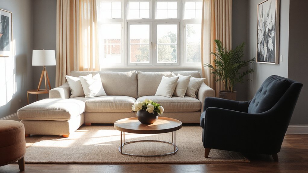
Subtle contrast is your secret weapon for depth without shouting. In neutrals, you create interest with careful color pairing that stays cohesive.
Pair warm and cool undertones within the same family to avoid jarring progressions, then introduce a single, intentional accent with a different texture or sheen. You’ll gain dimension by varying light reflection: matte walls with satin trim, or a velvet cushion against a linen sofa.
Balance is key, so limit high-contrast leaps to one or two focal points. Use accent accessories strategically to anchor rooms without overwhelming them. Consider metallics, woods, or ceramic glazes that pick up your base neutrals.
The result is polished depth that feels deliberate, not busy, and remains true to a serene, timeless palette.
The Role of Pattern Within a Neutral Palette
Patterns play a pivotal role in a neutral palette by guiding the eye and building rhythm without overpowering the room. You harness pattern to add personality while keeping harmony, not chaos. Begin with one dominant neutral pattern as the anchor, then introduce secondary patterns in complementary scales and motifs.
Pattern mixing works when contrasts stay subtle: pair a large-scale geometric with a small, organic motif, or blend a textured weave with a smooth solid. Repeat motifs across textiles, rugs, and wall coverings to create cohesion.
Remember balance: more quiet neutrals than bold prints, and never overwhelm a single focal plane. Use neutrals to frame the pattern statement, allowing color pops to feel intentional rather than accidental.
Embrace neutral patterns as deliberate texture, not decor clutter.
Material Choices That Elevate Neutral Rooms
Choosing the right materials can instantly lift a neutral room, adding warmth, texture, and depth without stealing attention from the palette. You’ll maximize impact by selecting surfaces that complement, not compete with, your color theory.
Favor natural fibers and refined finishes—soft wool rugs, linen upholstery, and matte stone or ceramic accents. These textures create visual interest while staying cohesive.
Consider furniture proportions: oversized pieces can overwhelm neutrals; scale them to the room’s footprint and ceiling height for balanced harmony. Wood tones should echo the palette’s warmth, whether through a warm oak or a cool ash, to enhance continuity.
Mix subtle contrasts—brushed metal hardware, velvet cushions, or a leather accent—to introduce presence without shouting. Prioritize durability, maintenance, and timeless appeal over fleeting trends.
Lighting: How Light and Shadow Shape Neutrals

Light interacts with neutrals to reveal their true tone, so you’ll notice how reflections brighten spaces and subtly shift color.
Shadows, when carved by furniture and architectural details, add depth that prevents flat, lifeless walls.
Light Reflects Neutrals
When light meets neutrals, the room’s character shifts with every hour and angle, revealing cooler or warmer undertones as shadows move. You’ll see how illumination edits perception, making neutrals feel either brisk or cozy, depending on source and intensity.
- Observe color temperature shifts as daylight changes, noting how walls appear cooler in mornings and warmer near lamps at night.
- Pair reflective surfaces with neutral tones to amplify monochrome harmony without shouting contrast.
- Use dimmers to control tone, preserving Neutral color psychology while sculpting mood.
- Test swatches in multiple lighting conditions to guarantee consistent, polished alignment with your design goals.
With mindful lighting choices, neutrals stay fresh and sophisticated, avoiding flatness and embracing depth.
Shadows Create Depth
Shadows aren’t merely the absence of light; they sculpt depth, revealing subtle shifts in tone that make neutrals feel grounded and intentional. You’ll use shadow as a design tool, not a mishap to fix.
Position lighting to create a controlled gradient—soft at eye level, crisper higher or lower—so the room gains dimension without harsh contrasts. Emphasize shadow play around architectural features, textures, and furniture silhouettes to emphasize form, not drama.
Vary light temperature and intensity to map depth illusion across surfaces, from walls to upholstery to flooring. Keep fixtures proportional to the space; layered sources prevent flatness and invite the eye to travel.
Together, these choices yield a cohesive neutrals palette that reads sophisticated, calm, and intentionally curated.
Furniture Silhouettes That Keep Neutrals Lively
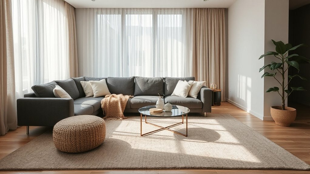
You’ll balance neutrals by choosing furniture silhouettes that blend fluid curves with soft edges, so the room feels alive without shouting.
Favor pieces that hold a strong presence yet remain mono in form, creating dynamic lines through shape rather than color.
Aim for a mix of flowing and angular silhouettes to keep the palette cohesive while adding visual interest.
Fluid Silhouette Interest
Fluid silhouette details keep neutrals from feeling flat by introducing subtle movement and form. You’ll harness fluid forms to create visual rhythm without overpowering the palette, so neutrals stay sophisticated, not static. Silhouette variation matters: mix curves with angular lines to keep eyes moving and rooms feeling energized.
- Embrace curved arms on sofas and rounded edges on chairs to soften strict lines.
- Pair low, elongated profiles with compact, sculptural pieces for dynamic contrast.
- Favor cantilevered bases and gentle scoops that hint motion without loud ornament.
- Use scale shifts—taller backs beside bench-like silhouettes—to maintain balance.
Soft Edges, Strong Presence
Soft-edged silhouettes command attention without shouting, delivering a confident presence that enriches neutrals. You steer the room with furniture that reads calm from afar and reveals intent up close.
Favor curved arms, rounded fronts, and tapering legs to soften lines without sacrificing impact. Soft edges translate with tact: a sofa’s generous curve, a coffee table with a beveled top, or a lounge chair with a gentle arc.
Pair these forms with crisp surfaces and a restrained palette to preserve a strong presence. Maintain balance by repeating curves across pieces, avoiding harsh corners in high-traffic zones.
Your aim: silhouettes that feel approachable yet purposeful, inviting touch and use. When done well, soft edges anchor your neutrals with quiet confidence and unmistakable style.
Mono Yet Dynamic Forms
Mono yet dynamic forms keep neutrals lively by balancing simplicity with subtle action. You’ll notice furniture silhouettes that read clean at first glance, then reveal movement through lines, angles, and negative space.
Monochrome harmony comes from how these pieces echo the same palette while playing with form, texture, and scale. Dynamic shapes keep your rooms feeling intentional rather than static, guiding the eye and coordinating with architectural echoes.
Here’s how to apply it:
- Choose low-profile silhouettes with tapered legs to suggest motion without shouting.
- Mix curved and angular lines to create visual tension that remains cohesive.
- Highlight shadows and reflections to emphasize depth in neutral tonalities.
- Pair matte surfaces with a touch of gloss to reinforce contrast and interest.
Accents That Pop Without Shouting
Accents that pop without shouting are all about contrast, texture, and placement. You’ll steer attention with deliberate contrasts—dark, glossy surfaces against matte neutrals, or a warm accent rug atop cool floors. Layer texture through woven throws, nubby cushions, and tactile blends that invite touch.
Placement matters: anchor a bold piece off-center, align lighting to highlight contrasts, and avoid overcrowding—your eye should travel, not trip. Introduce your focal note with restraint, then let supporting elements echo it.
When you choose bold patterns, balance them with calm backdrops so they read as intentional rather than loud. For statement art, select one standout piece and frame it to heighten sophistication.
Use these strategies to create depth, personality, and a polished, cohesive neutrals-driven room. Bold patterns, statement art.
Paint Finishes and White Balance for Warmth
Are you leveraging paint finishes and white balance to add genuine warmth to a neutrals-based room? Yes, and done right, the result feels inviting, not muddy. Focus on subtle texture and purposeful lighting to reveal depth without shouting color.
1) Choose mid-satin or eggshell sheens to reflect light softly, preserving neutral palettes while adding tactile paint texture.
2) Balance white tones with warm undertones—creamy whites, greiges, and warm whites pair best with natural materials.
3) Layer finishes in small areas for cohesion; save bold finishes for accents to avoid visual fatigue.
4) Calibrate color under consistent lighting, testing at different times of day to ensure warmth remains stable.
Practice patience, observe undertones, and refine until warmth feels natural and refined.
Using Tonal Ranges to Create a Cohesive Neutral Room

Start with layered neutral palettes to build depth without breaking cohesion, using varying tonal ranges from light to dark across walls, furniture, and textiles.
Keep subtle contrast techniques in play by pairing safe, close-toned hues and letting texture and form do the differentiating work.
Use texture through tonality—think weave, grain, and matte vs. sheen—to add interest while maintaining a calm, unified room.
Layered Neutral Palettes
Layered neutral palettes rely on a thoughtful progression of tones within the same family to create depth and cohesion. You’ll build a room that feels deliberate, not flat, by stacking neutrals from light to dark and balancing warmth with coolness.
Use color harmony to keep undertones aligned, so every element reads as part of a single story. Neutral palettes become adaptable when you vary texture and finish, not just shade.
- Start with a base light tone for walls to set airiness.
- Introduce midtones in upholstery and textiles for visual rhythm.
- Add darker accents through furniture or hardware to ground the space.
- Weave subtle pattern and sheen to create dimension without overpowering the palette.
Subtle Contrast Techniques
Subtle contrast is the quiet engine behind a cohesive neutral room: by pairing tonal ranges thoughtfully, you create depth without breaking the calm. You’ll guide the eye with a deliberate progression from light to mid to dark neutrals, ensuring each hue sits harmoniously within the spectrum.
Use color psychology to assign mood-affirming tones: cooler neutrals for calm, warmer tones for inviting warmth, then anchor with an anchoring dark base. Limit your strongest contrast to two or three spots, preventing visual jolt.
In furniture arrangements, layer pieces at varying heights and depths to reinforce flow, not chaos. Keep textiles, rugs, and finishes within your chosen palette, allowing subtle shifts to read as intentional rather than accidental.
The result is serene longevity, not trend-led fuss.
Texture Through Tonality
Texture is the engine that keeps a neutral room from feeling flat, and you achieve it by dialing tonal ranges into tactile variety. By layering textures from light to dark within the same color family, you create depth without introducing color chaos.
1) Choose textiles with varying sheens and densities to sculpt surface interest.
2) Pair woods and metals in complementary tonalities to reinforce coherence.
3) Balance large-scale pieces with smaller accents to guide the eye.
4) Prioritize color pairing and thoughtful furniture arrangement to maintain harmony.
This approach preserves serenity while adding tactile drama, ensuring a cohesive neutrals palette. You’ll notice rooms feel richer, more intentional, and visually calm when you subtly modulate light and shade across textures.
The result: a polished, practical space that invites lingering.
Zones and Flow: Decorating Neutrals by Space
Zones define how neutrals behave in a space. In practice, you’ll group neutrals by function and light, then establish clear progression between areas. Start with Neutral color schemes for living, working, and relaxing zones, so each area reads cohesive yet distinct.
Use soft dividers, rugs, and furniture placement to create intuitive boundaries without walls. Flow zoning relies on sight lines and traffic patterns—let neutrals shift subtly as rooms meet, guiding movement from one function to another.
Keep finishes consistent across adjacent zones to preserve continuity, while varying textures to maintain interest. Introduce a unifying accent from the same neutral family to tie spaces together.
Revisit scale and proportion as you reallocate furniture, ensuring calm transition and purposeful, uninterrupted navigation.
Metals and Glaze Effects in Neutral Interiors
In neutral interiors, metals and glaze effects act as the unifying language that coordinates warmth, reflectivity, and texture across spaces. You’ll harness these elements to add depth without overpowering the palette, using deliberate contrasts and controlled sheen. Focus on two pillars: metal finishes and glaze techniques.
- Pair brushed nickel with matte glaze over ceramic to soften glare while preserving edge.
- Introduce brass accents sparingly, balancing warm tones against cool neutrals for instant sophistication.
- Apply clear glaze to ceramics for subtle gloss that catches light without shouting.
- Seal metal surfaces with a protective coating to maintain luster and longevity in high-traffic zones.
Calming Neutrals With Character: Color Psychology
Calming neutrals gain character when color psychology guides your choices, not just your palette. You’ll shape spaces by pairing hues that reinforce mood with tactile textures that confirm intent.
Begin with color harmony: choose adjacent tones or a measured contrast that feels deliberate, not accidental. Next, align saturation with use; softer neutrals in a bedroom calm the mind, while a richer accent in a living area adds depth without shouting.
Consider temperature: warm neutrals invite coziness, cool neutrals sharpen focus. Introduce emotionally resonant elements—natural materials, soft lighting, and purposeful art—that deepen perception without clutter.
Track emotional impact by testing in real time, adjusting until your rooms feel cohesive, intentional, and serene. The result is interiors that read refined, approachable, and consciously designed.
Real-Life Neutral Transformations: Case Studies
Could a simple palette shift transform a space? Real-Life Neutral Transformations show how small changes yield big impact. You’ll see how neutral color psychology guides decisions, turning bland rooms into deliberate environments with mood and purpose.
The goal isn’t bold novelty but a refined, durable look: a room that feels calm, coherent, and subtly dynamic through tonal variation. Monochrome mood anchors rhythm and depth, while textured surfaces add warmth without shouting.
- Observe existing elements, then layer lighter or darker neutrals to create contrast without distraction.
- Swap finishes—matte walls, satin accents, and natural woods—to enhance tactility.
- Introduce controlled metallics or greens as quiet focal points.
- Align textiles with spatial scale to maintain balance and flow.
Maintenance Tips to Keep Neutrals Timeless
Neutral palettes demand ongoing care to stay serene and cohesive. You’ll prioritize consistency across surfaces and textures, so rooms read as a single story rather than a mosaic of trends.
Maintain color balance by anchoring neutrals with intentional accents that reflect color psychology lessons: calm blues for bedrooms, grounding earth tones for living areas, and crisp whites to refresh kitchens.
Schedule seasonal refreshes, focusing on textiles, art, and pillows that soften or sharpen the mood without overpowering the base palette.
For furniture placement, keep sightlines clear and group seating to foster conversation, ensuring scale and proportion support your neutral base.
Document preferred pairings and swap out accessories periodically to preserve timelessness while avoiding monotony.
Regular cleaning, fabric care, and timely replacement of worn finishes finish the upkeep.
Frequently Asked Questions
How Can Neutrals Feel Cozy Without Being Dull?
Yes, neutrals can feel cozy by layering textures and warm undertones; avoid neutral color myths, and always focus on balancing neutrals with tactile fabrics, varied sheens, and purposeful accents to keep your space inviting and grounded.
Which Textures Most Enrich a Neutral Palette?
Textural layering and material contrast enrich a neutral palette best. You’ll create depth by mixing velvets, wool, linen, and wood with metals, ceramics, and glass, ensuring tactile variety, warmth, and a polished, practical, confidently modern look.
Can Color Psychology Explain Neutral Room Warmth?
Yes, color psychology explains neutral room warmth: color symbolism shapes emotional impact, influencing how cozy you feel. By selecting warm neutrals and strategic accents, you enhance comfort, richness, and perceived temperature, guiding mood without overpowering space.
How Do We Avoid Flat Neutrals With Patterns?
Monochrome layering prevents flat neutrals by adding depth; you avoid dullness through contrasting accents. You’ll introduce texture, pattern, and subtle shifts in tone, staying polished, practical, and confident while keeping the space lively and inviting.
What Durable Finishes Suit Busy Neutral Spaces?
Durable finishes for busy neutral spaces include matte ceramic, granite, quartz, porcelain, and high-quality laminates. You’ll keep a Neutral palette durable while resisting scratches. Pair with accent accessories to add depth, texture, and subtle contrast.
Conclusion
In the end, neutrals are your quiet stage, where walls become blank canvases and textures whisper the louder notes. You’re the conductor, balancing warmth and coolness, letting subtle contrasts hum like a quiet chorus. Pattern arrives as a careful bow, metals as a patient foil, glaze as a soft echo. When you maintain restraint, the palette speaks with lasting clarity, a timeless ritual you perform again and again—calm, purposeful, endlessly adaptable.
About the Author



