
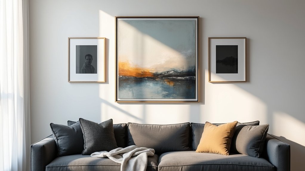
To choose the right wall art, start by reading your room: note wall height, light, colors, and furniture to guide scale and placement. Define the vibe you want—mood, subject, and symbolism—and pick pieces that reinforce it. Consider color foundations and textures to add depth without clutter, then plan display spaces for small and large walls. Make certain cohesive framing and spacing, and prioritize preservation for longevity. If you want more, you’ll gain additional techniques and tips.
Key Takeaways
- Assess room factors: size, light, color, furnishings, and focal points to determine suitable art scale and mood.
- Define intent: decide the vibe and message the space should convey to guide style and subject choice.
- Plan placement: establish a focal point, consider sightlines, and tailor arrangement to room function and traffic.
- Choose color and texture: use harmonious hues, with textures that add depth without visual clutter.
- Source thoughtfully: set a clear brief, verify provenance, and balance budget with a mix of pieces (statement, complements, accents, minimal).
Read Your Room for Wall Art

To choose wall art that fits, start by surveying your room’s size, light, and existing furnishings. Observe wall color, dominant textures, and focal points to determine scale and placement. Measure wall segments to guide art dimensions; consider ceiling height and furniture alignment for balanced composition.
Assess natural and artificial light to predict color shifts and glare, noting times of day that affect perception. Evaluate current decor style, promoting cohesion through compatible, not identical, themes.
Color psychology informs mood alignment with room use—calm palettes for workspaces, vibrant tones for social areas. Track art provenance to verify authenticity and maintenance needs, ensuring value and longevity.
Finally, map candidate pieces to locations, testing sightlines and accessibility, so selections enhance room function while preserving architectural integrity.
Define the Vibe: What Your Art Should Communicate
Ask what feeling you want the room to evoke, then select art that reinforces that mood instead of merely filling space. Define the vibe by articulating the message you want viewers to receive.
Art communicates through composition, color, and subject—so choose elements that align with your intended impression. Use art symbolism to convey ideas succinctly: a subject can imply resilience, serenity, or energy without explicit explanation.
Consider cultural influences to ground the piece in context, ensuring authenticity and resonance rather than generic decor. Your goal is clarity: the work should reinforce the space’s function and style, not clash with it.
Favor pieces that offer visual coherence with lighting, texture, and furniture. Avoid ambiguity that distracts from the room’s purpose; precise communication matters.
Scale Art to Your Wall and Furniture
Once you’ve defined the vibe, sizing becomes the concrete bridge between concept and room. You’ll translate wall and furniture dimensions into proportional art, balancing impact with harmony.
Begin by measuring wall width and available height, then select a primary piece sized to commands attention without crowding adjacent elements. For large walls, consider a central statement piece 60–80% of wall width, or a multi-panel set that forms a cohesive unit.
For smaller walls, opt for a single piece close to 70–85% of width, plus complementary small accents. Consider wall textures and art styles; rough textures amplify scale differently than smooth surfaces, so adjust frame depth and spacing accordingly.
Guarantee clear sight lines, avoid visual clutter, and test placement before hanging.
Color Foundations: Choosing Harmonious Hues

When you pick harmonious hues, balance color schemes by pairing adjacent or complementary tones to create cohesiveness.
Start with a dominant color and support it with secondary hues that echo its undertones, avoiding clashing contrasts.
This approach clarifies how Harmonious Hue Combinations and Balance Through Color Schemes guide your wall art choices for a unified look.
Harmonious Hue Combinations
Color harmony rests on intentional hue relationships that guide mood and cohesion. You’ll align palettes by establishing a dominant hue, supporting accents, and subtle neutrals to prevent visual fatigue.
Use color theory basics—complementary, analogous, and triadic schemes—as practical frameworks, not rigid rules, to craft flow between large wall art and adjacent elements.
Consider room purpose: tranquil blues for bedrooms, energizing reds or yellows for focal living spaces.
Balance saturation and value to maintain legibility and prevent overpower.
Color psychology informs how hues influence perception, so choose tones that reinforce intended feelings without shouting.
Let artistic inspiration translate into cohesive sets rather than isolated pieces, ensuring rhythm across artworks.
In practice, test swatches, observe under different lighting, and refine until the collection feels intentional and harmonious.
Balance Through Color Schemes
Balance through color schemes starts with a clear framework: choose a dominant hue, supporting accents, and neutral grounding to guarantee visual stability. You establish a core palette first, then align secondary art pieces to reinforce that foundation.
Color harmony comes from deliberate relationships among hues, not random matches. Pair analogous tones for cohesive calm, or introduce a complementary pop to energize a focal wall without overwhelming the room.
Maintain consistent saturation across pieces to prevent competing signals; this assures a unified read as you move through the space. Mind shade contrast to preserve depth: lighter pieces recede, darker ones advance, creating spatial rhythm.
Apply proportional weight so the art feels anchored, not scattered. This method yields predictable, controllable impact and a balanced gallery.
Texture and Material: Add Depth Without Clutter

Texture and material choices add depth without clutter by guiding light, shadow, and tactility across a space. You optimize impact by selecting surfaces that contrast yet harmonize with your art, balancing texture and finish.
- Textural contrast drives visual interest without overwhelming the composition
- Pair durable materials with lighter pieces to maintain longevity
- Use matte versus gloss finishes to control glare and depth
- Combine natural fibers with solid substrates for tactile variety
- Consider scale and restraint to prevent clutter while preserving nuance
This approach prioritizes material durability and stability, ensuring long-term performance.
You’ll notice how texture modulates perception, guiding attention to key artwork without competing with it. Choose textures that resonate with your room’s light dynamics, then align them with the piece’s subject matter to sustain cohesion.
Framing and Mounting: Frames, Glass, and Gallery Walls
Framing options set the tone and protection for your art, from minimalist profiles to ornate frames. Mounting and display methods vary by weight, size, and space, so choose hardware and layouts that guarantee stability and visibility.
We’ll explore framing variety and mounting strategies to optimize presentation on gallery walls.
Framing Variety Options
Where framing choices begin, you’ll want to take into account how each option affects presentation and protection. You’ll evaluate framing styles, glass types, and mat options to optimize durability and display. Precision matters for color fidelity, archival quality, and proportional balance.
- Framing styles: pick profiles that complement art and room style without overpowering the piece.
- Glass: opt for 90% UV protection or Museum glass to minimize glare and fading.
- Custom mats: control whitespace, improve focus, and protect image edges.
- Depth considerations: choose frame depth to accommodate backing and mounting needs.
- Gallery-wall planning: ensure consistent spacing and alignment for a cohesive display.
Mounting And Display Methods
Mounting and display methods balance aesthetics with protection, so you should choose frames, glass, and gallery-wall layouts that preserve color fidelity while guiding the viewer’s eye. You’ll select frames based on material, profile width, and archival stability to minimize reflection and color shift. Use museum glass or UV-filtering options to safeguard artwork without sacrificing clarity.
Mounting should align with weight, texture, and subject, employing wall cleats, archival mats, and appropriate spacers to prevent contact with glazing. For display, consider linear, grid, or salon-style arrangements that optimize sightlines and rhythm.
Innovative installation techniques, like staggered heights or floating mounts, can enhance depth without crowding. Creative arrangements support narrative flow, while consistent framing creates cohesion and easy rotation. Choose methods that balance longevity, accessibility, and visual impact.
The 4-Category Art Matrix: Statement, Complement, Accent, Minimal
The 4-Category Art Matrix—Statement, Complement, Accent, Minimal—provides a practical framework for selecting wall art that harmonizes with your space. You deploy it by aligning each piece with a primary role, balancing color theory and art symbolism.
- Statement pieces establish mood with bold scale and focal color.
- Complements harmonize adjacent elements, echoing tones and textures.
- Accents pull attention to details through contrast and nuance.
- Minimal works reduce clutter, emphasize negative space, and resilience.
- Cohesion comes from consistent framing, spacing, and intentional repetition.
Use the matrix to test combinations, then refine until you achieve visual rhythm. You’ll justify choices with color theory logic and symbolic meaning, not guesswork. This approach keeps selections purposeful, precise, and adaptable to evolving spaces.
Lighting Your Art: Natural Light and Accent Options
Natural light shapes how art reads in a room, so start by evaluating sun exposure and seasonal shifts to plan when and how pieces will be seen at their best. You’ll optimize placement to minimize glare and color distortion while preserving true tones.
Natural illumination should guide frame selection and viewing angles, ensuring hues stay accurate throughout the day. Use window treatments or reflective surfaces to control intensity without sacrificing daylight quality.
For evenings or dim corridors, introduce accent lighting to complement the artwork without overpowering it. Choose focused, low-CRI fixtures with dimmers to maintain mood and fidelity.
Align light color temperature with the artwork’s palette, typically in the 2700–3500K range for warm works and 3500–4000K for cooler pieces. Reassess seasonal shifts quarterly to maintain consistency.
Composition Essentials: Focal Point, Balance, and Rhythm

How you arrange artwork defines its impact: establish a clear focal point, maintain visual balance, and create rhythm through repetition or variation.
- Define a focal point as the visual anchor; ensure it draws attention first.
- Align elements to reinforce balance, using symmetry or deliberate asymmetry.
- Use scale differences to enhance rhythm without clutter.
- Repeat motifs or colors to guide the eye smoothly across the wall.
- Introduce subtle variations to keep interest while preserving harmony.
Focal point guides interpretation and lighting, while visual balance prevents overload or emptiness. Prioritize a single, strong centerpiece; support with offsetting pieces or negative space.
Rhythm emerges from a measured sequence, not randomness, so think flow, contrast, and cadence when composing the arrangement.
Placement by Room: Living Room, Bedroom, Office, Hallway
Where should you place wall art to maximize impact in each space?
In the living room, center large pieces at eye level and align with seating sightlines to enhance wall aesthetics and conversation. Use gallery clusters for dynamic energy, but keep scale proportional to furniture and wall area.
In bedrooms, position art to reinforce mood: soothing imagery above the bed or a quiet corner; avoid overhead glare and mirror distracting reflections.
For offices, anchor art near work zones to boost focus; choose pieces with clear symbolism that supports your professional tone.
Hallways benefit from a deliberate rhythm—line works or a sequence—creating movement and continuity. Consider continuity of color and framing, ensuring art symbolism reads consistently across progressions.
Shopping Smart: Where and How to Source Quality Art
To source quality art without overspending, start with a clear brief that defines your wall’s size, color palette, subject matter, and desired mood.
Then source strategically, balancing original works and high-quality reproductions. Use trusted channels to verify provenance and condition, and prioritize pieces with clear authentication documents.
Leverage established platforms, galleries, and artist studios to expand options without sacrificing reliability. Compare pricing, edition details, and framing requirements to avoid surprises.
Consider rotation potential to maximize impact over time. Maintain a notebook of prospects and decisions.
Art authentication and collector tips keep you disciplined, while diversification minimizes risk. Be mindful of shipping, insurance, and conservation needs.
By vetting source credibility, you cultivate a dependable collection that elevates spaces.
- Start with a clear brief
- Verify provenance and condition
- Compare editions and pricing
- Use trusted channels
- Maintain collector notes
Budget Smartly: Getting Impact Without Overspending

You can optimize your wall art with smart budgeting tactics that maximize impact while keeping costs in check. Choose value-driven options that balance quality, scale, and longevity, ensuring each piece earns its keep.
Start by prioritizing unobtrusive statement works and mix in affordable accents to amplify mood without overspending.
Smart Budgeting Tactics
Smart budgeting tactics start with a clear plan that aligns art choices with your space and budget. You’ll optimize impact by prioritizing framing options and precise budget allocation before purchases.
- Define a cap per piece and total ceiling for the room
- Prioritize focal pieces over multiples to maximize visual weight
- Use alternative prints or reproductions to stretch the budget
- Align frame quality with piece value for consistent presentation
- Schedule purchases to leverage seasonal sales and discounts
Track spend against intent, not impulse, and review results after installation.
Favor versatile sizes and standard frames to simplify replacements if tastes change.
Measure wall areas and lighting to ensure pieces read correctly at viewing distance.
Maintain a digital catalog of options and costs for quick reallocation if needs shift.
Budget allocation stays aligned with space priorities, avoiding excess.
Impactful Yet Affordable
Achieving impact without overspending hinges on smart, scalable choices that maximize value. You’ll prioritize affordable options that still communicate a clear message and fit your space’s proportions.
Start with size and placement: a single, well-positioned piece often outperforms multiple small pieces. Look for affordable options in formats that amplify presence—bold typography, high-contrast imagery, or a single statement panel.
Choose limited color palettes to reduce framing and printing costs while preserving impact. Build a cohesive gallery through a unifying frame style or matting, rather than chasing disparate looks.
Consider alternative surfaces—canvas reproductions, metal prints, or framed prints from lesser-known artists—carefully selecting pieces that deliver strong graphics and editorial quality.
Finally, invest in your core piece and rotate seasonal accents to sustain impactful designs without overspending.
Value-Driven Art Choices
Value-driven art choices start with value, not volume: pick pieces that deliver maximum impact for the price. You optimize by prioritizing emotional resonance and cultural significance, ensuring every dollar compounds meaning in your space.
Budget-smart selections rely on strategic sourcing, thoughtful framing, and scalable display plans rather than oversized, impulse buys.
Focus on cohesion with existing elements, then justify each piece by its narrative and lasting appeal.
- Emotional resonance over flashy novelty
- Cultural significance aligned with your space
- Quality materials and proper preservation
- Framing that complements, not competes
- Flexible arrangements to maximize impact over time
Custom vs. Print: Pros, Cons, and When to Choose
Custom wall art offers personalized styling and unique problem-solving for space, but it comes with higher cost and longer lead times than prints. You weigh control over materials, finishes, and scale against availability and budget.
Prints deliver consistency, rapid fulfillment, and lower entry costs, making them ideal for trend-driven updates or large-volume installations.
Material options for custom pieces include metal, wood, canvas, and specialty substrates, each affecting texture, depth, and light reflection.
Artistic styles vary from ultra-modern to classical, enabling precise alignment with your interior language.
Consider performance: durability, UV resistance, and cleaning requirements differ between formats.
When choosing, match your decision to space, usage, and maintenance capacity; opt for prints for flexibility and speed, or custom for longevity and a bespoke resonance.
Hang Like a Pro: Heights, Tools, and Alignment Tricks
You’ll position art with Height Placement Precision in mind to guarantee ideal sightlines and balance.
Gather Essential Hanging Tools and use them confidently, from level to stud finder, so your setup stays true under pressure.
Master Alignment and Spacing Tricks to create a cohesive gallery, accounting for wall features and neighboring pieces.
Height Placement Precision
Height placement precision hinges on a clear baseline and exact measurements. You gauge wall height and art positioning with precision, not guesswork, to achieve balanced visuals.
- Establish eye level as your baseline and align art accordingly
- Measure from floor to frame center for accurate height
- Use a laser or tape measure for repeatable results
- Account for furniture height to avoid crowding
- Mark spots lightly before hanging to confirm balance
Keep spacing consistent between multiple pieces, and adjust for ceiling height variations. You’ll fine‑tune until the composition feels anchored, not floating. This discipline prevents awkward offsets and preserves architectural harmony.
When you align art with a defined baseline, wall height and positioning become repeatable, enabling you to reproduce pro‑level results across rooms. Your final arrangement communicates intent through precise art positioning and measured confidence.
Essential Hanging Tools
To hang like a pro, start with the right toolkit: level, tape measure, stud finder, and a drill with appropriate bits. With these essentials, you guarantee precise alignment and secure support for your wall art.
Choose a levelled approach, verify stud locations, and mark outlet-free zones to avoid hazards. Use the stud finder to confirm framing behind plaster or drywall, then select anchors rated for your weight and wall type.
Keep spare bits and a pencil for clean, repeatable marks. For delicate pieces, consider wire or French cleats that distribute weight evenly, reducing stress on the art and substrate.
Art conservation considerations matter; avoid over-tightening to prevent frame deformation. In all cases, prioritize stable wall installation and reversible mounting options whenever possible.
Alignment and Spacing Tricks
When aligning wall art, start with precise height targets and consistent spacing so every piece reads as a cohesive display. You’ll rely on alignment tips to set a baseline and spacing techniques to maintain rhythm across the wall.
- Establish a common eye-line height before placing any frame.
- Measure and mark equal gaps for a balanced grid or salon-style layout.
- Use a level and masking tape to preview placements.
- Consider frame dimensions to preserve visual weight harmony.
- Verify overall alignment by stepping back and scanning the wall.
Keep screws and hangers aligned to the same vertical reference, and adjust for wall irregularities gradually.
This disciplined approach minimizes gaps, prevents skew, and yields a professional, polished result.
Display Strategies for Small and Large Walls
Strategically balance wall real estate by pairing scale with placement: on small walls, group several pieces into a tight grid or vignette to create visual impact without overwhelming the space. On large walls, anchor with a single dominant piece or a carefully spaced gallery array to establish focus and rhythm.
You should evaluate viewing distance, light, and furniture relationships to optimize scale decisions.
Use Abstract patterns to generate cohesion in tight configurations, ensuring edges align for crisp silhouettes. For expansive walls, ensure the dominant piece dominates without crowding, while secondary works provide cadence and flow.
Incorporate Cultural influences judiciously to avoid visual overload; mix line weight and texture to preserve legibility.
Always confirm proportions with the room’s occupancy and traffic patterns.
Curate a Cohesive Gallery: Mixing Eras and Styles
Effectively mix eras and styles by establishing a unifying thread—whether through color, material texture, or thematic cues—and let one anchor piece ground the display.
You’ll choreograph a gallery that feels deliberate, not cluttered, by aligning key elements across duos or triplets of works. Eras blending and Style mixing hinge on consistent rhythm, so repeat motifs, finishes, or tonal values to knit disparate pieces together.
Maintain balance with a clear hierarchy: anchor piece, supporting pieces, then sparer accents. Reassess scale and alignment to prevent visual overload, and use negative space to emphasize cohesion.
- Establish a unifying color or texture across pieces
- Vary frame styles but keep a common finish
- Align the composition to a shared grid
- Use one dominant piece as an anchor
- Clip extraneous pieces to preserve rhythm
Care and Longevity: Caring for Art Over Time
Care and longevity begin long before display—use proper housing, climate control, and handling to preserve artworks over decades. You’ll prioritize stable temperature and humidity, minimal light exposure, and clean storage when not viewing pieces.
For wall-mounted works, mount on compliant backboards and resist direct sun, heat vents, and damp environments.
Art preservation relies on routine inspection for edge lifting, grime, and mounting wear, with prompt remediation.
Cleaning techniques should be minimal and non-abrasive: dust with a soft brush or microfiber cloth, avoid solvents, and test a small area first.
Document provenance, condition notes, and any archival framing.
Limit handling to essential moments, use gloves, and store originals in protective enclosures.
Regular professional assessments complement at-home care to extend life and value.
Frequently Asked Questions
How Do I Choose Art That Fits My Space’s Lighting?
You’ll pick art by examining Lighting effects and how it interacts with your space’s natural and artificial light, then adjust brightness, contrast, and framing. This mood enhancement approach guarantees color accuracy, depth, and cohesive ambience under all conditions.
What Should I Consider Before Mixing Eras or Styles?
You should prioritize era compatibility and style harmony, noting that 68% of viewers sense cohesion when eras mix thoughtfully. You mix eras deliberately, use balanced proportions, and align mood across pieces to maintain a cohesive, technical rhythm.
Which Wall Art Sizes Suit Small vs. Large Rooms?
For small rooms, choose 12–24 inch pieces or a cohesive gallery grid; in large rooms, go 30–60 inch statements. Prioritize color coordination and texture contrast to balance scale and maintain visual cohesion throughout the space.
How Can I Determine if a Piece Offers Lasting Value?
An art investment pays off when it sustains your emotional connection and resists trends. Like a trusted mentor’s quote becomes timeless, you gauge lasting value by provenance, build quality, and future admiration rather than novelty, ensuring enduring quality and relevance.
What Easy Steps Ensure Correct Frame Height and Alignment?
Set frame height at eye level, then align centers for precise framing. Use a plumb line for vertical alignment. In Gallery arrangement, verify even spacing; choose Frame materials that resist warping. Confirm horizontal alignment with a level for consistency.
Conclusion
You don’t hang art to fill space—you orchestrate mood. Juxtapose bold with quiet: a massive canvas beside a delicate print, color clashes tamed by neutrals, texture offset by smooth surfaces. Measure walls like a technician, align with intent, and sequence pieces as you would steps in a workflow. In the end, your wall becomes a brief, precise argument—clear, compelling, and durable. Art isn’t decoration; it’s function wrapped in feeling, engineered to stay legible through time.
About the Author



