

Define your room-by-room color goals by mapping each space’s function, mood, activities, and social dynamics into measurable criteria like brightness, contrast, and saturation. Ground choices in color theory—understand undertones, harmonies, and how value shifts with light. Test palettes in real lighting, document codes and usage rules, and preview scenarios across seasons. Plan for accessibility with adequate contrast. Start neutral foundations and layer with deliberate accents to maintain harmony; if you keep exploring, you’ll uncover deeper, durable strategies.
Key Takeaways
- Define room-by-room goals: mood, function, lighting, and how you want spaces to flow together.
- Start with timeless neutrals as a base, then add intentional accents for personality.
- Test color under real lighting in each room and observe how it changes with daylight and artificial light.
- Consider undertones (cool, warm, neutral) and how they interact with existing furnishings and materials.
- Use a cohesive palette: harmony, balance, and cultural context, with documented rules for consistency.
Define Your Color Goals for Each Room

To define color goals for each room, start by identifying the room’s primary function and the mood you want to evoke. You’ll translate function into measurable criteria, such as brightness levels, contrast, and saturation limits, then map these to a color palette.
Consider how daily tasks, gatherings, and rest periods shape your choices, avoiding coincidental matches. Use color psychology to align hues with intended responses—calm zones, energetic workspaces, or welcoming social areas—while maintaining cohesion throughout the changeover.
Inspect historical influences that inform mood and material choices, noting era-appropriate tones or traditional pairings that support lasting appeal. Document target swatches, light exposure notes, and performance requirements (washability, glare).
Finalise room-specific goals, then review against overall harmony to prevent clashes and guarantee a coherent home narrative.
Color Theory Essentials Everyone Should Know
Color theory is the backbone of color decisions, translating mood, function, and lighting into measurable choices you can apply across rooms. You’ll operate with core principles: the color wheel, relationships, and perceptual impact.
Primary, secondary, and intermediate hues establish harmony through schemes like analogous, complementary, and triadic. Saturation, value, and brightness govern perceived intensity and depth, influencing space perception and energy.
Color symbolism and cultural associations guide initial selections, but you should verify meanings within your context and audience.
Contrast drives readability and focal points, while whitespace modulates balance and calm. Accessibility matters: assure sufficient contrast for legibility, particularly in functional areas.
Test palettes under varied lighting, document responses, and iterate. These essentials help you predict outcomes and refine outcomes efficiently.
Determine Undertones: Cool, Warm, or Neutral
Understand undertone categories—cool, warm, or neutral—and how they map to core neutrals.
Compare each category against your base neutrals to predict harmony and contrast in palettes.
Test under different lighting to confirm which undertone aligns with your desired mood and use case.
Identify Undertone Categories
Undertone categories—cool, warm, and neutral—define how colors interact with your skin and wardrobe. You classify undertones to predict harmony between fabric, lighting, and finishes, ensuring cohesive interiors.
Cool undertones lean toward blue, violet, and blue-green influences; warm undertones favor yellow, orange, and red-adjacent hues. Neutral outcomes balance both families for flexible pairing.
Identify undertones through skin undertone tests, jewelry response, and fabric comparison under natural light. This taxonomy guides color choice for wall, trim, and accent schemes, preventing clashes in undertone surges across materials.
Recognize that color symbolism and cultural associations can amplify or dampen perceived undertone effects, shaping mood and perception. Use this framework to streamline palette decisions, maintain visual equilibrium, and support precise, repeatable design outcomes.
Compare With Core Neutral
When you compare color options to a core neutral, determine whether they skew cool, warm, or neutral and how that alignment affects contrast and harmony. You’ll assess undertone alignment to predict how colors interact with the base neutral under typical lighting, focusing on color contrast and shade saturation.
Cool tones increase crisp contrast against warm neutrals but can feel clinical if overused; warm tones soften edges yet can overwhelm if dominant. Neutral undertones provide steady balance, preserving legibility and cohesion.
Use precise swatches, compare chroma against the neutral’s value, and note how saturation shifts perception. Prioritize relationships that enhance readability and depth without shouting.
- Evaluate undertone alignment for harmony
- Measure color contrast with the neutral
- Assess shade saturation impact
- Compare multiple swatches simultaneously
- Favor balanced, legible combinations
Test in Lighting Conditions
To determine undertones under real-world lighting, compare swatches side by side in the target environment and observe how they shift with ambient color temperature. In practice, test under morning, noon, and evening light to capture cool, warm, and neutral responses.
Hold each swatch at eye level, shade the wall behind it, and note subtle shifts in chroma, hue, and perceived temperature. Cool undertones lean blue or gray; warm undertones skew yellow, orange, or red; neutral remains balanced.
Document readings with a simple rubric: cool, neutral, warm, with confidence levels. Color symbolism and cultural influences shape interpretation, so consider room purpose and occupant associations when finalizing a palette.
Cross-check against furniture finishes and lighting fixtures to ensure consistency.
Set the Mood for Each Space (Calm, Cozy, Energizing)

Color sets the emotional tenor of a space, so choose palettes that align with the intended mood: calm with soft neutrals and cool undertones; cozy with warm neutrals, earthy accents, and subtle depth; and energizing with higher-contrast combinations and brighter accents.
- Leverage color symbolism to reinforce mood without overwhelming the senses.
- Consider cultural influences when selecting harmonious combinations.
- Use a restrained palette for calm, then introduce depth with texture rather than color.
- Pair warm neutrals with cool accents to sustain comfort and clarity.
- Employ higher-contrast accents sparingly to energize without fatigue.
How Natural and Artificial Light Shifts Colors
Natural and artificial light don’t render color the same way, and understanding their differences is essential for accurate palette planning. You’ll gauge color perception by observing daylight, incandescent, and LED sources at different times of day, noting shifts in hue, saturation, and warmth.
Natural light generally reveals true chroma, while artificial light can impart yellow, pink, or green tints that alter perceived contrast. Consider color temperature, CRI, and light distribution, since beam angle and intensity affect how surfaces reflect.
Plan palettes around the dominant light environment of each room, then test swatches under mixed lighting to confirm stability. Light influence matters for finish selection, ensuring fabrics, paints, and fixtures maintain intent from morning through night.
Document observed deviations to guide durable, reliable color decisions.
Build Your Core Color Palette: Base, Accents, and Roles
Consider how to anchor a cohesive scheme by defining a core palette with three roles: base, accents, and supporting tones. You’ll align every room by assigning a durable base hue, a curated set of accent colors, and subtle supporting tones that harmonize without competing.
Use Core combinations to test balance, contrast, and accessibility before committing to finishes. Color symbolism guides emotional intent, ensuring each room communicates its function through hues.
Maintain consistency by restricting the palette to a practical range and documenting role allocations for future updates.
- Define durable base hues with wide applicability
- Choose 1–2 decisive accents per room
- Pair with 2–3 supporting tones
- Test lighting impact and color symbolism
- Document roles for future tweaks
Pick a Dominant Color That Sets the Tone

To set the room’s tone, choose a dominant color that anchors the palette and guides mood, contrast, and lighting responses. You’ll establish a unifying framework that informs furniture selection, material finishes, and fixture tones.
Select a hue with broad appeal and the strongest visual weight, then calibrate its saturation and value to suit the space’s function and natural light. A true dominant color promotes color harmony across the scheme, preventing clashing accents or competing patterns.
Prioritize paint durability by choosing finishes that tolerate traffic, humidity, and cleaning without perceptible shifts. Test samples under different wall angles and daylight, confirming it remains legible and balanced.
Document the rationale for your choice to ensure consistent decisions during renovations or updates.
Choose Supporting Shades That Read as a Group
To guarantee your palette reads as a cohesive group, select supporting shades that share a common hue family and value range.
This visual tie-in strengthens cohesion by consistent saturation and temperature across tones.
Aim for deliberate contrasts and harmony that readers can instantly perceive as a unified set.
Read Cohesion Through Hues
When selecting supporting shades, aim for colors that visually read as a unified group rather than as separate accents. You’ll create cohesion by choosing hues with shared undertones and consistent saturation, ensuring each color supports the others rather than competing for attention. Consider color symbolism and cultural associations to guide choice, aligning tones with the mood you want to convey while avoiding mixed signals.
Use a limited palette to reinforce readability, and test in lighting to confirm cohesion. Maintain contrast through value hierarchy rather than chroma spikes, so depth remains readable across spaces. This approach strengthens flow from room to room and supports furniture and finishes without visual noise.
- Establish complementary undertones across all shades
- Limit palette to 3–4 core hues
- Align with intended mood and symbolism
- Test in natural and artificial light
- Schedule swatch comparisons under real conditions
Grouped Shades: Visual Tie-in
How can you guarantee supporting shades read as a cohesive group? Grouped shades create a visual tie-in by using a consistent logic across colors, tones, and finishes. Start with a core color and select supporting hues that share undertones, saturation, or brightness levels, ensuring they align with color grouping principles.
Avoid mixing disparate palettes; instead, map each shade to a defined role—base, accent, or progression—so progressions feel deliberate rather than accidental. Consider value steps, keeping adjacent shades within two to three steps on the light-dark scale for harmony.
Textures and finishes should reinforce the scheme, not overpower it. This approach supports shade coordination while maintaining contrast where needed. When executed correctly, the palette reads as a unified system with purposeful variation.
Test Swatches in Real Rooms Before Committing
Before committing to a color palette, test swatches in real rooms to observe how lighting, furniture, and adjacent finishes alter perception. You assess color behavior under daylight, incandescent, and LED, noting hue shifts and saturation changes.
Prioritize practical swatch organization: group samples by value, undertone, and finish to compare confidently. Document reactions to each swatch with concise notes, avoiding guesswork.
- Align swatches with room function and lighting conditions
- Track color psychology cues that influence mood and perception
- Compare matte, satin, and gloss finishes on each sample
- Maintain a labeled, orderly swatch library for quick reference
- Revisit decisions after a full day’s lighting variation
This disciplined approach guarantees reliable results, minimizes mid-project shifts, and yields intentional, cohesive interiors.
Create a Color Flow Map Across Spaces
A color flow map guides how hues traverse from one space to the next, preserving coherence while accommodating differing functions and lighting. You map primary, secondary, and accent colors across zones, noting adjacent rooms and sightlines.
Define a dominant hue for common areas and derive supporting tones for private or niche spaces, ensuring progression feels intentional rather than coincidental. Consider lighting quality and material textures, as they alter perceived color; adjust swatches to reflect daylight, incandescent, and LED scenarios.
Align with color psychology to foster desired moods in each zone while maintaining a unified palette. Document environmental impact by prioritizing durable, low-VOC finishes and recycled or sustainably sourced materials.
Review the flow periodically after renovations, ensuring new elements integrate without breaking the established sequence.
Use Neutrals to Grow With Your Style
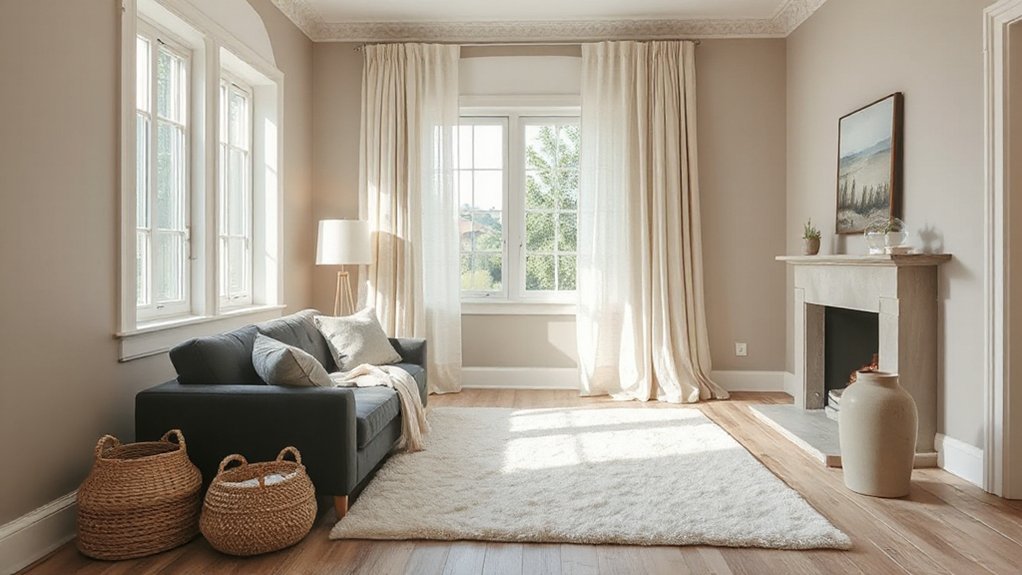
Neutrals form a flexible backbone for evolving styles, so start with a balanced base that adapts as trends, textures, and lighting shift. You’ll leverage neutral tones to anchor rooms while permitting dynamic updates through accents and finishes, supporting steady style evolution.
Use a modular approach: keep surfaces cohesive, then layer texture and light to adjust the atmosphere without overhauling the palette. This method minimizes risk while maximizing longevity, because growth hinges on subtle shifts rather than complete overhauls.
- Ground spaces with soft, warm neutrals for warmth and consistency
- Introduce contrast via materials: wood, metal, fabric textures
- Employ varied neutrals (cool, warm, gray, beige) for depth
- Swap small accent elements to refresh without broad changes
- Plan lighting to enhance neutral tones as a driver of style evolution
Apply Color Psychology by Room
Color choices set room mood, so you tailor palettes to the intended function and feel of each space. Start by matching color temperature and saturation to the room’s purpose—calm neutrals for focus, brighter accents for activity, and muted tones for rest areas.
Consider palette consistency across surfaces and fixtures to reinforce the desired mood and support practical uses.
Room Mood Effects
Room mood effects emerge from how color domains influence perception and behavior within a space. Selecting palettes that align with room function enhances usability and comfort. You assess how hues modulate ambiance, luminance, and attention, framing daily activities with intentional atmosphere.
Color symbolism guides associations, while emotional impact shapes motivation and relaxation, yielding measurable outcomes in performance and satisfaction. The interplay of saturation, value, and temperature informs balance, contrast, and focus, ensuring cohesive environments that support function without fatigue.
By prioritizing room-specific psychology, you optimize usability, mood regulation, and aesthetic congruence.
- Color symbolism informs expected meanings and cues
- Emotional impact drives engagement and calm
- Saturation and value tune readability and depth
- Temperature shifts influence perceived size and comfort
- Functional zones benefit from deliberate tonal separation
Palette by Purpose
When you design per purpose, color palettes are chosen to support specific room functions and user tasks. In this section, you align hues with intended activity, boosting usability and mood.
For work zones, favor neutral bases with restrained accents to reduce distraction and reinforce focus, recognizing color symbolism tied to calm concentration.
In kitchens, implement warm tones to evoke appetite and efficiency, while ensuring contrast for readability of controls.
Bathrooms benefit from cool, clean palettes that imply hygiene and freshness, yet avoid sterile sterility through subtle warmth.
Living areas should balance social vitality with comfort, using adaptable schemes that reflect cultural meanings and everyday rituals.
Always validate your choices against user tasks, cultural expectations, and the room’s functional workflow.
Plan for Durability: Timeless Over Trendy
Durability should guide palette choices, not fleeting trends that fade after a season. You should prioritize timeless fundamentals over the latest fad, ensuring longevity in perception and resale value.
Consider how color symbolism and cultural influences shape meaning, then anchor your scheme to enduring neutrals with strategic accents. By emphasizing harmony, balance, and legibility, you create spaces that resist datedness while still feeling intentional.
Focus on value, undertones, and lighting compatibility to maintain consistency across seasons and lighting conditions.
- Favor durable neutrals as the foundation
- Use accents to express personality without overpowering
- Assess color symbolism in local contexts
- Account for cultural influences in shared spaces
- Test in real light before committing to large areas
Finishes Matter: Matte, Satin, Gloss Effects
Matte finishes reduce glare and emphasize texture, giving a soft, non-reflective backdrop that highlights subtle color shifts.
Satin introduces a balanced sheen that enhances depth while concealing minor surface blemishes, guiding light to draw attention without overpowering the palette.
Gloss effects boost contrast and clarity, signaling focal points and adding perceived durability through higher reflectivity.
MatteFinish Texture Effects
MatteFinish texture effects define a non-reflective surface that dampens glare and hides minor imperfections, making them essential for controlled light diffusion in design projects. You’ll gain a calm, even backdrop that reduces hotspots and yields true color perception, while maintaining depth and contrast.
Matte finish enhances wall and cabinet surfaces without emphasizing texture, delivering a refined, durable look suited for high-traffic spaces. Texture effects integrate subtle grain, micro-velvet, or plaster-like nuances that help disguise brushing inconsistencies during application.
You’ll want consistent ambient lighting to maximize this finish’s readability and mood. MatteFinish choices influence maintenance cycles, cleaning needs, and long-term wear.
Consider contrast with metal or glass accents to preserve legibility of color relationships.
- Non-reflective base for glare reduction
- Conceals minor surface flaws efficiently
- Subtle texture adds visual depth
- Balances color accuracy under varied light
- Low-gloss, durable for high-traffic areas
SatinSheen Light Reflection
SatinSheen light reflection bridges the gap between matte and gloss by delivering a soft, yet perceptible, sheen that enhances color depth without attracting glare. You’ll notice a balanced mid-gloss effect that preserves surface detail while reducing viewing fatigue.
In practice, satin sheen moderates light reflection to reveal true hue and undertone under varying ambient conditions. This finish minimizes fingerprint visibility and wear marks compared to high-gloss options, making it suitable for high-traffic rooms.
When selecting colors, consider how satin sheen interacts with room lighting; walls may appear warmer or cooler as light shifts. Use consistent swatches to evaluate color stability across different times of day.
Document Your Palette: Codes, Usage, and Rules
Documenting your palette is a foundational step that guarantees consistency across all materials: you must define codes, usage rules, and governance to prevent drift.
You’ll implement a centralized system for color codes, swatch labeling, and approved digital assets, ensuring uniform interpretation across designers, contractors, and vendors.
Establish governance for updates, version control, and archival of historical decisions to preserve color intent.
Enforce usage criteria for combos, contrast, and accessibility, and codify exceptions with documented rationale.
Tie decisions to color symbolism and Historical palettes to maintain meaning across spaces and periods.
Consistency reduces rework, strengthens branding, and clarifies expectations for stakeholders.
- Codes, naming conventions, and swatch hierarchies
- Usage rules by space, light, and accessibility
- Version control and change governance
- Approved asset formats and delivery specs
- Rationale linking Color symbolism and Historical palettes
Preview Lighting Scenarios Across Seasons

How do lighting conditions evolve with the seasons, and why does previewing these changes matter for design intent? You’ll assess how seasonal lighting shifts alter perceived color warmth, saturation, and contrast. Use a consistent evaluation method: document incidents of daylight variations, then simulate their impact at key times of day and across rooms with your palette.
Consider winter’s cooler, low-angle daylight versus summer’s intense, broad-spectrum light, and how skylight direction changes with the Sun’s arc. Visualize scenes through virtual or physical mockups, noting pigment responses, undertone shifts, and depth cues.
Record luminance ranges, then test design decisions under multiple daylight variants to ensure color harmony remains stable, avoiding unwanted tint bias and guaranteeing legibility, mood, and material fidelity across seasons.
Plan for Accessibility and Practicality (Contrast)
Accessibility and practicality must guide color decisions from the outset, ensuring sufficient contrast for all users and durable performance in real-world conditions. You’ll implement Contrast planning to balance aesthetics with legibility, preventing visual fatigue and error-prone environments.
Consider tested luminance ratios, avoid near-equals saturations, and verify contrast on all surfaces and textures. Accessibility considerations extend to furniture, fixtures, and signage, not just walls, ensuring consistent readability.
Document your decisions to support maintenance and future updates, and test under typical lighting conditions. The goal is a resilient palette that remains functional over time while preserving design intent.
- Contrast planning foundations for every room
- Accessible color pairs by luminance and hue
- Consistent contrast across materials and finishes
- Real-world durability and legibility tests
- Documentation for future updates and compliance
Final Check: A 2-Part Recheck Before Painting
Before you begin painting, perform a two-step verification to guarantee reliability and color integrity.
First, conduct a final check of swatches under the actual lighting conditions planned for each space, confirming hue, saturation, and value match the design intent.
Second, test color batches on sample panels, evaluating color consistency across batches, surface textures, and primer compatibility. Use controlled lighting, eliminate glare, and compare against a calibrated white reference to detect subtle shifts.
Document any deviations and adjust formulas or finish selections accordingly.
Confirm edges, corners, and large field areas display uniform color.
Final check validates longevity, finish quality, and shade stability throughout drying and curing.
This process reinforces color consistency and confidence in your palette.
Frequently Asked Questions
How Do I Pick Colors for Small Rooms Without Crowding?
To keep small rooms from feeling crowded, you pick light neutrals with Accent pops, leveraging color psychology and lighting effects to enhance perception of space; stick to low-saturation hues, and maximize reflective surfaces for balanced, airy visuals.
Can I Mix Warm and Cool Tones in One Space?
Yes, you can mix warm and cool tones in one space. Color psychology guides choices, balancing hues for harmony, while considering emotional impact to avoid discord; pair neutrals with accents, and test light reflections to guarantee cohesive, controlled contrast.
Which Color Pairs Boost Perceived Room Height or Depth?
Yes—you boost perceived height with light, cool tones on walls and darker accents to deepen depth. Use accent walls strategically, and rely on color psychology to select contrasts that visually expand ceilings while anchoring spaces.
How Many Colors Are Too Many in a Single Room?
Three to five colors is plenty; avoid overcrowding. You’ll benefit from color psychology insights and current color trends to maintain cohesion, balance contrast, and keep spaces legible. Use 1–2 dominant tones, with accent hues for emphasis.
What’s the Best Way to Test Color Changes Before Painting?
To test color changes before painting, use swatches on walls alongside large, temporary samples, observe under different lighting, and check color psychology and lighting effects; compare with digital mockups, guarantee consistency across rooms, and document your results for accuracy.
Conclusion
You’ve mapped goals, weighed undertones, and tested light across seasons, so your palette isn’t guesswork but a tested system. By documenting codes, usage, and accessibility, you’ll stay consistent from room to room. As you preview real lighting, you’ll spot shifts before paint dries, and a final two-check seals your plan. In short, color strategy becomes your compass—steady, precise, and ready to guide every brushstroke, like a well-tuned instrument in a carefully composed room.
About the Author



