

In 2025, you’ll want durable, low-odor paints in versatile neutrals that hold up to daily life while reading true under both natural and LED light. Focus on warm and cool neutrals as foundations, with balanced accents in soft blues, grays, greens, or pale yellows to avoid glare. Matte or eggshell finishes reduce reflections and conceal flaws, while test swatches under varied lighting confirms harmony. If you keep exploring, you’ll uncover practical picks and pairing strategies.
Key Takeaways
- Opt for warm neutrals (greige, oatmeal, soft greys) as versatile foundations with flexible accents and evolving schemes.
- Choose light, low-saturation tones to boost calm, brightness, and perceived space while reducing glare.
- Pair wall colors with wood and metal undertones; test swatches in natural light for harmony.
- Use durable, washable finishes (matte/eggshell) for daily living and easy maintenance.
- Preview color under different lighting (CCT/CRI) and document swatch performance across times of day.
What Makes a Great Living Room Paint in 2025

Great living-room paint in 2025 hinges on durability, color versatility, and ease of maintenance. You select coatings with high scrub resistance and stain repellency to resist daily use, spills, and smudges. You prioritize consistent pigmentation for reduced touch-ups and uniform finish across walls, ceilings, and architectural features. You evaluate coverage efficiency, odor intensity, drying time, and cure completeness to minimize disruption. You balance light reflectance with room function, ensuring appropriate ambient glow for films, reading, and conversations. You incorporate artistic murals as accent strategies and textured finishes to add tactility without compromising cleanability or wipeability. You validate warranty terms, applicator compatibility, and environmental compliance. You document performance criteria, normalize maintenance expectations, and align choices with long-term interior design intent.
Core Criteria for Color Selection
You should evaluate color choices by hue, temperature, and balance to achieve a cohesive base for your living space. Consider how lighting shifts perception, and adjust the hue and warmth to maintain the intended mood throughout the day. Assess lighting impact early to guarantee the selected palette remains consistent across rooms and activities.
Hue Temperature Balance
Hue temperature balance is the cornerstone of color selection for living rooms, ensuring the space reads as cohesive and comfortable rather than jarring. You assess ambient light, materials, and furnishings to match warm and cool cues across surfaces. Maintain neutral anchors (greige, taupe, soft greys) as baseline references, then tune accents with subtle shifts in undertone to preserve harmony. Use consistent lightness levels to prevent perceptual drift between walls, trim, and textiles, and verify with multiple lighting conditions before finalizing. Color psychology informs how temperature cues influence mood and perceived intimacy, guiding your palette choices toward inviting warmth or crisp clarity as needed. Prioritize paint durability by selecting formulations with stable pigments and effective stain resistance, ensuring long-term compositional integrity.
Lighting Impact Assessment
Lighting conditions drive perceived color and should be evaluated across time and tasks. In this section, you assess Lighting Impact to guide color selection for living rooms. You’ll compare Artificial lighting versus Natural light performance, noting how each source shifts hue, saturation, and brightness. Consider correlated color temperature (CCT) and color rendering index (CRI) to predict real-world outcomes. Document how sample swatches render under dimmed evenings, bright afternoons, and mixed environments, then translate results into actionable recommendations. Prioritize colors with stable undertones, low metamerism risk, and sufficient luminance contrast for furniture and artwork. Integrate dimming controls, lighting zoning, and window treatments into the assessment. This approach minimizes color surprises, ensuring consistency across tasks and times.
Base Neutrals and Mood Builders
A neutral base sets the stage for your living room’s atmosphere, balancing light, texture, and scale. Pair a adaptable Neutral Base Palette with strategic Mood-Boosting Hues to control energy levels and visual cohesion. This section guides you on choosing durable neutrals and accent tones that elevate mood without overpowering the space.
Neutral Base Palette
Are you laying a solid foundation for your living room color scheme with a neutral base that anchors mood and furniture? A neutral base palette combines base neutrals with controlled contrast to support diverse accent schemes. Choose warm neutrals (greige, oatmeal, soft taupe) for walls to preserve depth without dominating architectural details. Integrate cooler undertones sparingly to maintain balance, making certain the consistent undertone runs across major surfaces. Your mood builders rely on durable, scrub-friendly finishes and appropriate sheen to reflect light without glare. Use grain textures and subtle micro-variations to add depth without competing with focal elements. When introducing Bold patterns or Vintage furniture, guarantee the base remains cohesive, allowing statement pieces to resonate rather than clash, while maintaining timeless adaptability and resale resilience.
Mood-Boosting Hues
Mood-boosting neutrals anchor the room and elevate mood by balancing warmth and coolness across walls, ceilings, and larger surfaces. In this mood-boosting hues section, you’ll select base neutrals that support color psychology goals while serving as durable foundations for accent shades. Opt for pigments with stable undertones to minimize perceptual shifts under varying light, preserving intended mood throughout the day. Consider finished surfaces and sheen levels that align with space usage to optimize perceived calm or energy. Durability matters: choose paints with proven coverage, scrub resistance, and fade resistance to maintain consistent ambience over time. Pair base neutrals with controlled contrast to enhance focal points without overwhelming the room. Document color samples, test under natural light, and verify compatibility with existing materials and lighting plans.
Neutral Blues and Grays
Neutral blues and grays offer a versatile foundation for living rooms, balancing warmth and coolness without overpowering other design elements. You’ll apply these tones in ways that support furniture, art, and textiles without competing for attention. From a technical perspective, choose mid-range saturations to maximize light reflectance while preserving depth across variations of natural light. Color psychology indicates these hues convey calm and collected spaces, aiding focus and conversation without signaling intense emotion. When selecting paint, prioritize low-VOC, durable finishes for high-traffic walls and consider matte or eggshell to minimize glare. For accent zones, test swatches under daylight and artificial lighting to ensure consistency. Paint application should proceed in uniform coats, with proper surface priming and 24-hour curing between passes.
Warmer Neutrals That Cozy Up a Space
Warm neutrals combine white with subtle warmth to create a inviting base. You’ll notice cocoa-toned accents add depth, while taupe-soft textures keep surfaces comfortable and cohesive. This trio—Warmth With Whites, Cocoa-Toned Coziness, and Taupe-Soft Textures—guides a balanced, modern approach to cozy living rooms.
Warmth With Whites
Warmth with whites blends soft undertones and low-level color shifts to create a cozy yet contemporary living room. You’ll target subtle warmth by selecting whites with trace yellow, beige, or greige notes, avoiding stark brightness that reads clinical. In practice, interior wall textures influence how light diffuses; a matte or lightly textured surface minimizes glare while preserving depth. You assess finish, then map color temperature to room exposure, ensuring curtains and furniture harmonize rather than clash. Paint application techniques matter: consistent roller blades, cut-in accuracy, and multiple thin coats yield even luminance and reduce sun-bleached patches. Use mid-tone whites for main walls and reserve cooler whites for trim to reinforce structure. Document reflected color shifts, and adjust with gentle accent hues to sustain cohesion throughout the space.
Cocoa-Toned Coziness
Cocoa-toned coziness relies on warmer neutrals that read as inviting without overpowering a space. You’ll leverage depth from mocha, cocoa, and caramel hues to temper bold accents while preserving light. Color psychology guides this approach: these tones evoke comfort, reduce perceived activity, and anchor furniture without visually shrinking rooms. When selecting paints, prioritize even saturation and avoid high-gloss finishes that reflect too much energy. Paint texture matters: matte or eggshell surfaces minimize glare, while subtle, barely-there sheens can enhance warmth without introducing distraction. Pairing warm neutrals with cool architectural elements produces balanced contrast that remains cohesive through daylight shifts. Use these hues to define zones, not dominate, ensuring a serene living area that remains versatile for both daily use and entertaining.
Taupe-Soft Textures
Taupe-soft textures combine warmer neutrals with tactile finishes to create a cozy, inviting living space. You’ll pair taupe walls with subtle textures—slap-on plaster, fine grit, or linen-inspired renders—to add depth without signaling busyness. Wall texture should be deliberate: keep patterns understated to preserve light reflection and balance. For durability, choose matte or satin sheens on walls with a durable topcoat that resists scuffs and fingerprints, while maintaining a soft, velvety feel. This approach reduces contrast fatigue between surfaces, enabling a cohesive palette that remains timeless. When selecting paint, prioritize formulas with proven durability and minimal yellowing over time. Coordinate textiles and furniture in cooler and warmer undertones to enhance the warmth, ensuring the space feels anchored, modern, and resilient.
Soft Greens for Calming, Restful Vibes

Soft greens create a calm, restorative backdrop that reduces visual noise and supports sustained focus in living spaces. You’ll benefit from hues with balanced undertones—sage, moss, and eucalyptus—that pair with natural light to maintain surface neutrality. Use these colors on primary walls to cut glare and improve perceived room height without sacrificing warmth. In practice, select low-saturation greens with slight gray or yellow undertones to avoid mossy or clinical feels. Coordinate furniture finishes to reinforce cohesion: matte woods, linen textures, and restrained metallic accents. For layout, introduce depth with two to three tints rather than a single shade across walls. Garden furniture, placed near windows, benefits from complementary greens to reduce contrast. Wall art choices should echo the palette’s muted intensity to preserve restful ambience.
Subtle Yellows and Warm Whites for Brightness
Subtle yellows and warm whites brighten living rooms without overpowering other design elements. You create a lively base with sunlit mornings and balanced contrast, ensuring spaces feel open yet grounded. Use warm whites to reflect light while maintaining depth, then layer subtle accents to prevent flatness. Color temperature matters: keep yellows soft, leaning creamy rather than neon, so rooms read inviting rather than aggressive. Consider natural light quality and paint finish; satin or eggshell minimizes glare while preserving brightness. Pairing with cool neutrals tightens harmony, while wooden textures add tactility. You’ll notice improved perceived space without sacrificing sophistication when you apply these principles consistently.
- Suggested palettes: warm white base with pale yellow accents
- Finish selection: eggshell or satin for balance
- Lighting impact: optimize with daylight-rich settings
- Accessorizing: subtle accents to maintain cohesion
Muted Lavender and Dusty Rose Accents
Muted lavender pairings create a subtle cool foundation, while dusty rose accents add warmth and visual interest. You’ll want to balance these hues to maintain flow between furniture, textiles, and architectural details. Consider proportion and saturation to guarantee cohesive contrast across the room while preserving calm, legible defining moments.
Muted Lavender Pairings
Muted Lavender works best when paired with Dusty Rose accents that balance cool and warm undertones. You’ll create a refined backdrop that reads modern while nodding to classic schemes. Use controlled saturation to prevent overwhelm, ensuring the lavender remains the focal cue rather than the theme of the room. Highlight balance with composure: choose Dusty Rose for upholstery, textiles, and accessories, and reserve white or graphite for trim and structural elements. This approach supports cohesive lighting, minimizing glare and maximizing mood. Bold accent walls can anchor the space, while Vintage color palettes tie disparate pieces into a single narrative. Implement with precision, calibrating color samples under natural and artificial light.
- Bold accent walls
- Dusty Rose textiles
- Neutral trim for contrast
- Vintage color palettes integration
Dusty Rose Accents
Dusty Rose accents pair seamlessly with muted lavender to create a balanced, contemporary living room palette. You’ll leverage dusty rose as a restrained color cue, avoiding saturation spikes that overwhelm the room. Use this hue on accent walls to anchor seating areas without dominating sightlines. Pair it with lavender for subtle contrast, ensuring undertones stay cool enough to feel modern. In practice, apply dusty rose to one focal wall and keep adjacent walls in a soft, desaturated baseline to preserve depth. Textured textiles and matte finishes enhance sophistication, while clean profiles in furniture prevent visual clutter. Consider lighting that shifts warmth toward magenta tones during evening hours to preserve nuance. Avoid over-application; restraint preserves harmony and guides spatial perception.
Balance and Flow
Achieving balance and flow with muted lavender and dusty rose accents hinges on deliberate placement and tonal restraint. You’ll align color zones to support navigation, using lavender as a calm anchor and dusty rose as a relational highlight, avoiding overpowering saturation. Consider color psychology: soft lilac spaces calm, while pink-leaning tones elevate warmth without dominance. Keep contrast purposeful—choose one accent wall or textiles to anchor furniture groupings. Plan light reflection with strategic white or warm neutrals to maintain coherence and depth, enhancing paint durability through even coverage and proper priming. Light conditions should guide shade selection, not override it. Regularly test samples in multi-hour windows to verify mood and performance under real-life glare.
- Deliberate placement anchors flow and avoids chaos
- Use one dominant accent, restrained secondary accents
- Test samples across varied lighting for color psychology
- Prioritize even coats and proper priming for paint durability
Gentle Blues for Coastal and Modern Homes

Gentle blues offer a versatile foundation for both coastal and modern interiors, pairing well with natural light and clean lines. In practice, these hues create depth without overpowering space, supporting layered textures and architectural detail. You’ll see subtle shifts under varying daylight, so choose tones with balanced undertones—neither too gray nor too green—to maintain timeless appeal. For coastal setups, pair with white trim and lighter woods to enhance airiness; for modern schemes, anchor with charcoal accents and metallics to emphasize structure. Apply the color on walls or large panels to maximize its expansiveness. Use gentle blues selectively in high-traffic rooms, then complement with restrained palettes. Outdoor patio and Kitchen accents benefit from this range by echoing exterior light and cohesive indoor rhythm.
Greige: The All-Rounder That Works Everywhere
Greige, the versatile blend of gray and beige, has become the universal neutral that adapts to any décor tone or lighting condition. You’ll find it balances cool and warm undertones, supporting varied palette choices without competing with accents. In practice, this shade aids color psychology by creating calm, inviting spaces that feel cohesive across rooms. Its paint durability remains dependable when paired with quality primers and appropriate finish levels, resisting fading under common living-room daylight exposure. You’ll optimize furniture and textile compatibility by leveraging its neutrality, rather than dominating sight lines. Use it as a backbone for evolving schemes, knowing it won’t constrain future updates.
- Consistent mood across lighting shifts
- Flexible with bold or subtle accents
- Strong resale appeal through timeless appeal
- Reliable durability with proper prep and finish
How to Pair Paint With Wood Tones and Metals
Pairing paint with wood tones and metals requires a deliberate balance of undertones, contrast, and sheen. Begin by identifying the dominant undertone of your wood grain and the primary hue of your metal finishes. Choose a base wall color that harmonizes rather than competes: cool woods pair with cool neutrals; warm woods suit warm neutrals. Introduce contrast through a lighter or darker shade to define edges without overemphasizing texture. Consider sheen compatibility: flat or eggshell walls maximize nuance, while semi-gloss trims highlight architectural details. Test swatches side by side under natural light to confirm neutrality or deliberate bias. Maintain a restrained palette to avoid busy outcomes; allow wood grain and metal finishes to serve as textural anchors. Document your selections for future touch-ups and refinements.
Lighting-Led Color Perception: What to Consider

Lighting-LED color perception hinges on color temperature, brightness, and rendering index. You should evaluate how these factors shift hue appearance in living rooms, especially under mixed daylight and artificial sources. Color psychology informs choices; cooler temps can feel expansive, warmer temps feel intimate, yet perception shifts with brightness levels and lamp type. Consider that paint longevity and durability interact with light exposure, influencing chalking and fading over time. High-CRI LEDs reveal true undertones and guarantee consistent color readouts across fixtures. Calibrate scenes with samples at different times of day, not just in isolation. For performance, prioritize paints with robust UV resistance and washable finishes to sustain look under LEDs. Test swatches on walls to confirm sustained color fidelity.
- Color temperature impact on mood and perception
- Brightness and fixture type matter for consistent hue
- Color psychology and paint durability interplay
- Sample testing across daylight and LED conditions
Finishes That Change the Mood (Matte vs. Eggshell)
When you specify the finish, you directly influence perceived depth, texture, and mood in a living room. Matte and eggshell surfaces differ in sheen, reflectivity, and tactile quality, shaping how light reveals or softens details. Matte finishes minimize glare and conceal small wall imperfections, creating a velvety backdrop that emphasizes color saturation and depth. Eggshell offers a subtle shine, enhancing warmth and presenting a cleaner, more durable surface under normal wear. For high-traffic areas or families with kids, consider finish durability alongside washability; eggshell stands up better to cleaning without amplifying glare. Matte excels in modern schemes seeking muted drama, while eggshell suits traditional or transitional motifs. Choose based on desired lighting, texture perception, and maintenance tolerance to optimize room atmosphere. Paint texture matters.
Sample the Right Way: Testing Paint at Home
Ready to get accurate color results? Testing paint at home isn’t guesswork; it’s a controlled, repeatable process. You’ll compare samples under typical lighting, document observations, and align with color psychology to predict mood in your living space. Use small swatches on multiple wall areas, not just one spot, and panel them against existing decor. Allow each sample to cure fully, then assess in morning and evening light. Record hue, value, and saturation changes, noting how artistic brushstrokes in your furniture might interact with the finish. Apply a neutral top coat on a test area to reveal true color. Keep notes precise to avoid room-wide misfires.
- Plan multiple lighting scenarios to gauge consistency
- Label each sample with room, lighting, and coordinates
- Observe under daylight and incandescent tones
- Compare against color psychology goals rather than trends
Budgeted Palette: High-End vs. Budget-Friendly Picks
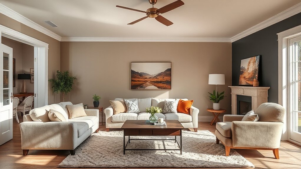
Choosing between high-end and budget-friendly paints isn’t just about price; it’s about achieving the same performance in coverage, durability, and finish. In practice, you compare a mid-range product against a premium line by examining pigment load, hide rate, and VOC limits, not just sticker price. High-end options often deliver steadier color consistency, better color selection, and superior paint durability under frequent cleaning. Budget picks can match these outcomes with proper primers, multiple coats, and surface preparation, but may require more frequent touch-ups over time. Color psychology informs your choice: deeper hues demand higher coverage to avoid streaks, while lighter shades reveal surface defects sooner. Balance costs against long-term performance, ensuring coverage parity, washability, and permanence within your living room’s lighting conditions.
Frequently Asked Questions
How Many Samples Are Enough to Test Color Accurately?
A sample size of at least 5–10 swatches is needed to test color accurately, ensuring reliable results. You should assess lighting and surface variability to verify color consistency across the space, reducing bias and improving prediction accuracy.
Do Paint Undertones Shift With Lighting During the Day?
Yes, undertones shift with lighting, affecting perceived color throughout the day. In fact, studies show up to a 2000K perceived color temperature swing can alter hue. Lighting variations influence undertones; choose stable schemes, evaluate under practical conditions.
Which Finishes Affect Perceived Color Depth the Most?
Finishes that affect perceived color depth most are texture effects and Matte vs. gloss; you’ll notice deeper color with matte, while gloss adds brightness and depth catchlight, and subtle texture amplifies perceived contrast under varying lighting.
Can Wall Color Influence Room Perceived Size and Warmth?
Yes, wall color can alter perceived size and warmth. Color psychology explains larger, lighter walls feel more expansive, while cooler tones reduce warmth; emotional impact strengthens mood shifts. You’ll leverage subtle contrasts to maximize space and comfort.
Are There Color Trends That Clash With Popular Wood Tones?
Yes. You’ll see complementary color schemes work with contrasting wood tones, but avoid extreme pairings; test swatches first. You maximize harmony by balancing cool and warm neutrals, ensuring contrast enhances depth without overpowering the room.
Conclusion
You’ll choose with confidence when you evaluate undertones, test samples, and compare finishes. You’ll balance neutrals with mood builders, weigh cool against warm pallets, and align lighting with perception. You’ll experiment deliberately, avoiding guesswork, embracing both high-end inspiration and budget-friendly options. You’ll craft harmony through contrast, depth, and texture. You’ll document results, iterate thoughtfully, and finalize decisively. You’ll create living rooms that feel timeless, cohesive, and personalized, ready for everyday moments and memorable gatherings.
About the Author



